Stretching from Downtown Brooklyn to Jamaica, and then onwards to Southeast Queens, the Long Island Rail Road’s Atlantic Branch carries commuter trains on a line that, in many places, looks more like a forgotten part of the New York City Subway. I usually have little reason to use the Atlantic Branch but, thanks to summer rebuild work on the J subway line in Jamaica, rides on the Atlantic Branch were made free for MetroCard-carrying riders. I took advantage of this momentary lapse in our normally-fragmented transit fare system to ride the line between East New York and Atlantic Terminal in Downtown Brooklyn.
East New York is an area where the infrastructure really a story of another era. At one time, three elevated lines—the Fulton Street, Jamaica, and Canarsie lines—converged here. Trains on any of the three lines coming from eastern Brooklyn and Queens could change at East New York to any of the three routes on to Manhattan (and vice versa). Though the latter two lines remain today (the Fulton Street elevated was replaced by a subway, now the A and C lines), transit operations around East New York today are much simpler. The Atlantic Avenue station on the Canarsie line (today’s L train) has two disused platforms and four disused trackways—a legacy from when both Canarsie and Fulton Street trains used the station.
The Atlantic Avenue station offers a connection to the Atlantic Branch, which runs on a strange right-of-way through East New York: the train tracks are at grade-level, but are separated from traffic, as Atlantic Avenue runs on an overpass above the station. The entrance to the LIRR’s East New York station is not the most well-advertised—you enter through one of the archways of the Atlantic Avenue overpass on to the platforms.
There are also two subway-style underpass entrances to the station, saving passengers from crossing often-fast-moving traffic adjacent to the station, which are also very low-key. This is such entrance viewed from the LIRR platform, with an L train passing above, headed for Canarsie.
Because the railroad tracks are at grade-level, the station underpasses are also the only way for pedestrians to cross the tracks (and Atlantic Avenue) in this area. The underpass entrances lead to either platform, and contain old mosaic signs in a similar style to subway stations built by the city-run Independent Subway (IND). The sign pointing to the eastbound platform reads “to Jamaica and the Rockaways:” LIRR trains, of course, once ran on what is now the A subway line to the Rockaways.
This is the other subway-style underpass entrance, on Van Sinderen Avenue. The elevated structure at Broadway Junction is in the background; the two stations are only about two blocks apart.
This photo definitely exaggerates it but, thanks to its unique construction under the Atlantic Avenue roadway, the East New York LIRR station is far from the most well-lit transit station in the city.
Heading west from East New York, the next station is Nostrand Avenue in Bedford-Stuyvesant. Before this station, the line rises on to a viaduct that is very similar to NYC’s elevated subway lines. It’s fairly unique in New York City to be on a commuter rail train running so close to urban housing—this section of the line is very reminiscent of elevated subway lines (the M through Bushwick and Ridgewood comes to mind specifically, as that also runs very close to its neighbors’ windows).
The Nostrand Avenue station really just feels like any other elevated subway station. It’s just missing a subway station’s frequent service!
The land use around the Nostrand station is not ideal, though. Despite its close proximity to residential density and busy commercial corridors on Fulton Street and Nostrand Avenue, Atlantic Avenue is mostly auto repair shops, so there are a lot of broken-down—or just straight-up broken—cars sitting by the curb. The lack of pedestrians leads to a classic chicken-egg problem of arterial roadways: without pedestrians, Atlantic is treated as a de facto highway, making it even more hostile to pedestrians, and discouraging the growth of any pedestrian traffic that might help make traffic calmer.
In addition, the vast spaces underneath the viaduct are left almost entirely unused. However, the station was extensively rebuilt recently, and its entrances are in far better shape than those at East New York.
It is worth noting that it does not have to be this way! Many other cities also have elevated rail viaducts, and some of those cities have taken advantage of the space underneath them to enhance the public realm. Even if the space under the viaduct is unused, other cities also demonstrate how roadways around viaducts can easily be more friendly to pedestrians.
Land use and streetscape aside, the Nostrand Avenue station definitely gets used. The crowd coming off a midday train from Long Island wasn’t tiny.
Continuing west from Nostrand Avenue, the Atlantic Branch goes back underground for its last mile and a half to Downtown Brooklyn.
Atlantic Terminal (formerly Flatbush Avenue) is where the branch comes to an unceremonious end, just shy of reaching Manhattan. It is one of a few Long Island Rail Road terminals which remain as monuments to a time before trains could cross the East River, though the Atlantic Terminal stop sees much more use than its brethren upriver in Long Island City.
It’s a fairly unremarkable station itself—though it was renovated relatively recently—and it is connected to the massive Atlantic Avenue/Pacific Street/Barclays Center subway hub, which retains an original 1908-built entrance designed by the Interborough Rapid Transit company (IRT).
This concludes this look at some of the LIRR’s Atlantic Branch. Its nature—a rapid transit-esque line, but without frequent service; a line which services busy neighborhoods, but ends short of the city center—makes it a frequent subject of discussion among New York-area transit advocates’, who often envision the line extended to Manhattan (or further to New Jersey) and hosting frequent, subway-like service.
To some extent, the MTA has acknowledged the need to bring the Atlantic Branch into the fold of transit in New York City. One of the barriers to high ridership, besides infrequent services, is the high cost of commuter rail fares. In 2018, the MTA began offering a special Atlantic Ticket, which halved peak-time fares on Atlantic Branch trains, and became quickly popular. It is more proof, if proof were needed, that when public transit is made easier-to-use, it will be used. With further improvements to affordability, service, and stations, the Atlantic Branch could easily become a critical transportation artery for Brooklyn & Queens. The infrastructure is there and waiting.
Few New York City neighborhoods have seen a recent explosion of development on the scale of Long Island City’s waterfront. An industrial area throughout the 20th century, Long Island City has undergone a recent transformation into a hub of residential development, spurred by its close proximity to Manhattan and numerous inter-borough subway connections.
There are few artifacts of the neighborhood’s history still standing. One such artifact is the Long Island City station of the Long Island Rail Road, which is probably New York City’s most-hidden and certainly one of New York City’s least-used railroad stations.
Along Center Boulevard, the closest street to the waterfront, new construction has brought density at a nearly-dazzling scale to Long Island City.
Long Island City still retains a few relics of its more-industrial history, most notably the two gantries labeled “Long Island,” which give Gantry Plaza State Park its name. These gantries controlled the Long Island Rail Road’s car float operation, which transferred freight cars carried on East River barges to railroad tracks for the remainder of their journey across New York City or to Long Island.
Some of the first shiny, new R32 subway cars were delivered to New York City by Long Island Rail Road car float in 1964. These would have been some of the final deliveries made by car float, as the gantries, and the rail line which led to them, was disused by the 1970s. (Below image credit: Gerald H. Landau, via nycsubway.org, link)
Only a few sections of track remain in Gantry Plaza State Park, which opened in 1998, that give any hint that the waterfront was once the end of a railroad line. The North Shore Freight Branch ran alongside the waterfront before joining the main line of the Long Island Rail Road.
Before tunnels under the East River were opened in 1910, Long Island City was the westernmost reach of the Long Island Rail Road, and passengers transferred to ferries for access to Manhattan. Since the opening of the tunnels and the end of ferry service in 1925, the station, left without a purpose and which now gets very little use, has sat as a monument to an era of very different travel patterns.
The modern, and growing, skyline of residential towers on the Long Island City waterfront provide a stark contrast to the sleepy train yard and station which sit in their shadow.
But people who live nearby could be forgiven for not realizing this station actually exists—let alone that they can take a train to or from it. Access to the station (at least right now, this shouldn’t be permanent) is along a temporary sidewalk; a single and easy-to-miss sign is the only confirmation that you are approaching the entrance to a train station.
Long Island City is primarily a storage facility for the Long Island Rail Road’s diesel equipment which, because it cannot enter Manhattan, must be stored in Queens between the morning and evening rush hours. Despite this, the station has seen some minor improvements in recent years: the two platforms pictured here are new additions, as is the electrified third rail on these tracks. (Previously, only three non-platform tracks in the yard were electrified).
These two platforms are not easily accessed or visible from the current street entrance, and getting to them involves a walk around the perimeter of the yard. However, those platforms were the ones in use on this particular evening.
Nonetheless, the station does see some use: a handful of evening commuters at Long Island City board trains heading east towards Long Island. The number of people living within walking distance of the station has grown tremendously in the past two decades, but the station remains quiet.
This is in large part due to the fact that trains only run to Long Island a few times per day—there isn’t a large Western Queens-to-Long Island commute market, and the Long Island City station has no direct subway or bus connections (and the mediocre pedestrian access shown above).
The Hunterspoint Avenue station, a short distance east, is connected to the subway and, though service there is still limited, it receives significantly more ridership than Long Island City.
Carrying six passengers, the 5:30 to Port Jefferson—one of three trains from Long Island City in the evening—departs the station.
Most trains to and from Long Island City are peak-time trains, and at peak prices, a ticket to Jamaica is $10.50. We should be under no illusion that this station would be packed if tickets were cheaper—but there is almost certainly no world where stations like Long Island City are better used if commuter rail fares stay unchanged.
For as long as the station is important to train storage—which it will be for the foreseeable future—it will likely remain open to passengers, if very seldom-used. It is unique not just in New York City but in the world: there are not many other places where growing urban neighborhoods and near-disused rail stations still coexist.
Whether the Long Island City station will ever be busy again is an open question. Its adaptation—and that of other, similarly-lightly-used urban railroad stations—to New Yorkers’ modern travel needs should be on the minds of regional planners, policymakers, and transit operators as the city continues to grow, and more people hopefully turn to public transit for urban mobility.
Photography Notes
These photos were shot on Cinestill 800T film. Considering that the environment in which these were taken—a very bright, sunny evening—is the precise opposite of what this high-sensitivity tungsten-balanced film was designed for, I’d say it held up quite well. Undoubtedly, though the out-of-place nature of this film choice is evident in a number of the photographs—because of that, I wouldn’t consider this a totally fair look at what this film can really do!
The Port Authority Trans-Hudson (PATH) system is the New York City area’s second and, to most New Yorkers, lesser-known rapid transit system. For subway riders who aren’t regularly traveling to New Jersey, the PATH train can easily go unnoticed, perhaps partly because it’s given short shrift on the MTA’s subway map. But PATH is an indispensable pillar of trans-Hudson transportation; in 2019, over 82 million rides were taken on the system. Its status as New York City’s “second” subway system belies the fact that it, like the larger subway, has a fascinating history that includes a number of stories of ambitious but unfruitful attempts at expansion. The PATH system as it is today was completed in 1911, around the same time as much of the early NYC Subway. Unlike the subway, though, there have been no lines or stations added to the PATH system since then. This was not for lack of effort: in the PATH system’s 114-year history, there have been numerous ill-fated proposals for expansion. This post will focus on one of the most recent attempts at transforming the system, and the lesson of its failure for transit planning today.
During the 1970s, the PATH system nearly became the New York region’s answer to the hybrid urban subway-and-suburban rail systems that were becoming popular around the world as cities grew and suburbanization took root. Paris opened the Réseau Express Régional (RER) in 1977 using brand-new tunnels under the center of Paris to link the city’s growing suburbs. Seoul’s first Metro line, which opened in 1974, similarly provided new city-center tunnels for suburban lines. Systems like the Tokyo Metro and Berlin S-Bahn had pioneered the combination of urban and suburban transit decades earlier, providing a template for mid-century systems in Seoul and Paris, and more locally, in the Bay Area, Washington D.C., and South Jersey. Under the most ambitious PATH expansion proposals of the 1970s, it would have been possible to take a PATH train directly from Manhattan deep in to the Union County suburbs, 30 or more miles from Midtown. Why didn’t that happen, and why does our suburban rail still lag behind that of other major metropolises?
Becoming PATH: Transit Under “Political Duress”
The old and the new: original mosaic sign pointing passengers from the IND to H&M Tunnels, and newer PATH signage at the 14th Street station.
The system we know now as PATH was constructed by the Hudson & Manhattan Railroad (H&M). Under the stewardship of William Gibbs McAdoo, an enterprising lawyer who later served as Secretary of the Treasury and as a U.S. Senator, the H&M was the first railroad to construct tunnels under the Hudson River. McAdoo’s success was the third attempt at building the tunnel; two prior attempts were made but not completed as the railroad ran out of money. In 1908, the H&M opened the Uptown Tubes, which carry trains from Hoboken to Greenwich Village and up 6th Avenue to Herald Square. The following year, the H&M opened the Downtown Tubes from Jersey City to Manhattan’s Financial District. Providing a connection from New York City to the farther-flung suburbs of New Jersey was always the system’s intention: the H&M’s stations on the New Jersey side of the Hudson—at Hoboken, Pavonia, and Exchange Place—were sited to provide easy access to the waterfront termini of the Lackawanna, Erie, and Pennsylvania Railroads, respectively.
The H&M, also commonly known as the “Hudson Tubes,” aspired to enlarge their system. One of the H&M’s goals was to connect with the growing NYC Subway in more locations, and had proposed an extension of the Uptown Tubes from their 33rd Street terminus to Grand Central Terminal, and a branch from 9th Street to Astor Place. The H&M and various outside groups also tabled several ambitious expansion proposals throughout the years. As the original system neared completion, the H&M suggested a short extension to the Central Railroad of New Jersey’s Communipaw Terminal in Jersey City, and a longer extension from Newark to Orange and Montclair. In 1926, the North Jersey Transit Commission (which included in its membership Archibald Cox Sr., father of the Watergate special prosecutor whose firing would lead to the resignation of President Nixon) suggested expansion of the H&M as part of a larger transit plan to relieve pressure on the “saturated” suburban railroad terminals serving North Jersey. One proposal would extend the line 8 miles west from its Newark terminus to Springfield; the other proposal was for a short extension north through Hoboken’s city center. The commission’s full plan would have also seen extensions of New York’s subway into North Jersey, some using the existing rights-of-way of the mainline railroads. But none of the H&M’s, or the commission’s, proposals were ever realized.
Map of the H&M Railroad in 1909, depicting proposed extensions to Grand Central Terminal and the Astor Place subway station (left, link) and 1926 map by the North Jersey Transit Commission depicting proposed extensions of the H&M to Hoboken and Springfield. (right)
Part of this had to do with the fact that the H&M’s financial struggles never ebbed and, like other railroads and rapid transit operators of the time, the H&M encountered further financial difficulty and declining ridership toward the middle of the 20th century. The railroad spent the late 1930s and early 1940s fighting the Interstate Commerce Commission, eventually taking the case as far as the Supreme Court, for permission to raise fares from 8 to 10 cents, in order to cover costs. Between 1933 and 1947, the H&M incurred losses of $8M—$109M adjusted for inflation—and in 1949, the H&M argued successfully for permission to increase fares to 15 cents, threatening that without the increased fares, the railroad would be forced to close by 1952. This was too little too late, and in 1954, the H&M declared bankruptcy. By then, the railroad’s mounting debt and losses had led to conversations about having it sold to the Port Authority, the bi-state agency charged with operating interstate crossings, ports, and airports in New York and New Jersey. At the time, the Port Authority was seeking to construct the World Trade Center complex on the East Side of Lower Manhattan. Any action taken by the Port Authority required the dual approval of legislators in New York and in New Jersey, where politicians were skeptical of the World Trade Center plan. In order to secure the support of New Jersey politicians for the World Trade Center, the Port Authority moved the proposed site to the West Side, on land then occupied by the H&M’s terminal, and agreed to take over operation of the H&M service. In 1962, the Port Authority takeover of the H&M wasapproved, allowing the World Trade Center proposal to proceed, and beginning a new era for the ailing H&M.
The circumstances in which the Port Authority took over the H&M were described as “political duress.” But despite their possible disinterest in running the system, once assuming control, the Port Authority quickly set about modernizing the H&M. The system was given its new name, Port Authority Trans-Hudson, and in 1965, new, air-conditioned, and very 1960s-styled rolling stock arrived to replace the aging H&M cars. The Port Authority’s landmark World Trade Center and its connected PATH station were completed in 1973—after which the Port Authority turned their attention to transforming the transit system they inherited.
The plan for the new World Trade Center PATH station, replacing the previous H&M-built Hudson Terminal, and the larger World Trade Center site (left, link) and new PA-1 cars sitting in PATH’s yard at Journal Square in 1969. (right, link)
An Attempt To Save Public Transit
The Port Authority hoped to be the first to finally grow the PATH system. In 1973, the agency proposed an ambitious expansion of PATH to the New Jersey suburbs. Since PATH’s opening, its primary role was shuttling commuters from the termini of suburban railroads to the city, not providing direct city-to-suburb service. The Port Authority’s proposal would see PATH assume the latter role for the first time. From its terminus at Newark Penn Station, the PATH system would be extended to Newark Airport, and on to the cities of Elizabeth and Plainfield, taking over the local commuter service then being operated by the Central Railroad of New Jersey (CNJ). West of Elizabeth, the Port Authority would take over two of the CNJ’s four tracks, and electrify them using the third rail already used on the rest of PATH. The Plainfield extension would add 18 miles to PATH—more than doubling the system’s length—and the Port Authority even suggested the idea of one day extending PATH as far west as Raritan, another 13 miles from Plainfield and 40 miles from New York City. The extension to Plainfield was originally estimated to cost $402M (about $2.6B adjusted for inflation). Part of this investment would go toward additional, more comfortable rolling stock with “larger, upholstered seats,” more suitable for the longer journeys passengers would make than on the existing PATH cars. (Had the extension happened, it’s likely that PATH would look quite a lot like the PATCO system, which had been recently constructed with a similar goal of connecting South Jersey suburbs to Philadelphia).
The operations plan for the extension was equally ambitious. The Port Authority envisioned that rush-hour trains between Plainfield and New York City would run every 3 to 7 minutes—as frequently as the busiest parts of some subway lines—and every 30 minutes during off-peak hours. That timetable would be a radical change for suburban rail in 1973 (and equally so in 2022). Fares would be set at PATH’s flat rate as far as Newark Airport; beyond there, fares would be set at the same distance-based prices as the CNJ’s fares.
New York Times map showing the route of the planned PATH extension, and charts depicting the PATH system’s ridership and operating expenses. Though the Port Authority were investing heavily in the system, ridership and costs still painted a grim picture for public transit.
The large investments in PATH that the Port Authority was planning should not be mistaken for a public transit renaissance, however—the circumstances were quite the opposite. In the early 1970s, PATH ridership had begun to make a small recovery from its late 1960s nadir, but remained nowhere near the H&M’s peak ridership before 1930. The system’s expenses still far outpaced any the revenue it was making. The Port Authority’s investments in the PATH system and its expansion were as much about just saving the existence of public transit—and saving money for the state of New Jersey—as they were about substantially growing public transit overall.
Commuter Rail In Crisis
The state of commuter rail in the 1970s: CNJ RDC cars at Cranford, probably forming one of the Cranford-Bayonne shuttle trains the CNJ operated after the implementation of the Aldene Plan (left, link) and a CNJ GP40 locomotive sitting at Newark Penn Station, both in 1969. (right, link)
The 1960s and 1970s were a hugely difficult period for passenger rail across the United States. The CNJ, on whose tracks the Port Authority proposed to extend PATH service, had a particularly difficult time, as it was the only one of its neighboring major railroads to have a New Jersey terminus that remained without a mainline railroad or PATH connection to Manhattan. (Remember that the H&M had proposed serving the CNJ’s Communipaw Terminal, as it did other railroads’ termini, but never built such a connection). This meant that the CNJ were also responsible for the ferry service that carried their passengers from Communipaw to Manhattan, the operating costs of which further compounded the financial woes of the railroad. Starting in the 1960s, the New Jersey Department of Transportation began subsidizing the cost of operations and new rolling stock for New Jersey’s remaining commuter rail operators—the CNJ, Penn Central, and Erie-Lackawanna—which kept the CNJ’s trains running even after the railroad declared bankruptcy in 1967.
The state had also spent an additional $6.1M to prop up the struggling CNJ with the “Aldene Plan,” which rerouted CNJ trains away from the inconvenient Communipaw Terminal to Newark Penn Station, where passengers could change for train service—either Penn Central or PATH—to Manhattan. The Aldene Plan was named for Aldene, NJ, where the CNJ line crossed underneath the tracks of the Lehigh Valley Railroad, which provided the connection between the CNJ and Newark. When the plan was agreed in 1964, the state hoped that moving the CNJ’s trains to the more convenient Newark terminal, along with a $3M per year operating subsidy to the railroad, would return the CNJ to “sound financial condition.”
This was not to be; in 1973, the CNJ’s passenger services were still operating at a loss, despite the state’s continuing subsidy, which was then $5M per year. It is clear why the state was then searching for an alternative to railroad operation which could provide an escape from this cost—which attracted the state to the idea of replacing the CNJ’s main line service with rapid transit.
The Port Authority’s Ambition Meets Reality
Given the dire financial state of the commuter railroads, and the desire of public bodies to save transit in New Jersey, implementing the Port Authority’s proposed revitalization of suburban transit should have been smooth sailing. The PATH extension proposal was welcomed by the State of New Jersey, which gave the extension an endorsement in its 1972 master plan for transportation. In that document, the state Department of Transportation recognized that the use of PATH’s tunnels for additional suburban service could reduce the pressure on the single set of (then-Penn Central) rail tunnels between New Jersey and Manhattan. “Having one or more [railroad lines] rebuilt for operation on PATH lines,” according to the state, would improve connectivity and be a useful step toward the ultimate goal of “direct service to some point on Manhattan for all lines.” Though the Aldene Plan made it easier, CNJ passengers still had no direct access to Manhattan, and as a result, the CNJ route was a focus of the state’s effort to expand direct service to Manhattan. In the 1972 master plan, the state weighed the PATH extension against a direct extension of CNJ service to New York City:
The options are a PATH extension over this route or extension of CNJ service to Penn Station, Manhattan. The former, an extension of PATH, would provide through service for the greatest number of commuters on this route. It also would improve passenger flow and train movement at Newark and eliminate duplication of equipment and personnel inherent in an end-to-end transfer. A Manhattan Penn Station based operation of the CNJ would provide a more desirable off-peak service and a somewhat higher level of comfort. In addition to the system choice, the desirability of integrating service in this corridor with Newark Airport access is being explored.
The state identified several merits of the PATH extension, not just for CNJ passengers, but for streamlining the state’s passenger rail network as a whole. As the project evolved, the state government became its strongest supporter, particularly after Brendan Byrne, who was enthusiastic about the Port Authority expanding its rapid transit operations, took office as Governor of New Jersey in 1974. Byrne more enthusiastic about the prospect of large-scale PATH than the Port Authority itself, battling with the chairman of the Port Authority, and contending with the resignation of a Port Authority commissioner who disagreed with his vision, to keep the PATH extension on the table. Despite the support of the State of New Jersey, and the Governor especially, the Port Authority’s plan quickly became unstuck as they attempted to begin construction.
In 1975, the Port Authority applied to the federal Urban Mass Transit Administration (UMTA) for a $322M grant to start work on the extension, but the Port Authority was met with questions instead of quick approval. The UMTA was unconvinced that the PATH extension was a good use of the money the Port Authority was seeking, one of the highest requests in the UMTA’s history. At the heart of the UMTA’s unease to the PATH plan was a question that remains relevant to transit planning today: why are the outsize capital costs of converting a railroad line to rapid transit service worth it, when improving existing railroad operations could deliver similar benefits for much less expense? Questions of cost-effectiveness also came from within the state. Meeting with passengers, New Jersey’s assistant commissioner of public transportation admitted that electrification of the CNJ main line, which would allow existing CNJ trains to run directly to Manhattan, would cost less than the PATH extension. The state had also agreed to consider keeping some passenger service west of Plainfield—meaning that, potentially, the state would have to fund the costs of PATH construction and continue the railroad subsidies anyway. As the project’s cost-effectiveness was questioned, and tensions between state and federal government continued, U.S. Senator Clifford Case (R-N.J.) advocated the UMTA’s rejection of the PATH extension.
PATH train arriving at Harrison, bound for Newark, in 1969. (link)
The state had presented to the UMTA a number of alternatives for improving transit on the CNJ corridor. The first was the PATH extension, the most expensive option, but the option with the lowest projected annual operating deficit, an estimated $6.4M in 1985. The state also considered three potential enhancements of existing CNJ service: upgraded rolling stock, the addition of a third track on the shared CNJ-Lehigh Valley line between Aldene and Newark, and electrification of the CNJ mainline. Though the rail alternatives could be implemented at a lower cost, they had projected yearly deficits significantly higher that the PATH extension, between $14.8M and $15.9M. These projected deficits explain the state’s enthusiasm for the PATH extension, as it would entail a smaller financial obligation in future years. The UMTA remained unconvinced of the case to hand over a large amount of federal money, mostly to allow New Jersey to save itself money in the future. The UMTA’s director, Frank Herringer, was forthright: “We are concerned that for a great increase in construction costs—more than $200‐million — you get a small saving in operating expenses…we need more substantiation before approving the grant.”
In December 1975, the UMTA rejected the proposed PATH extension to Plainfield. The project was revived in 1976, when the federal Department of Transportation said it would be willing to fund the PATH project as part of a broader agenda for transit in New Jersey. Unfortunately, this revival was extremely short-lived: in 1977, a Supreme Court ruling stated that covenants in 1962 Port Authority bonds prevented the Authority from using its revenue to finance “any commuter rail projects.” In June 1978, Governor Byrne, once the project’s most passionate advocate, declared the PATH extension to Plainfield dead. In its place would be a far-less ambitious upgrade to the equipment used on the CNJ line. The dream of rapid transit to the suburbs was over.
An Alternate Transit History
PATH’s new World Trade Center station (left, link) and one of the Paris RER’s new stations on that system’s inauguration day. (right, link).
The PATH terminal at the World Trade Center was described by the New York Times as “[resembling] newer stations on the Paris Metro.” Given that the World Trade Center opened around debut of the Paris RER, this is possibly referring to some of the new RER stations. But without the planned expansion of PATH, the World Trade Center terminal would never serve as a true regional transit hub on the scale of Paris’ RER stations. Nor would the region see the ramifications of the Plainfield extension, which would likely have been felt beyond the PATH system. Had the reuse of mainline railroad lines by PATH been a success, it may have helped to spur on similar proposals made by New York’s MTA, which would have seen subway trains extended on Long Island Rail Road tracks in Eastern Queens. The frequent service would be conducive to stronger integration between bus and rail in the New Jersey suburbs, in turn likely increasing the mode share of transit among commuters. The addition of rapid transit to large swaths of North Jersey would have been transformative. No less accessible by transit from Manhattan than parts of New York City’s outer boroughs, many Union County suburbs—and its urban county seat, Elizabeth—would look very different, likely with lots more housing and many more jobs located in more walkable downtowns.
Map showing what the PATH system would look like today had it been extended to Plainfield.
However, the UMTA was right—fundamentally, the PATH extension plan was flawed. With the Plainfield extension, the Port Authority was attempting to use a major capital construction project to solve what was ultimately an operations issue. There is a popular transit-planning mantra, which originated in German-speaking countries: Organisation vor Elektronik vor Beton (organization before electronics before concrete). In other words, transit operators should ensure that less-costly organizational fixes are made before pursuing expensive construction projects. UMTA Director Herringer essentially invoked this phrase, without saying the exact words, in his criticism of the Port Authority’s funding request. The PATH extension failed in part because it took a reverse approach, aiming to fix an organization issue (high operating cost of railroad service) with particularly-expensive concrete (a rapid transit extension). The State of New Jersey might have achieved more material upgrades to transit through electrification of and upgrades to the CNJ main line, while also attempting to lower the operating cost of railroad service. In the 1972 transportation master plan, the state advocates the use of automatic fare collection on the Penn Central lines—which would help lower some operating costs—but that suggestion went nowhere.
The Aldene ramp, which connects the former CNJ to the former Lehigh Valley line to Newark has only a single track, which also contributes to low capacity on the Raritan Valley Line (luckily there is space for another track—let’s add it!) (link)
There were some improvements were made to commuter service on the CNJ line. In 1976, several bankrupt railroads, including the CNJ and Penn Central, were consolidated into the federally-backed Conrail, and in 1983, suburban rail in New Jersey was taken over by the new, state-owned New Jersey Transit (NJT). Some of the suggested upgrades to former CNJ service were made by NJT, which ordered new rolling stock for the line in the early 1980s, but many of the problems of the 1970s remain problems today. The former-Lehigh Valley line between Newark and Aldene remains a bottleneck, as it has only two tracks shared by passenger and freight trains. The line was never electrified; until the arrival of dual-mode locomotives in the 2010s, there was no way to offer direct service to Manhattan. The direct service to Manhattan offered today is very limited because the cross-Hudson capacity problem identified in 1972 was never addressed, meaning there is no room in the tunnels to Penn Station during peak hours for Raritan Valley Line trains.
Finally, PATH expansion is back on the map. The Port Authority plans to spend $1.7B to extend PATH 2.4 miles from Newark Penn Station to Newark Airport. (At $708M per mile, that is a more-than-threefold cost increase compared to the 1970s Plainfield extension, at $200M per mile). It is worth noting that Newark Airport already has a railroad station, served by New Jersey Transit and Amtrak trains, in the same location as the proposed new PATH stop. The questions raised by the Plainfield extension are again relevant: is this project accomplishing something which cannot be accomplished by organizational or policy-based changes to railroad service? The failure of the Plainfield extension should be a cautionary tale to transit planners today. We need a lot more transit, in North Jersey especially—but we all lose out on better transit, sometimes for generations, when projects undermine their own potential effectiveness by taking a backwards approach to problem-solving.
Map of today’s PATH network, with the proposed Newark Airport extension, courtesy of the Regional Plan Association. (link)
(This post is an elaboration of a Twitter thread on the same topic).
Digital destination signs have occupied their familiar place on the side of subway cars for nearly thirty years. In the early 1990s, the original rollsigns on the R44 and R46 cars were replaced with digital displays, and since then, digital signage has been included on every subsequent order of new subway cars. There are clear advantages to using digital signage, especially when it comes to flexibility. Rollsigns—which once dominated the subway fleet, and remain on many older subway car models—need to be changed manually, and individually, so are easily rendered inaccurate when a train’s destination changes in service (which, on a system where services are diverted as easily and frequently as they are in New York, is often). In contrast, digital signs can be programmed to just about anything and, importantly, can be easily changed on the fly. But in the thirty years they have been in use, the basic design of these signs has remained almost entirely unchanged: one box on the left of the screen identifies the line the train is operating on, and another box to its right cycles through the train’s destination and routes taken.
The basic design of exterior destination signs (left) has remained the same, from their first installations on the R46 cars (center), to the more recent R160s (right).
The Problem
There are a handful of simple subway routes: they mostly keep to themselves, can claim an entire line as their own, and can’t really be diverted on to others—the L, 7, G, or the shuttles are the best examples. On lines like these, single-line destination displays might be perfectly adequate. But the majority of subway routes share lines with one another. The M, for example, is a service that stitches together four subway lines: the Queens Blvd, 6th Avenue, and Myrtle Avenue lines in their entirety, and part of the Jamaica line (and if you count the 53rd Street Tunnel as its own line, five total lines). This has to be communicated through rotating lines of text on destination displays. To keep things from getting too overwhelming, the MTA seems to limit the number of text rotations to three (see example GIF below). The result of this is that a lot of really important information about where trains are going—and where they’re stopping on the way—has to be compressed down to fit on three lines. In the M train example, below, “6 Av Local/53 St” might make sense to those more familiar with the route, or with the subway system, but would not be as easy for someone not used to subway geography to understand.
Example of a current R160 destination display, on the M line towards Forest Hills.
The Solution
Example of a two-line display used for the same M route.
I think the solution here is really obvious: destination signs simply need a second line. This can be done by retrofitting new displays on the New Technology Trains—the R142s, 142As, 143s, 160s, and 179s—within the existing window display frames. With a second line, the train’s destination—arguably the most important information, as this confirms to riders that they are getting on a train in the correct direction—can be displayed constantly on the top (first) line, while route information rotates on the second line. If we were to keep the second line to 3 rotations, as the signs are currently, we could clear up a lot more information: that the M train runs via 53rd Street can be displayed separately—which makes a lot more sense if you are less familiar with subway geography but going to either of the M stations with “53rd Street” in their name.
Gallery of different uses for a two-line display in subway service: to display diversions or service changes en route (such as the M running via 8th Av, the R via the Manhattan Bridge, the C running express, or the L skipping stations), or to remind riders of stopping patterns (such as the F express in Brooklyn, skip-stop J service, or express Q service), that trains from one platform serve multiple branches (such as the B and C at 59th Street), or that a train serves an important destination (such as the A to Far Rockaway via JFK Airport).
But the much larger strength of the second line is how much additional information can be clearly communicated—and how much more flexible it can make subway signage. For instance, we could display a train’s next stop at platforms shared between local and express or skip-stop trains (such as Marcy on the J) or where lines branch (like 59th on the A/B/C/D)—an important way for riders to ensure they board the right train. (This also applies when a service makes an unscheduled express run). The second line can also highlight that a train is on diversion—like a 6th Avenue service running via 8th, or vice versa—while keeping the train’s final destination in view at all times. This can help to reduce the moment of confusion which invariably occurs when passengers find a diverted train arriving at their platform. Ideally, new signage should take advantage of full-color LEDs, or use an LCD, to further emphasize important information or unusual service. I’ve shown diversions and unplanned changes, as well as service to important destinations likeJFK Airport,in yellow. Part-time express service, such as the F in Brooklyn, could be similarly highlighted in yellow, or in the line color (though this may not always be practical). Full-color displays might seem extravagant in comparison to what we have now, but both color LED and LCD displays are becoming cheaper and more ubiquitous (the MTA have retrofitted LCD ad panels into a handful of subway cars, and are ordering new cars with them pre-installed).
With the recent (and welcome) advancements in platform information displays, it may not seem necessary to enhance those on the trains themselves. For a number of reasons, I would disagree: firstly, even in an ideal world, it would be difficult to guarantee that there is always a real-time display within view anywhere on any platform. Secondly, clear information on trains serves as an important verification of platform displays. While platform screens such as the one pictured to the right will always be more helpful for general journey planning and communicating a train’s entire route, on-train displays can serve as a final confirmation to passengers that they are about to board the correct train. Though this can be done with the displays as they are, it would be much easier to make this confirmation at a glance with a two-line display (and of course, there are those times when you’re running for a train and may not be able to wait as long for the display to cycle through!)
Platform information displays at Court Square on the 7 line.
Technology has progressed a lot since the 1990s, and this should be reflected in the rider experience of our subway cars. The most recent such advancement was introduction of the Flexible Information Display (FIND) maps on the R160s in 2006. The R211 cars, fresh from the factory this year, take some further technological steps, restoring the subway’s iconic bullet line indicators in full-color LEDs and refreshing the FIND displays, but they unfortunately fall just short of what could be a comprehensive re-think of subway information.
Close-up of the destination sign on the static mockup of the R211. (image credit)
Antenna Design‘s 2017 static mockup of the R211 cars—which are planned to replace the digital display-pioneering R46 cars within the next few years—addressed the display space issue with two lines, one each for the destination and service pattern. But the production cars (at least the few which have arrived in NYC recently for testing) deviate from this design, returning to the more familiar two rectangles, though with altered proportions as a result of the new cars’ shorter windows. From the limited number of glimpses that have been made at the R211s’ signage in action, it appears that, although the displays have two lines because of size constraints, information will be displayed in the same fashion as on older, one-line displays. These size constraints make the type of displays I propose difficult on the R211s—but I think making the route bullet smaller in exchange for more text space on remaining cars would be a worthy trade.
Destination sign on production R211 car #4060, displaying an identical sign (A to Far Rockaway). (screenshot taken from video by NYC Transit).
When electronic displays were introduced on the R44 and R46 cars, it was part of a mid-life overhaul the cars received after 20 years of service. That is about the same age as the 2000s-era New Technology Trains are right now. It’s not known whether they will receive a similar mid-life overhaul—though, again, the pace of technological change probably warrants it. It’s worth noting that the MTA has experimentedrecently with upgrading the displays on a handful the 7 line’s R188 cars, but made no changes the fundamental design. The limitations in the design of earlier displays make sense considering the technology available in the mid-1990s. But as a new generation of subway cars arrive, and the previous generation reach the middle of their service lives, it’s past time to take advantage of more recent technology to make subway navigation easier and improve riders’ experience on public transit.
One of the many things made suddenly more obvious by the COVID-19 pandemic was the dire lack of public restrooms in New York City. As shops shut their doors to the public to curb the spread of the virus, it quickly became harder than ever to find any open bathrooms in the largest city in the United States. Further exacerbating this situation was the fact that, shortly after the start of the pandemic in New York City, the remaining public restrooms in subway stations were closed.
It was not always this difficult to find a bathroom in New York City. There were once hundreds of public restrooms scattered across the city’s 472 subway stations, though only several dozen remain. For years, the subway’s remaining public restrooms have been held at arms-length, both by the MTA—which provides little information about where they can be found—and by much of the riding public, few of whom use subway restrooms, but may hear of their existence through occasional articles on their dilapidated condition.
Right now is the time to reopen the bathrooms in the subway system—not just from the temporary pandemic closure, but as an intentional and permanent provision of good public restrooms to New Yorkers. New York’s would be far from the first subway system in the world to incorporate public restrooms for its riders. As with many other much-needed improvements to operations, governance, and rider experience, it is important that we look to peer subway systems and cities to inform the re-opening of restrooms in the subway system, and plan for a future New York where the closest public restroom is always just a few minutes away.
Formerly-public restroom at the DeKalb Avenue L station (you can just about make out the painted-over mosaic reading “women” to the right of the door).Another closed restroom at Astor Place: this had been converted into a newsstand, which was recently closed.
Subway Restrooms During COVID
Even if they have been closed to the public for decades, subway restrooms are usually pretty easy to spot in stations, once you know what to look for: typically paired, identical doors, often immediately on the platform-side of fare control. Many retain their original mosaics or plaques, above or next to the doors, such as this example from Astor Place on the Lexington Avenue Line (above). The still-active bathrooms are not advertised ostentatiously, marked only by pretty small, standard-issue MTA signage. Those closed to the public may still serve a purpose: some remain restrooms, open only to staff; some are used as storage rooms; and some have been transformed entirely, like the former women’s restroom at Astor Place, which was recently a newsstand.
Active (but temporarily closed) public restrooms at 14th Street-Union Square.
As the COVID-19 pandemic took hold over New York City in March 2020, subway restrooms were closed as a way of mitigating the spread of the virus. They have all remained closed since; despite increasing calls for their re-opening, the MTA has been non-committal on when they may be unlocked. In a growing trend of political hostility towards homeless New Yorkers, and heightened fears over crime and safety in the subway system, there is a worrying possibility that the agency may be hoping to silently keep bathrooms in the subway closed indefinitely. That would be wrong. New York City, like many US cities, already has a dearth of easily-accessible, truly public restrooms. The subway system—a public space where New Yorkers spend a considerable amount of time, and which already has the required infrastructure—is the ideal place to begin developing a robust network of public restrooms in New York.
Public Restrooms In NYC: A Brief History
Public restrooms were an important element of New York public works projects in the era of the New Deal, which provided funding for the construction and renovation of public restrooms. During the 1970s and ’80s, many public facilities, including restrooms, were closed, as a result of municipal near-bankruptcy and fears of crime. Since then, there has been no concerted effort to build the city’s public restrooms back to their New Deal-era peak. The most recent effort—the Automated Public Toilet (APT) scheme launched by the Bloomberg administration—stalled several years ago. Only five of the twenty units built were installed as of 2018, and the remainder continue to sit in storage. The de Blasio administration has shown little interest in expanding access to public restrooms in the city, but did very briefly provide portable restrooms during the early months of the COVID pandemic. There have also been one-off projects by Business Improvement Districts to build public restrooms, such as the very highly-rated facilities in Greeley Square and Bryant Park.
Parks Department Comfort Station in Fort Greene Park, Brooklyn, 1936 (image credit)2010s Automatic Public Toilet in Madison Square Park. Only a few of these have been installed in the city despite larger plans. (image credit)
The Rise & Fall Of Subway Restrooms
Former men’s restroom at Astor Place, part of the original, 1904-built IRT subway. Though closed to the public, this remains a restroom for staff.
The history of restrooms in the subway system follows a similar trajectory. The New York City Subway, constructed primarily between the 1900s and 1930s, was built with hundreds of public restrooms across its hundreds of stations. 1940 seems to have been the peak of the subway bathroom, with 1,676 working toilets in the system (and, according to a report, only 12 “unclean” ones). By 1970, as years of poor maintenance had caught up with subway infrastructure, their conditions were deteriorating seriously: “dirt, corrosion and uncollected garbage greet each traveler as he enters the stations. Flaking paint from ceilings and missing wall tiles complete the picture. Conditions in restrooms are equally bad, with many having inoperative fixtures.” In 1982, the Transit Authority locked the vast majority—75 percent—of subway restrooms to the public. Citing decreasing use, vandalism, and problems with safety, the agency reduced the number of public subway restrooms from 788 to 204, the remaining restrooms mainly located at terminals, major interchanges, and other busy stations. Many restrooms remained open for transit staff only.
Since then, there have been only sporadic attempts to revitalize subway restrooms. In 1994, the MTA ran a pilot program at three busy stations—Grand Central, 34th St–Herald Square, and Jamaica Center—to improve the cleanliness and safety of subway restrooms. Staff monitored restrooms every 15 minutes, cleaning and maintaining facilities as necessary. At the time, the pilot cost $287,000—about half a million 2021 dollars—for nine months. “If successful,” the program would have been extended, but this seems to be one of the many pilot programs lost to history.
The improvement of subway restrooms became the subject of agency discussion more recently. The 2017 Fast Forward Plan included a commitment to “improve restroom availability and servicing.” The agency documented progress towards these goals in reports from mid-2018 (on the “overhaul” of restrooms at two stations) and late 2019 (on the reopening of a restroom at the 5th Avenue–53rd Street station and cleaning and repairs at several other station restrooms); this brings us to shortly before the arrival of COVID-19 in New York City, and the resulting closure of all public restrooms in the subway. Fast Forward plan was put on hold last year because of COVID-19’s impact on transit finances, and significant changes in agency leadership since the drafting of Fast Forward throw into question the degree to which the plan will guide the agency’s post-pandemic strategy. The last the public heard about the re-opening of subway restrooms was at the MTA’s June 2021 board meeting. Then-NYC Transit Authority President Sarah Feinberg stated that restrooms should be reopened, but was non-committal about when that would happen, saying only that long-standing issues such as homelessness on the subway should be addressed first.
Public Restrooms On Other Metro Systems
There is something of an age divide that determines whether a metro system was built with public restrooms. Older systems—such as those of New York, Chicago, and Boston—were built with them (Chicago, similarly to New York, closed theirs in the 1970s). Later-20th-century metro systems seem less likely to be built with public restrooms, or were built with fewer of them. (There are, of course, exceptions: public restrooms were built into San Francisco’s BART stations, though many have since been closed, and all 622 of Seoul’s Metro stations have public restrooms).
This later aversion to public restrooms is exemplified in Mexico City where, in 1973, the director of their then-new Metro highlighted its lack of public restrooms as one of the many things that set their clean, modern system apart from New York’s increasingly-dilapidated one. Montréal’s Metro was opened around the same time—in 1966—and also did not include public restrooms (though there appear to be a small handful, which may have been retrofitted). The Vancouver SkyTrain—opened 1985—includes no public restrooms, and while its operator TransLink has said in the past that they would consider installing restrooms, they have made no concrete plans, and the upcoming Broadway subway extension will not include them.
Public restroom at the Ho Man Tin MTR station, Hong Kong. (image credit)
Hong Kong’s metro was opened a decade after those of Mexico City and Montréal, in 1979, and it too did not include public restrooms (though one of the reasons given for this decision was the high availability of public restrooms in the city’s commercial buildings). In 2007, MTR, the corporation which runs Hong Kong’s metro, considered retrofitting public restrooms to their network, but deemed this technically unfeasible as underground stations lacked the requisite sewage capacity and ventilation. However, in 2016, MTR announced a program to retrofit public restrooms to interchange stations by 2020, and appears to have largelyaccomplished this. Restrooms have also been included in all newly-built stations, and MTR has plans to add further restrooms in the coming years.
Toronto’s subway has public restrooms, though only at interchange stations and terminals (and former terminals). In 2012—six years before his Fast Forward plan at the MTA would recommend similar steps—then-TTC President Andy Byford led an upgrade of the system’s restrooms. As well as the replacement of restroom fixtures, the TTC program increased frequency of cleaning from every 4.5 hours to every 90 minutes, and the frequency of “major” cleaning from weekly to five times per week. Availability of public restrooms is depicted on Toronto’s subway map. And though London’s transport network also lacks comprehensive public restroom coverage—they are mainly concentrated at outer-city, rather than central, stations—Transport for London does provide a very convenient Toilet Tube Map.
Paris’s Self-Cleaning Solution
Metro systems around the world illustrate that public restrooms work—but, crucially, they should be well-equipped and well-maintained. New York’s, prior to the pandemic closure, were not. In 2019, a station supervisor (cited in the article linked) said that restrooms at the Norwood–205th Street station) were cleaned three times per day. In both the MTA’s—and other agencies’, such as the TTC’s—past attempts to improve public restrooms, one of the key objectives was increasing the frequency of cleaning and maintenance. This sounds ideal, and it is, but the big downside would be cost: very frequent inspections of restrooms will cost a lot. The specific frequency may depend on the level of use of the station, and in some cases this maintenance may be incorporated into existing cleaning jobs, but increased restroom maintenance will almost certainly be an additional cost for transit agencies.
Public restroom on Paris’s RER line A (image credit)
A partial solution to high maintenance and cleaning costs could be to opt for automatically-cleaning restrooms. While New York’s brief experiment with these facilities on the street never gained momentum, such facilities—sanisettes—are extremely common on the streets of Paris, and the technology is also employed in public restrooms on the Métro and RER. According to the RATP–SNCF-run RER A Blog, these restrooms are inspected and cleaned twice per day, even at the busiest stations such as La Défense and Châtelet (presumably, the self-cleaning functions adequately take care of more frequent cleaning).
Sanisettes For The Subway (And The Problem Of Costs)
In the subway, individual sanisette units could be installed in the existing spaces of either active or closed restrooms, which are plentiful in the system.
But the issue of cost is, as ever, not fully solved. Retrofitting self-cleaning restrooms to subway stations will come at a cost, and given New York’s history of construction costs, this is likely to be high. Street sanisettes in Paris cost about €200k per unit; similar units in Montréal cost CA$340k per unit, and CA$3.1m (CAD) for 12 units; but New York’s cost $500k to install in 2014. These costs include new connections to respective cities’ sewer systems, a cost which may be mitigated in subway installations, where restrooms already have sewer, and electrical, hookups. (That said, these savings could easily be negated by the required demolition of existing restrooms).
Maintaining the restrooms does not come without cost, either. Maintenance of Paris’s sanisettes—which takes place thrice-weekly at each unit—is handled by JCDecaux under contract from the city; for 420 sanisettes, the city apparently pays €6m per year, or approximately €14k per year per facility.* But New York’s APTs cost over twice that amount to maintain, at $40k per year in 2014. At Parisian costs, installing one sanisette-style unit at the 76 stations currently equipped with public restrooms would cost $18m, and $1.3m per year in maintenance. But at New York APT costs, this rises steeply to $38m for installation and $3m for maintenance—and that is before we get to expanding the number of restroom-equipped stations, which we should be doing. (In comparison, the MTA’s 1990s frequent maintenance pilot cost about $670k per year for six stations. The frequency of cleaning could probably be lower, but for just the 76 existing restrooms, the yearly cost would exceed Paris’s sanisette prices).
These costs may seem high, but capital costs for better subway restrooms are not escapable. An alternative to automated units could be could be keeping and reopening subway restrooms basically as-they-are, but should be refurbished, which will come with capital costs, and would require higher yearly costs stemming from more frequent cleaning. Realistically, though, it is unlikely that the MTA would finance such a program at either Parisian or New York costs right now—and, at this nadir in city-state cooperation, especially on transit—equally unlikely that the city government would chip in.
* (As of April 2020, the city was seeking a new holder for the contract, as well as the replacement of the facilities by 2024, so this may change).
Conclusion
The MTA should adopt a subway restroom improvement program, either installing new, self-contained units in existing spaces, undertaking refurbishments of existing restrooms, or a combination of the two, based on expected use at given stations. Restrooms should be more clearly signed in stations, and availability of restrooms should be added to the subway map (or otherwise listed in one location) as in London and Toronto. The case for readily-available public restrooms as part of city infrastructure has been made many times, and applies here. This is far beyond a matter of convenience—access to public restrooms is necessary for genuinely accessible public spaces, including transit systems. Given that these will be an important part of the city’s public infrastructure, it would make sense for the city to have a financial stake in such a program—but this will require a different political world here.
Finally, facilities should be free. Hesitancy to provide public restrooms, or desires to place restrictions on their use, is commonly a product of hostile attitudes towards homelessness—thinking which should not be entertained. Paris made its originally-paid-access sanisettes free in 2006, specifically to allow easier access to homeless Parisians. Secondly, most existing subway restrooms are already located on the “paid” side of fare control—there is no need to apply a second “fare” that will accomplish little but make restrooms less convenient and accessible. Ideally, New York would have street-level, free, APT-style public restrooms distributed around the city, outside of the subway, as the sanisettes are—and we should have this. But using the space and infrastructure which already exists in the subway system is the best way of getting public restrooms across the city quickly and efficiently.
I recently wrote a post about how New York City’s transit system could be made more accessible by incorporating more multilingual signage and announcements. That post included a few examples of other transit systems’ (especially Paris’s) multilingual wayfinding. This post is an addendum to that, and is meant to serve as a catalog of multilingual transit around the world, and provide further suggestions for non-multilingual transit agencies, specifically New York’s, on how to (relatively easily!) create a more inclusive public transit network.
Examples Of Multilingual Transit
In The United States
New York’s neighborhood-specific multilingual service change notices already make it one of the strongest multilingual transit systems in the country (even if the translations sometimes need some help). But provision of information in languages other than English does not extend to typical informational announcments or wayfinding signage.
The best examples of multilingual wayfinding in transit are outside of the United States. (And, generally, outside of the English-speaking world, with the exception of bilingual Canada). Bilingual signs with English translations are common, but systems which regularly employ trilingual signage are not difficult to find either.
Navigational signs at Shibuya (image credit) and Ikebukuro (image) stations in Tokyo
The Tokyo Metro (and associated JR and other mainline stations) provide the majority of signs in Japanese and English. Exits are generally distinguished with yellow signage (see Shibuya example, left) and transfers emphasize line colors (both examples). Platform and train announcements are also typically bilingual, as are the digital information screens common on trains (since these are coming to NYC—both retrofitted to current trains and on new fleet deliveries—the example provided by Tokyo is worth copying).
(There are a lot of really good blog posts on the internet about wayfinding in the Tokyo Metro and across transit in Japan—such as here, here, and here—which I would highly recommend).
Seoul Metro station signage, with line termini listed bilingually. Also includes distances in meters to station facilities! (image)
In Seoul, most Metro signs and announcements are given in Korean and English. In at least one case—Metro Line 1 at Seoul Station—the station announcement with transfer information is made in four languages (Korean, English, Japanese, and Mandarin).
Platform signs in Seoul (image) and Tokyo (image), which display the previous and following stops of trains at that platform
The Hong Kong MTR system is also multilingual: all announcements on trains are made in Cantonese, Mandarin, and English, and all signs include Chinese and English text.
Wayfinding signs at the Central MTR station, Hong Kong (image)
The above systems all additionally employ symbology to direct riders towards important station facilities, such as exits, elevators, restrooms, and information kiosks. These systems also number (or letter, or in Tokyo’s case, both number and letter) their stations’ exits—this might reduce confusion among those unfamiliar to the system and the city, or to those who do not understand the given languages on signage (as exit numbers can be included on mobile maps).
Wayfinding in Hong Kong: illuminated, symbol-based exit sign at Yau Ma Tei (image)……directions to Exit D at Sheung Wan ( image)……and exit directory at Central with location of each exit (image)Tokyo’s stations use letters and numbers to label exits (image)
Even Metro systems without multilingual signs, such as Lisbon, use symbols for exits—arguably the most important information a rider should know upon stepping off the train. This is a contrast to systems which are heavily text-based, such as London and New York. Even when exit signs are visually distinguished—as New York’s and London’s typically are—what reason is there not to provide commonly-understood iconography in addition?
Paris is one of the world’s more multilingual metro systems. The RATP provides most important announcements, in stations and on trains, in multiple languages. Some examples of Paris Métro (and RER) multilingual announcements include: momentary delays, arrival at a terminus, advice for traveling in hot weather, disruption to airportservices, operation of shorter trains, notices of pickpocketing, and, of course, “mind the gap.” Signs in Paris are include some multilingual directions—for tickets and passenger information—and the RATP employs several methods to keep wayfinding accessible, such as symbology for station facilities, numbering exits, and line maps at platform entrances, which allow passengers to confirm they are on the correct platform to reach their station.
Cluster of signs at Saint-Michel (image)Strip map for M7 southbound at Cadet (image)
Many more metro systems include basic multilingual signage. There are too many to list here, but some examples include those of Santiago, Dubai, Istanbul, Shanghai, Brussels, Madrid, and Rio de Janeiro.
The previous post had several suggestions for multilingual signage on New York City’s transit network. Those were to improve translation options on the MTA website, add multilingual informational announcements as in Paris, and clarify wayfinding. This post will have a few other more random ideas: some thoughts on clarifying wayfinding and making important information more accessible, and more on how and which announcements can be made multilingual.
On The Subway
Signs outside the 14 Street-Union Square station……and inside the DeKalb Avenue station.
Firstly: it should not need to take this much (somewhat awkwardly phrased) text to communicate to people where they can get information and assistance on fare payment (from an agent, at a 24-hour booth). Other metro systems get by with a commonly-recognized icon for information—which could easily replace the directions to “24-hour booths” within stations. If this icon was also labeled—ideally multilingually—one of the most important station facilities could be located by riders without having to scan rows of text. (Hopefully, rethinking the wayfinding around fare payment can accompany the rollout of the MTA’s new fare payment system throughout the next year).
Accessible boarding area sign at 14 St-Union Square.
Some busier stations include designated accessible boarding areas—typically sections of the platform which are level with the train floor. This is an example of a sign which should be translated, and supplemented with platform additional signage directing riders towards the accessible boarding area. These same directional signs should also direct people, using symbology, to the nearest elevators (if the platform has them, which, of course, it should).
There are other wayfinding lessons which New York can learn from international metro systems. Route information on platforms would be welcome in New York. The previous-and-next stop signs used in Seoul and Tokyo may work well. Knowing the immediate next stop is often relevant on New York platforms which mix local and express service, while dynamic digital signs are better for full route information, given our system’s penchant for shuffling and diverting subway routes. Numbering or lettering exits is worth considering, but could very easily become more confusing than not, given station signs are already saturated with numbers and letters used to describe subway lines.
Existing platform signs with route information should be considered obsolete. They are difficult-to-decode walls of text describing often-complicated and changing service patterns. Signage facing riders as they exit trains would be much better used to direct riders towards exits and transfers (this is already done at Times Square, though this sign could probably be made clearer). The Paris and Lisbon examples show how this type of signage working.
Above-platform signs in the NYC subway: route information……and exit & transfer directions at Times Square (both images)
Buses
The MTA has recently added digital information screens and announcements to its buses. Generally, I think that the interface on these screens is due for an upgrade (as are the basic text-to-speech announcements), and this is an easy way of adding more inclusive navigational information to the bus system. Digital screens can easily cycle through various translations of information, and informational announcements on buses can be played in several languages as well (ideally, the choice of languages can be made based on the communities served by a given route—as the MTA already does with service change posters). As noted above, buses in Houston already announce their route and destination bilingually upon arrival at bus stops, and this is a good example to follow.
In New York, we lag behind the rest of the world when it comes to multilingual accessibility and clear wayfinding. This is not difficult to change: printing signs and reprogramming digital displays is not a major capital expense, and does not involve construction, but can go a long way to improving the usability of transit for native New Yorkers, newcomers, and visitors alike. Issues like wayfinding have, understandably, taken a backseat in recent months, as transit in New York City and across the US have faced dire, at times existential, threats posed by the pandemic-related plummet in ridership. But a less-confusing transit system is one that people will be more eager to ride. If the MTA is considering a general refresh of the system’s wayfinding (and if not, they should be, it’s been a while), it is imperative they look to other systems’ examples of how navigating public transit can be more inclusive.
Cities, by nature, are multilingual. New York City (especially Queens) is one of the most linguistically-diverse places on Earth. On top of that, major cities such as New York attract (when there isn’t a pandemic happening) tens of millions of visitors every year from around the world, further adding to the number of languages being spoken in the city. The signs we use to navigate public transit should reflect this. On some transit systems this is already the case: signs and announcements may include translations into the languages of neighboring countries, and English in addition—but wayfinding on New York City’s transit, and many other US transit systems, is mostly English-only. Work to make public transit fully accessible must include the addition of multilingual signage and announcements to existing ones.
The Paris Example
Paris’ Métro and RER systems provide an example of how crucial information can be provided multilingually. Informational announcements—such as an unusually large platform gap at an upcoming station—are typically announced in at least three languages: French, English, and one of either German, Italian, or Spanish. (Announcements on Métro Line 1, which serves many of the city’s major tourist sites, also adds Japanese). This is carried over to more general platform announcements, such as advice for traveling in hot weather, and reminders to be aware of pickpocketing. Service interruptions or changes, such a suspension of trains to Charles de Gaulle Airport, or the fact that some trains are shorter than the platform length, are also provided in several languages.
While our MetroCard vending machines offer multilingual interfaces, we could probably make more obvious that they are, in fact, fare machines: other than the scrolling LED sign (which is too often warning you that some functionality of the machine isn’t available) our MetroCard vending machines don’t actually advertise very obviously from a distance that they are where you buy fares. With the new fare payment system, OMNY, being rolled out, and the increasing de-emphasis on in-person fare transactions, we should look to follow international examples in making clearer where riders buy fares.
Comparison of NYC MetroCard vending machine (left) with Paris Métro ticket & Navigo machine (middle), and Berlin S-Bahn ticket machine (right).
What NYC Should Do
To the MTA’s credit, a large amount of their temporary printed signage—such as posters for service changes—is multilingual. Typically, longer-term rather than short-term service changes are advertised multilingually; there are few examples of permanent multilingual signs.
While the MTA website can be translated by Google Translate into any of the 109 languages on that service, this function is kept pretty hidden at the very bottom of the website’s pages—rather than at the top of the page, where it is easy to identify. While keeping Google Translate as an option for many languages may be beneficial, for those most commonly spoken in New York City, it might be worthwhile to have a dedicated site for those languages and a staff to ensure pages are translated accurately.
Comparison of translation options on the websites of the MTA (NYC-region) and the RATP (Paris-region).
We should add multilingual announcements and permanent information signs. New York’s subway system employs most of the typical subway informational announcements—mind the gap, et cetera—that are multilingual in Paris; they should be multilingual here as well. The ones which we don’t employ already—such as health advice for high-heat days, common on European systems—should be added, as they apply equally here. One of the reasons such system-wide general announcements have not been used in the past is because the system has, until relatively recently, lacked the infrastructure to push messaged from control centers to passengers in stations. There remain 76 stations on the subway which remain equipped only with analog public address systems, but the MTA has provided funding in the current capital plan (p.67) for these stations to be upgraded to the newer, centralized PA/CIS system. We should take this opportunity to provide better, and multilingual, informational announcements to passengers. In order to keep announcements reasonably concise, this would also entail shortening existing scripts of said announcements, which I don’t think anyone would complain about.
Wherever possible, we should eliminate “walls of text” in wayfinding and informational signs, and lean more heavily on universally-recognizable subway symbology such as line bullets. The recent addition of digital strip maps to platform advertising screens is a hugely positive step in this direction: these allow passengers to see which stations arriving trains stop at—and whether their destination is served—without having to decipher text describing service patterns of each line. Reinforcing digital signage with more permanent line strip maps, which are employed by many metro systems, in certain locations would also be beneficial.
We should accelerate the retirement of text-based service pattern signs (left), in favor of digital (middle) or permanent (right) strip maps detailing the routes taken by arriving trains.
Other information which can significantly change the way people interact with our transit system should be multilingual as well. One example of this—again, carried over from Paris—is alerting riders of shorter trains. There are many platforms on the subway which regularly serve trains shorter than their platforms’ lengths (the entire 6th Avenue line and Queens Boulevard local stops, for example, not to mention the infamous G train). At bus stops, information about frequency of buses, and about the span of service (for example, lack of late night or weekend service) should also be translated. The MTA already uses information about local demographics to translate service change posters into languages appropriate for given neighborhoods, and the same method should be carried over for bus stops.
Implementation
The example provided by Paris is not perfectly suited to New York City, given its normally extremely high degree of linguistic diversity, in addition to high tourism, but a similar implementation of multilingualism is still possible in NYC. In addition to multilingual service change posters in specific neighborhoods, the MTA also uses a common set of languages—English, Spanish, Chinese, Korean, Russian, and Haitian Creole—on some signs (such as some of the subway etiquette information, COVID-19 posters, safety posters, and legal notices). These should be the basis for multilingual announcements, and the combination used at specific stations, and on specific lines, can be determined by languages spoken in the surrounding community. The MTA should trial multilingual announcements on existing trains, and include them in the under-production R211 fleet. Additionally, focusing on quality translations of the MTA’s website into these languages would be a good way of making the website more accessible.
In terms of more permanent signs, travel to and from the region’s airports is a likely need for visitors to the city. Information on airport travel from central stations should be translated on signs, and readily available on the website—visitors to the city who feel comfortable using public transit to get into the city for the first time are probably more likely to continue using it throughout their time in the city. At busier stations, safety information—platform gaps, advice not to wait in certain parts of platforms—should be translated on permanent signs.
Conclusions
Of all of the things which US transit agencies should to do increase transit’s mode share, this may seem relatively small. But that’s also (kind of) the point here: this is not a proposal for a major capital project or top-to-bottom upheaval of agency structure. Making signage and announcements multilingual is something that can be accomplished without great cost, but can go a long way to making both native New Yorkers and those new to the city and subway system feel more welcome and more comfortable with navigating the subway. Public transit is an important—for many, necessary—way of getting around the city and accessing employment or education. Inevitably there will be people who, because signage is confusing, opt not to use public transit, but taxis, ride-sharing services, or private automobiles instead, if they are able to—because they can be sure that they will reach their destination without confusion or stressful navigation. This is a failure of transit agencies to make their systems fully-accessible.
This focused on New York and Paris because they are two systems which I’ve used. But the examples here could be—and should be—exported equally to other US transit systems, most of which have overwhemingly-English-only signage despite covering far more diverse areas. As a change which can be made relatively easily, multilingual signage deserves more attention from policymakers looking to expand the accessibility and appeal of public transit.
Most New Yorkers probably don’t see freight trains very often. Decades ago, freight rail played a more visible role in the delivery of goods to and from New York City, before mid-century suburbanization and deindustrialization helped bring about the disuse of much of the city’s freight rail infrastructure (and, as a result, gave us the High Line).
The Bushwick Branch is a spur of the Long Island Railroad’s Lower Montauk Branch, and runs from its junction with the latter line in Maspeth, through Ridgewood and its namesake neighborhood of Bushwick, to its terminus in East Williamsburg. The branch carries freight only, and is symbolic of the era when rail was dominant. Though trains are infrequent today, there remains lots of evidence that it was once a much more important artery to the city.
View towards Manhattan from the Kosciuszko Bridge. The railroad tracks in the right photo are the Long Island Rail Road’s Lower Montauk Branch, into which the Bushwick Branch merges further west. Views of Dutch Kills from the Borden Avenue Bridge.The 120-year-old swing bridge over the Newtown Creek at Grand Street, on the border of Maspeth (Queens) and East Williamsburg (Brooklyn).
The Newtown Creek is one of the city’s most storied waterways. Once at the center of New York’s industrial economy—carrying more goods than the Mississippi River in 1912—the history of the creek is also a history of urban environmental crisis. Petroleum was the dominant industry along the creek, and pollutants wiped out all natural life from the creek by 1900. Water quality has also been harmed by the creek being part of NYC’s combined sewer-overflow system, which diverts raw sewage into the creek during heavy rain events that overwhelm the sewer system.
Stretching from the East River in Long Island City to Maspeth and East Williamsburg, the creek and its tributaries (“kills”) are crossed by seven bridges, which range from some of the oldest to some of the most modern in the city. The Kosciusko Bridge—where the top row of photos were captured—opened in 2017 and carries the Brooklyn-Queens Expressway (and also pedestrians and bikes), replacing a prior bridge of the same name. The Grand Street Bridge, dating from 1902 (and subject of the third row of photos), is a swing bridge, but has not been opened since 2012. Narrower than the road it serves and increasingly difficult to maintain, replacing the bridge has been discussed for years (and may finally be happening).
View of the Newtown Creek towards Long Island City—including the Kosciusko Bridge—from the Grand Street Bridge.
More Views Of North Brooklyn Industries
Warehouses along Randolph Street, near the border of Brooklyn and Queens
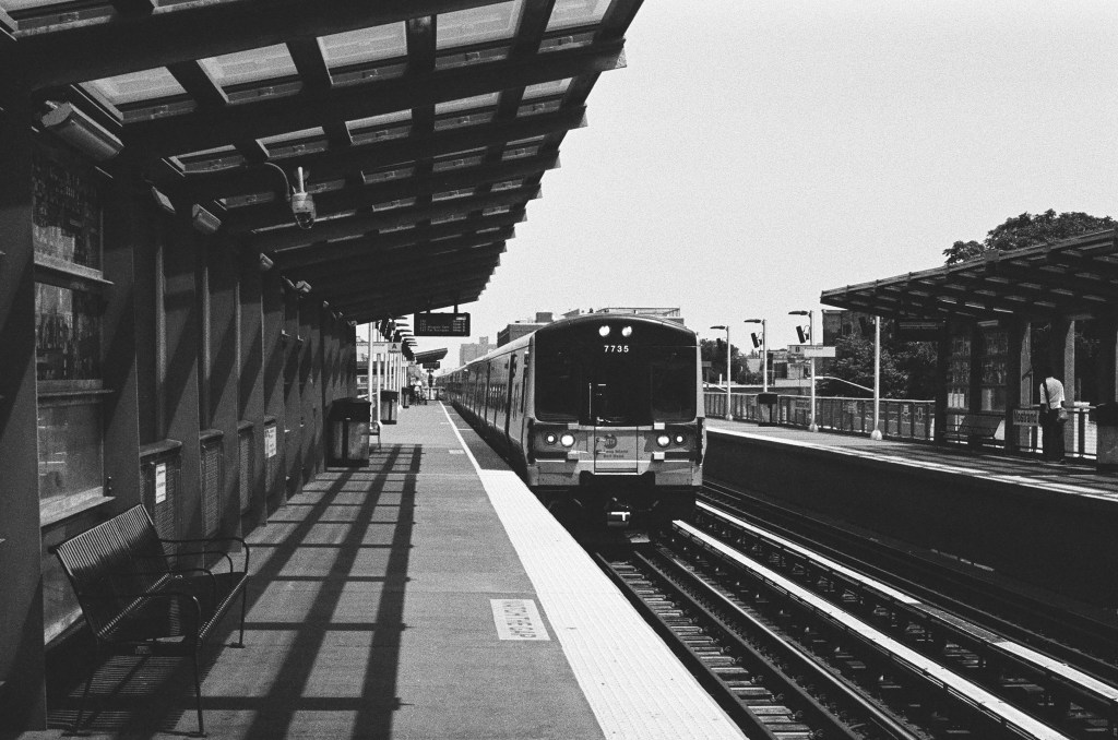
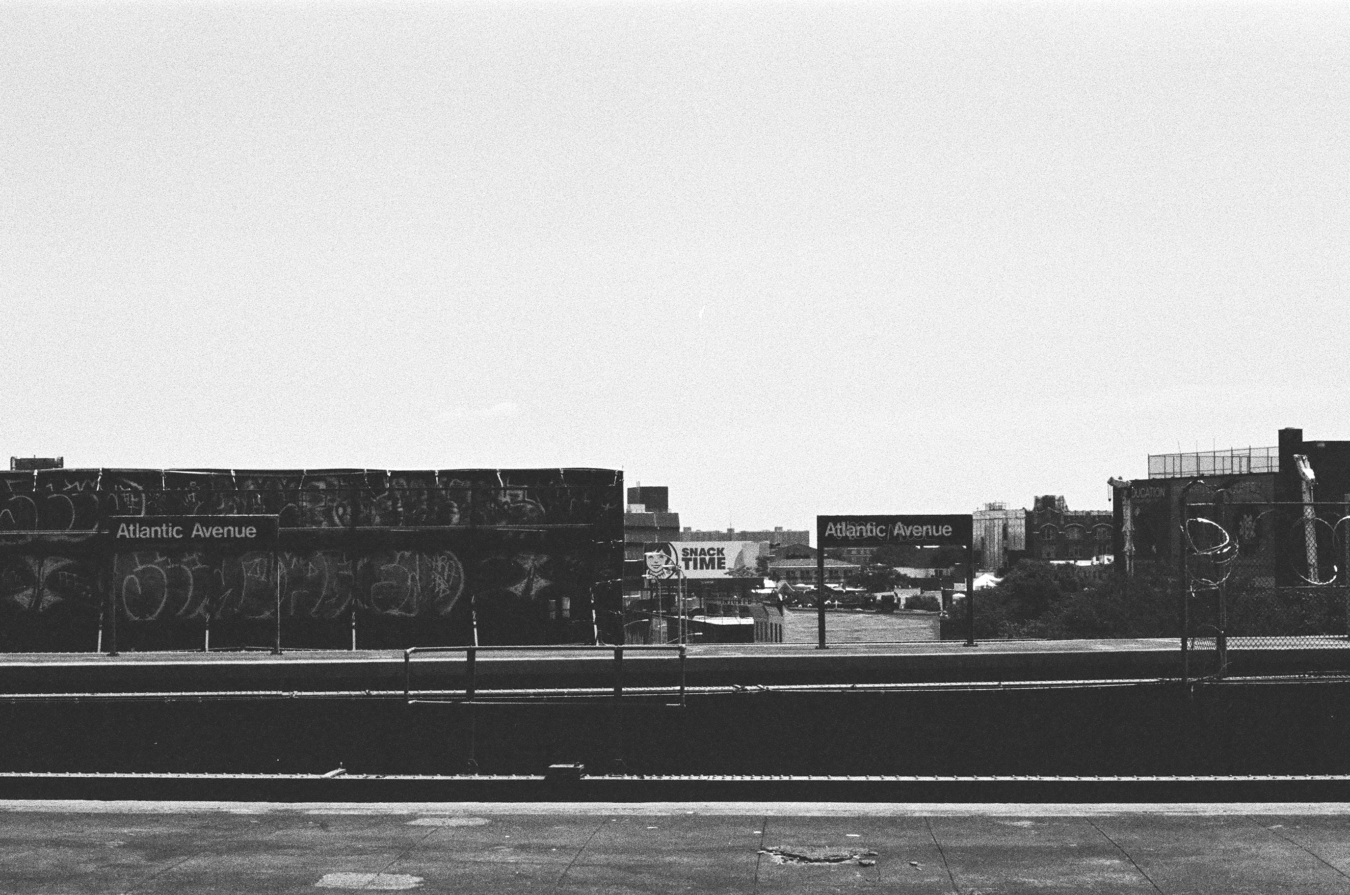
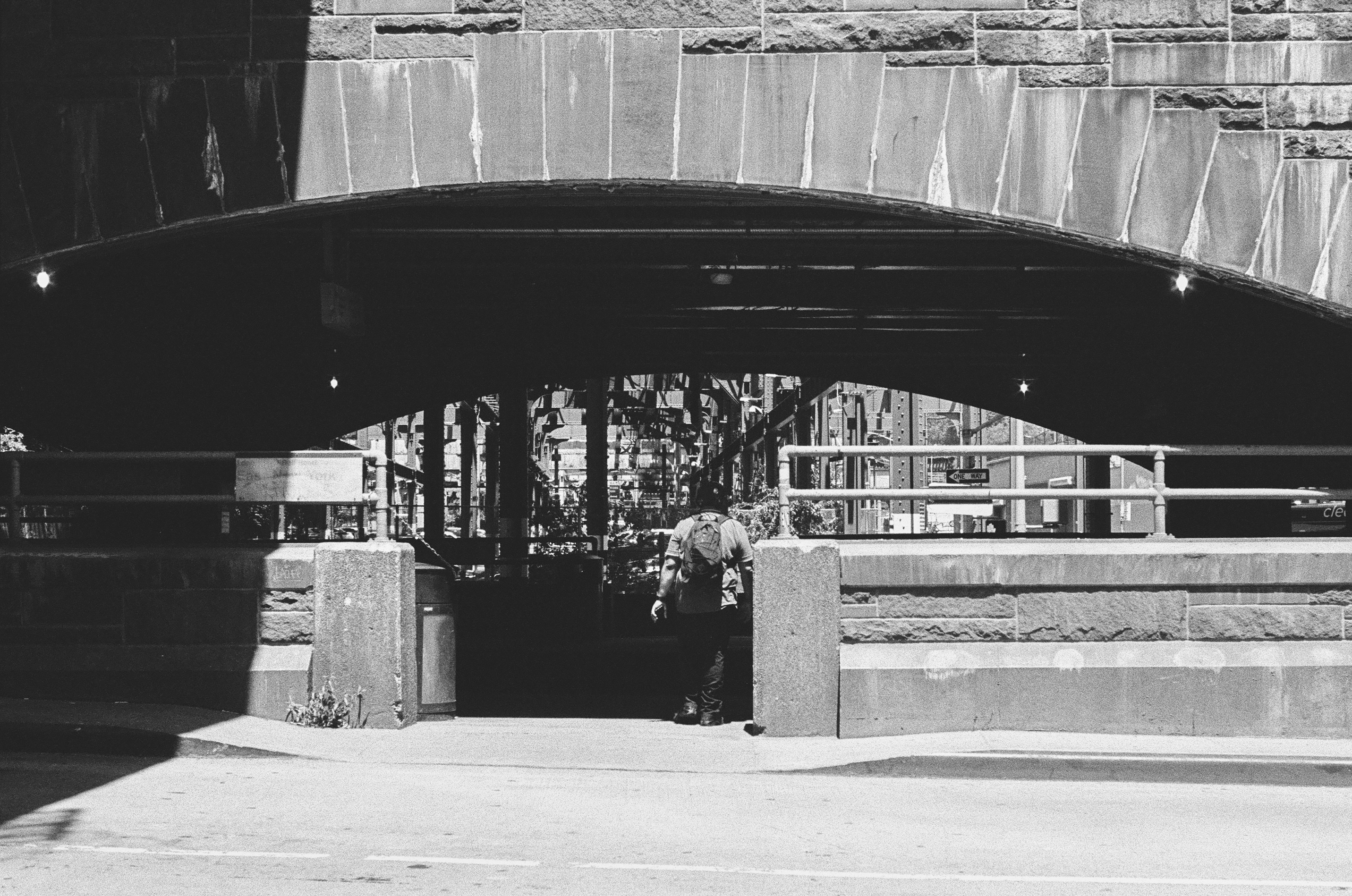
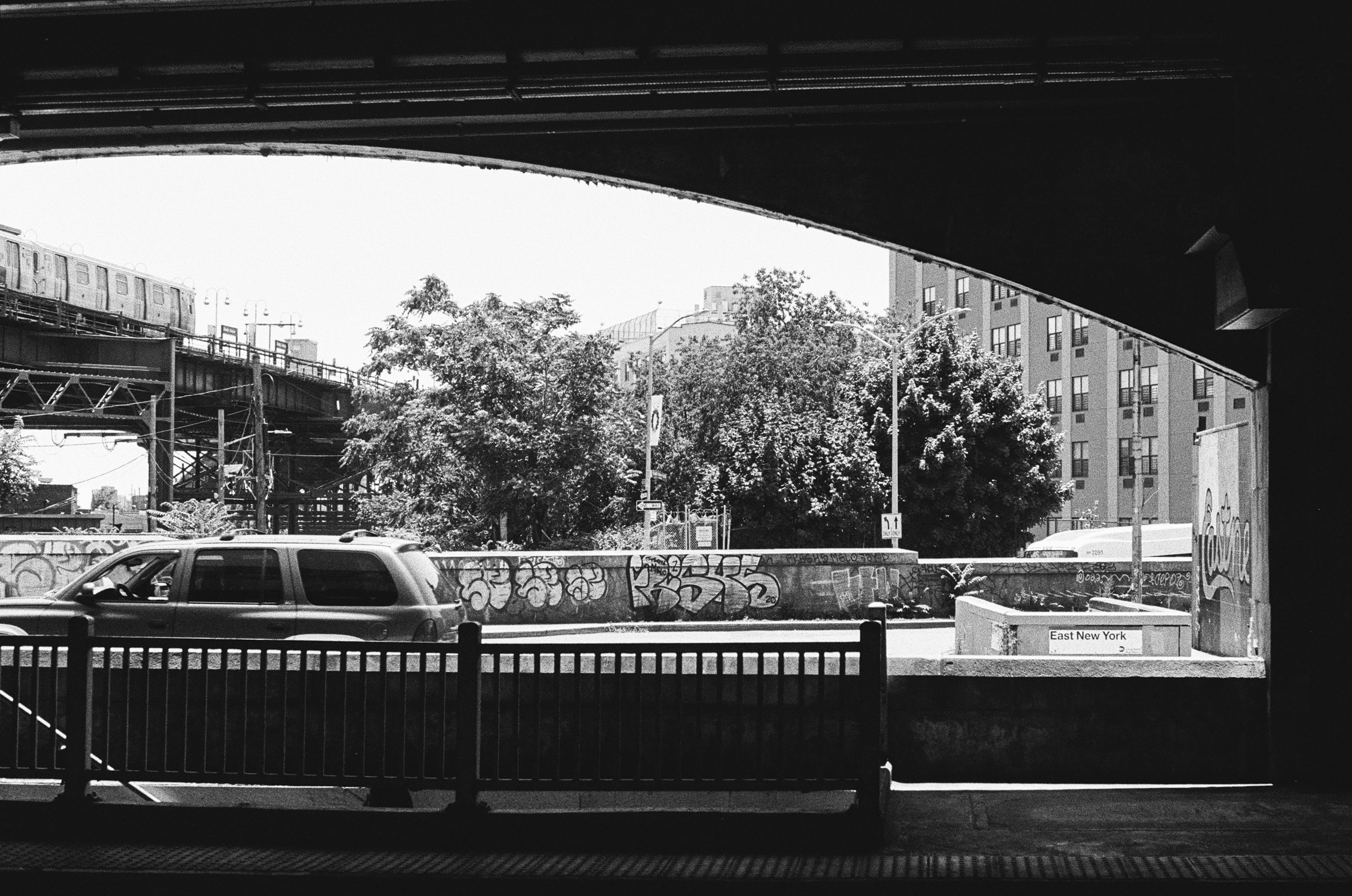
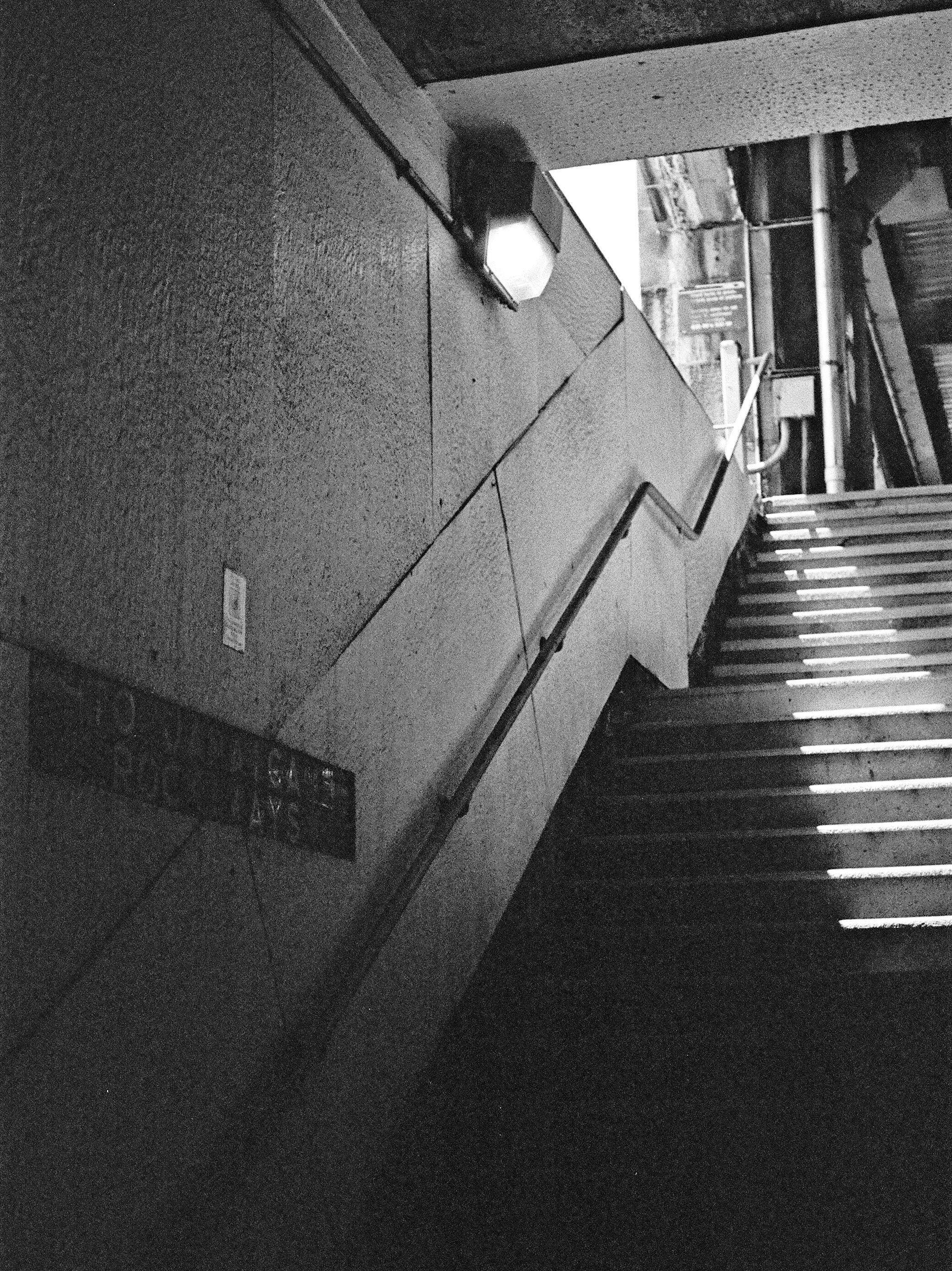
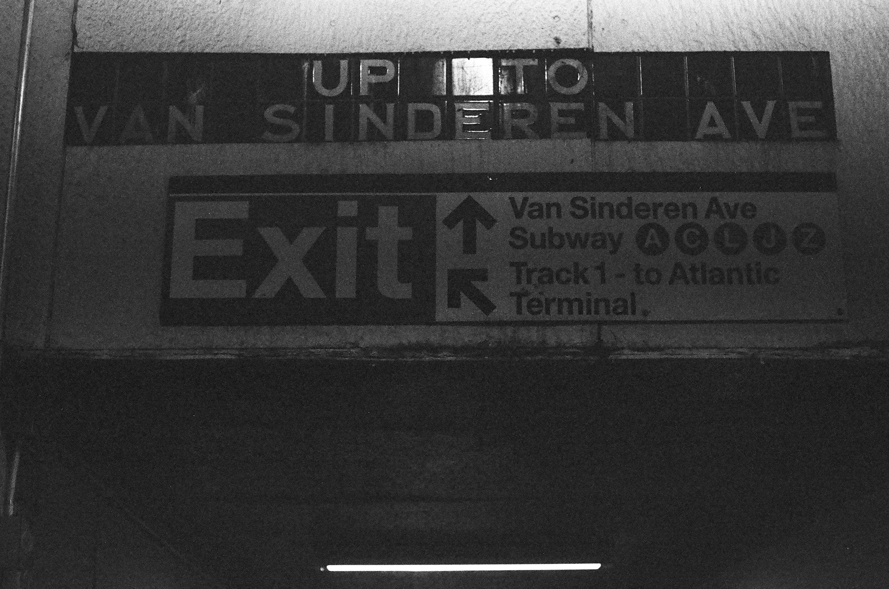
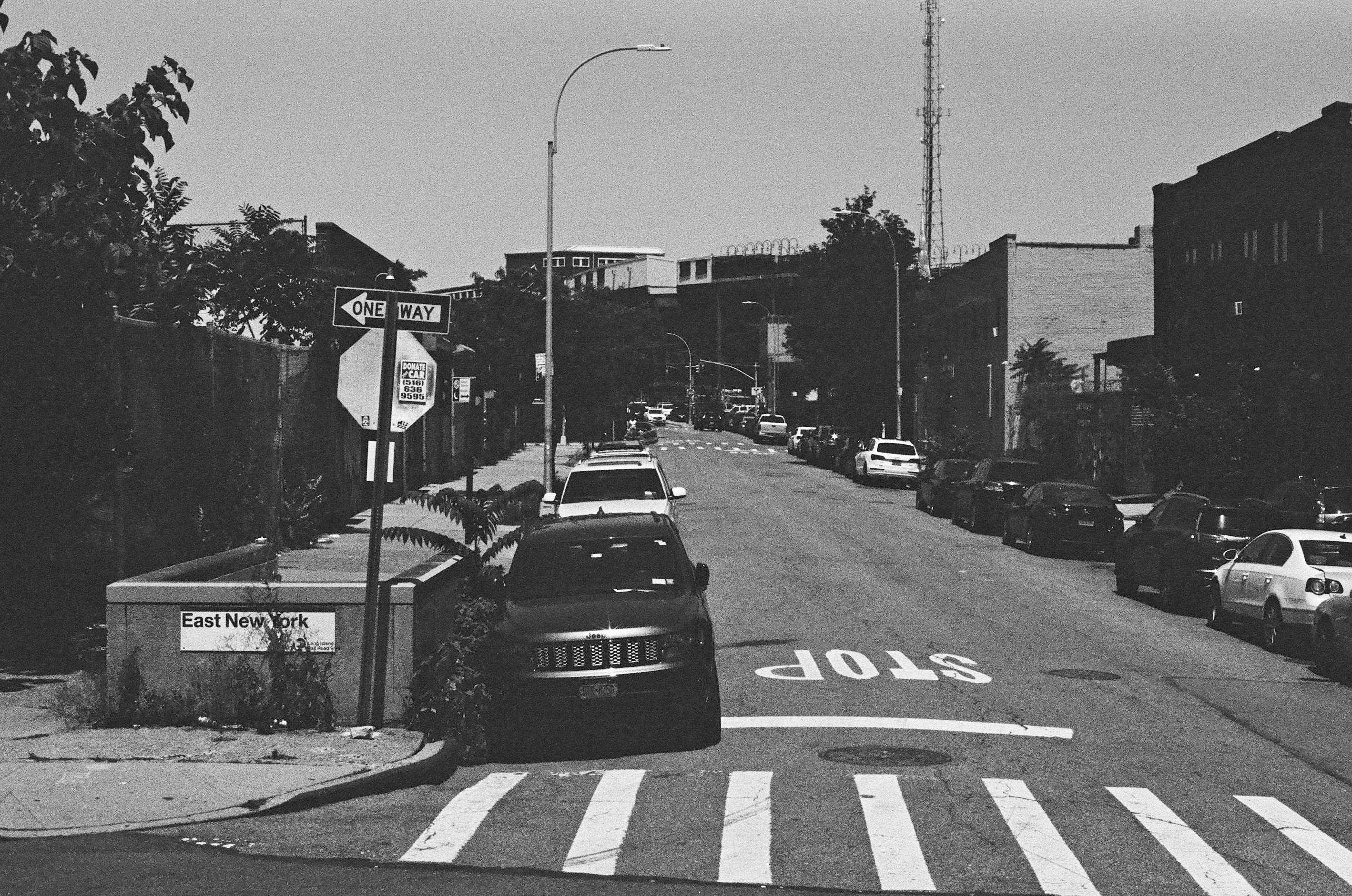
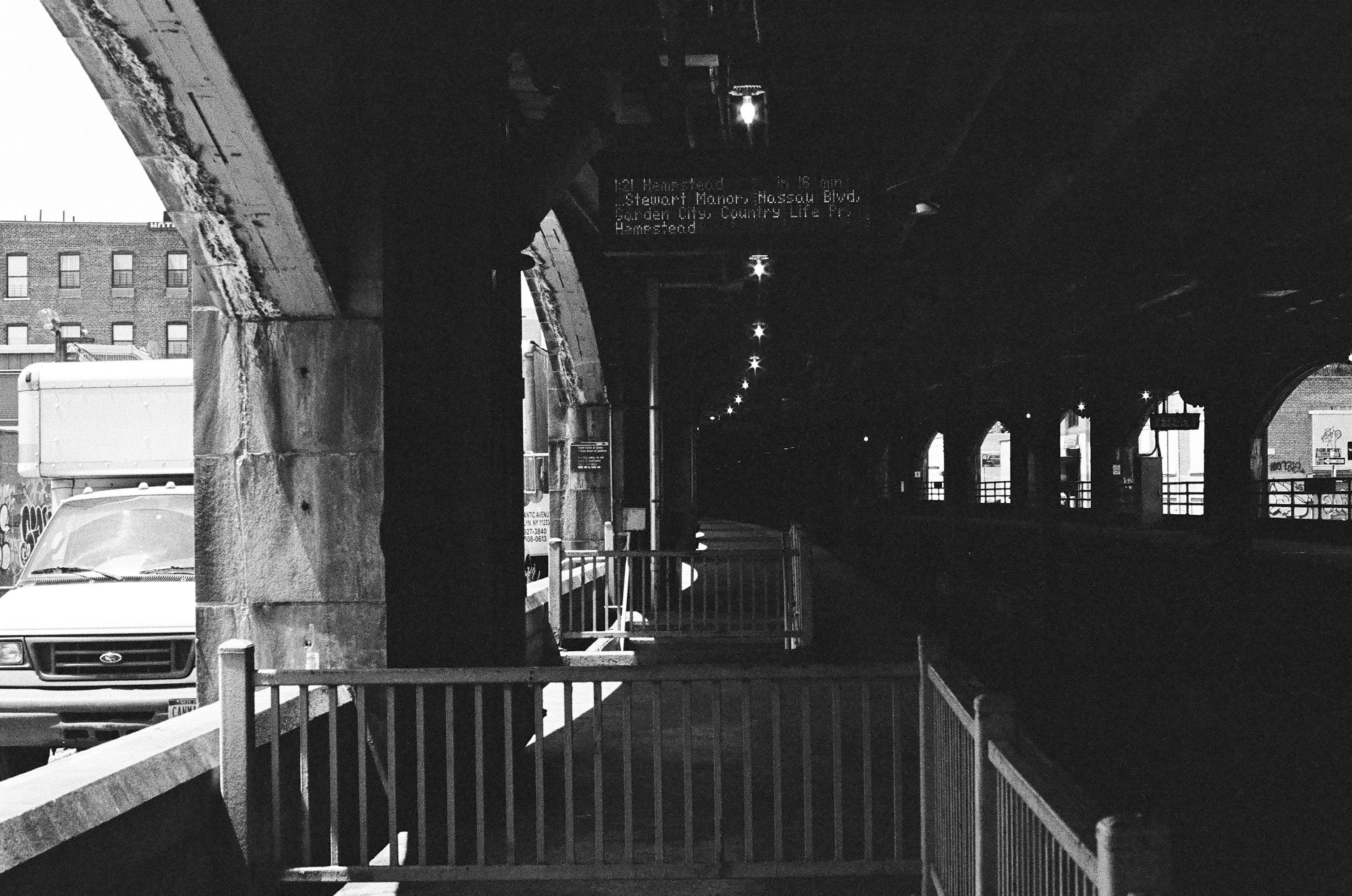
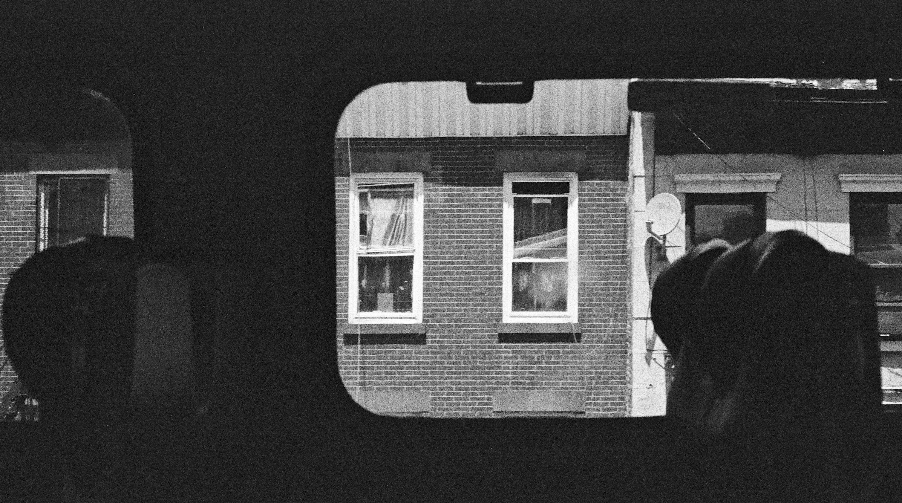
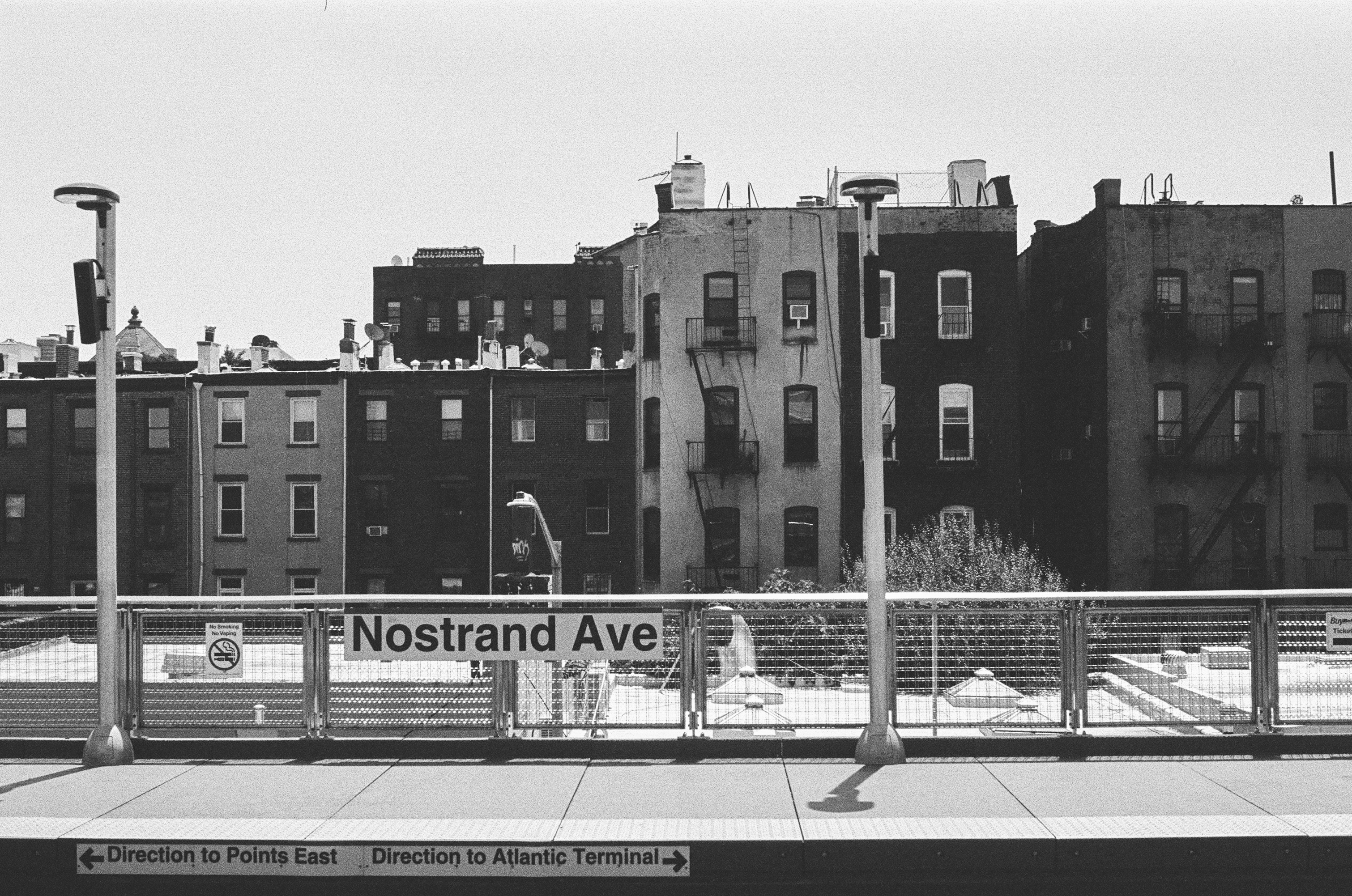
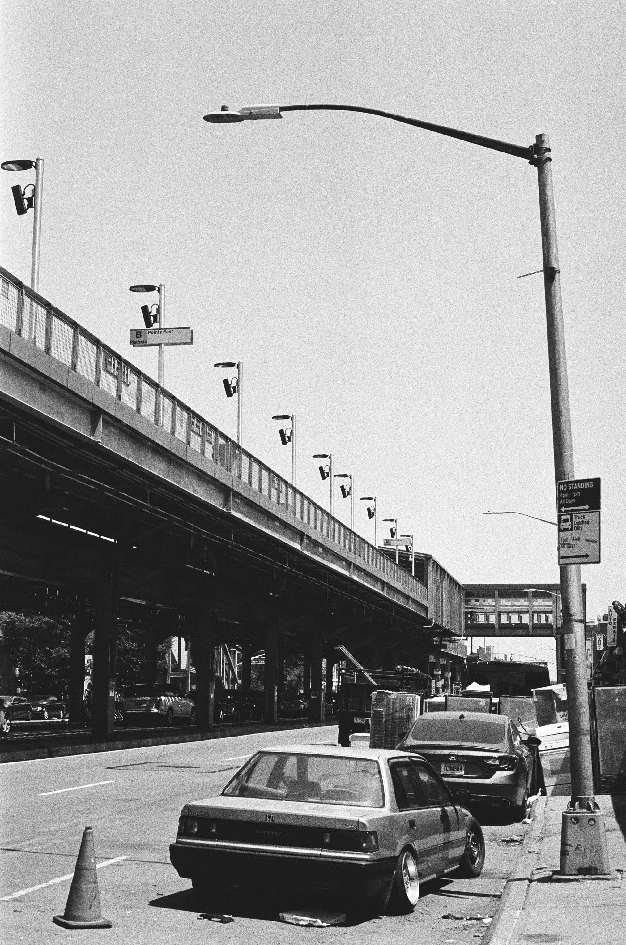
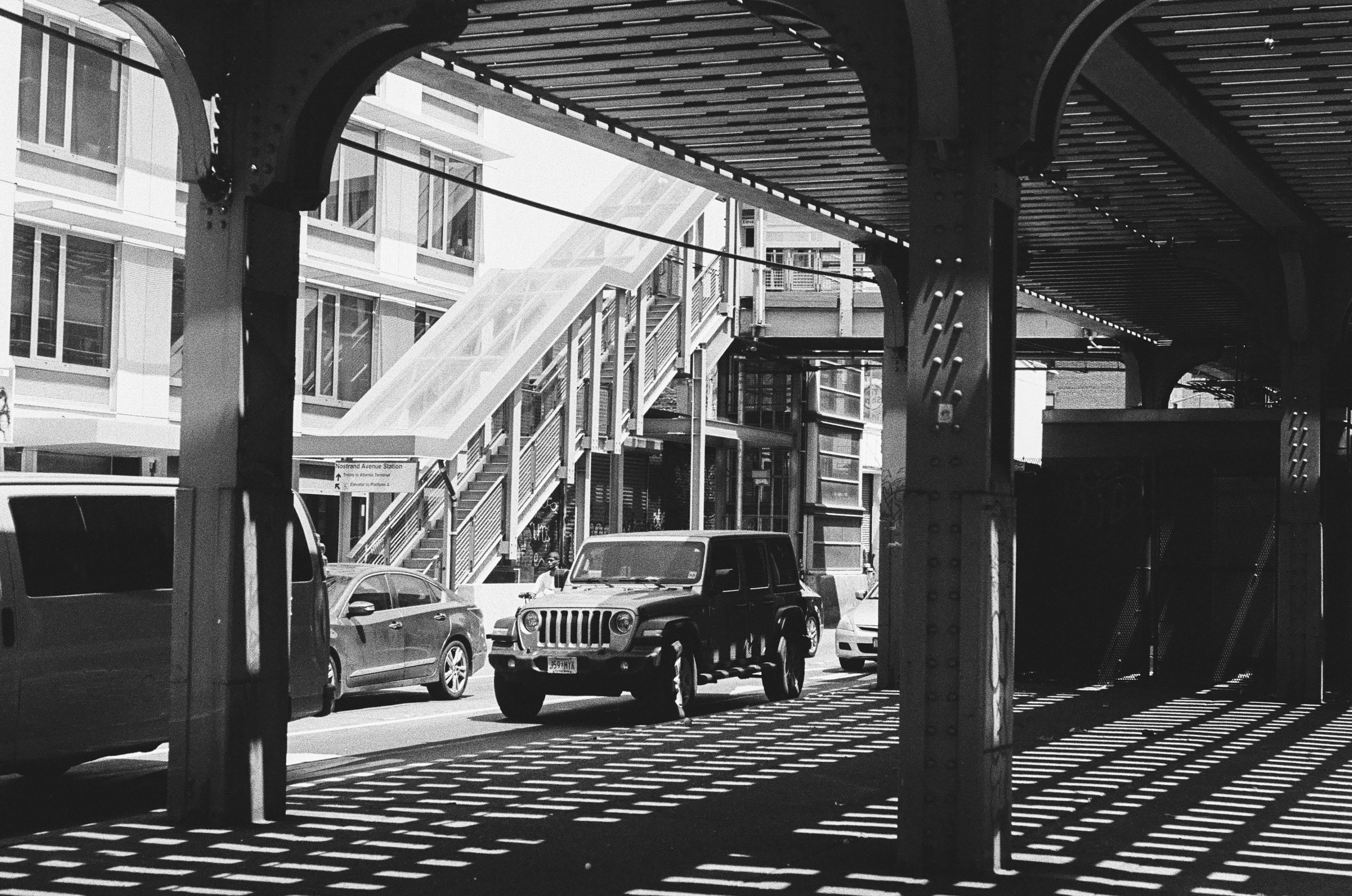
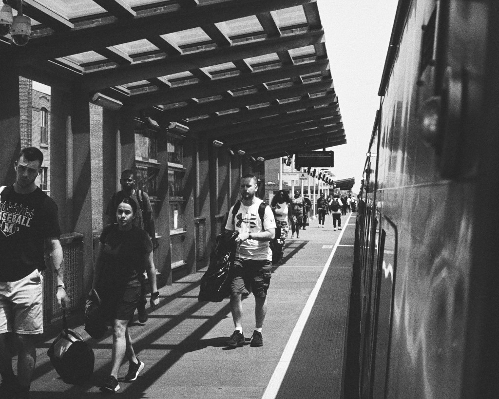

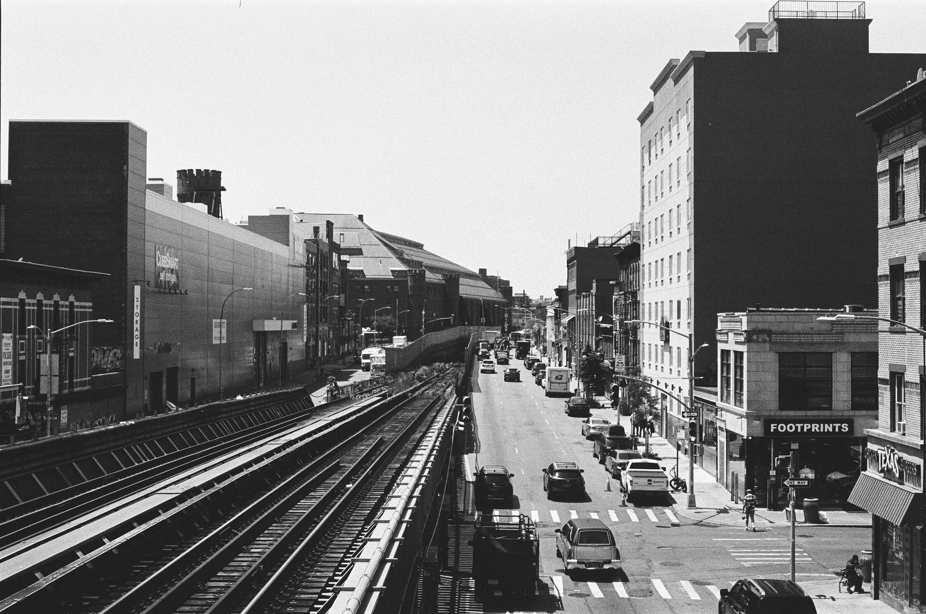
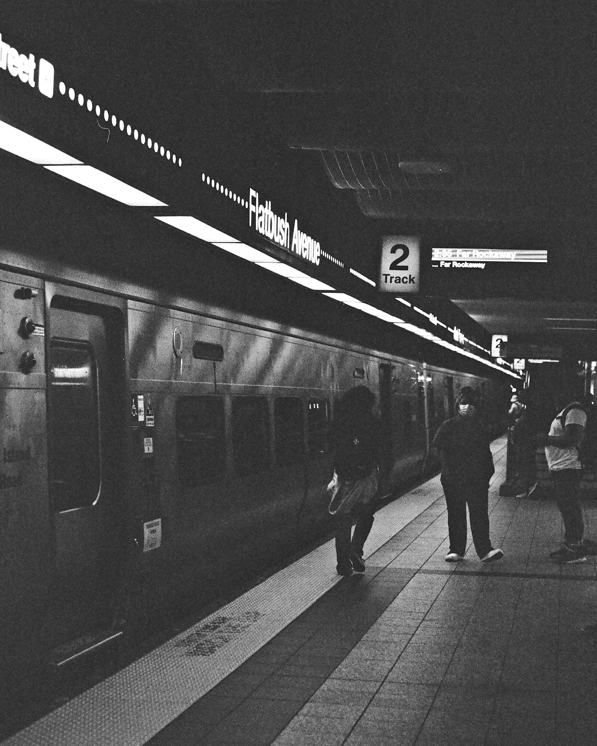
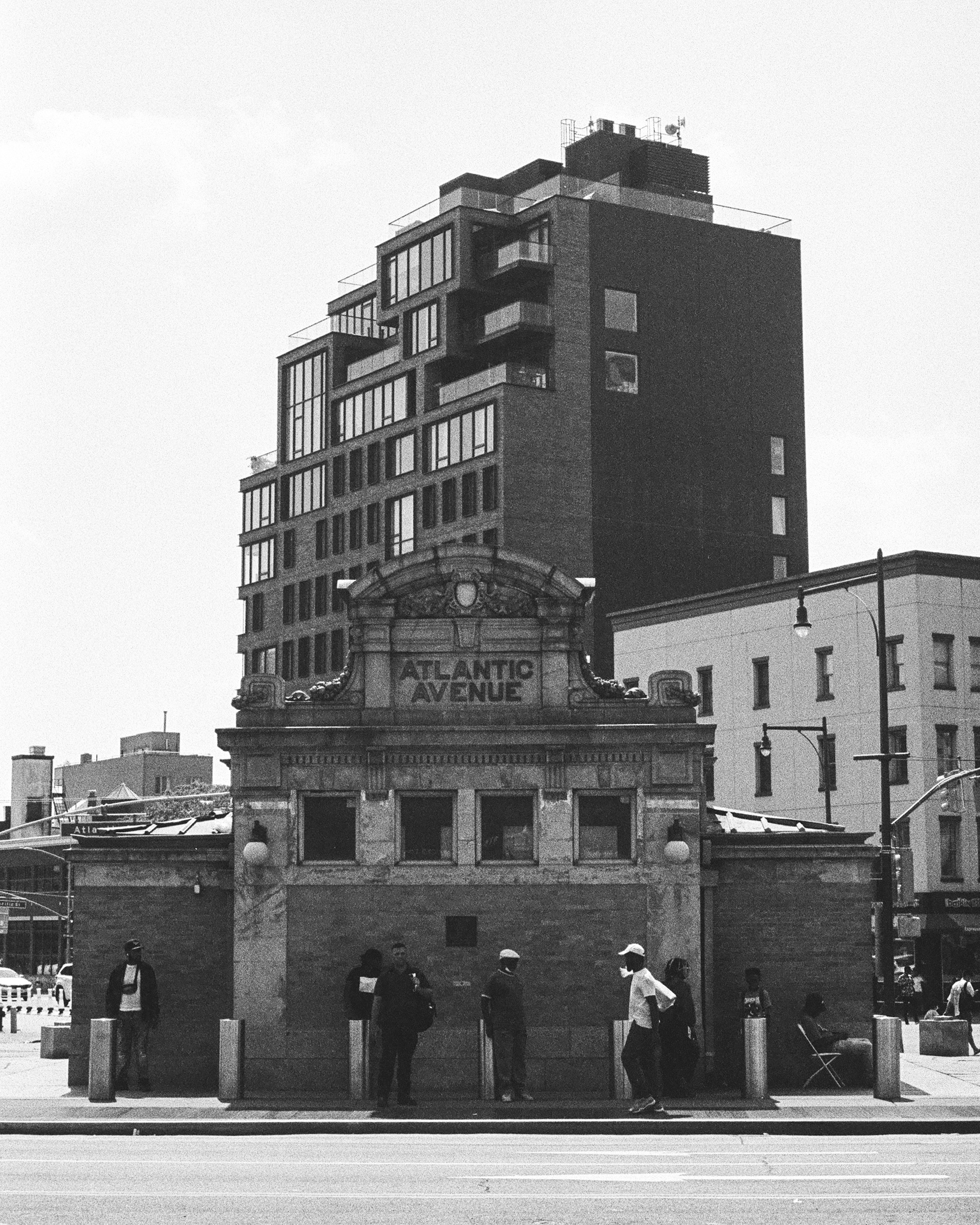
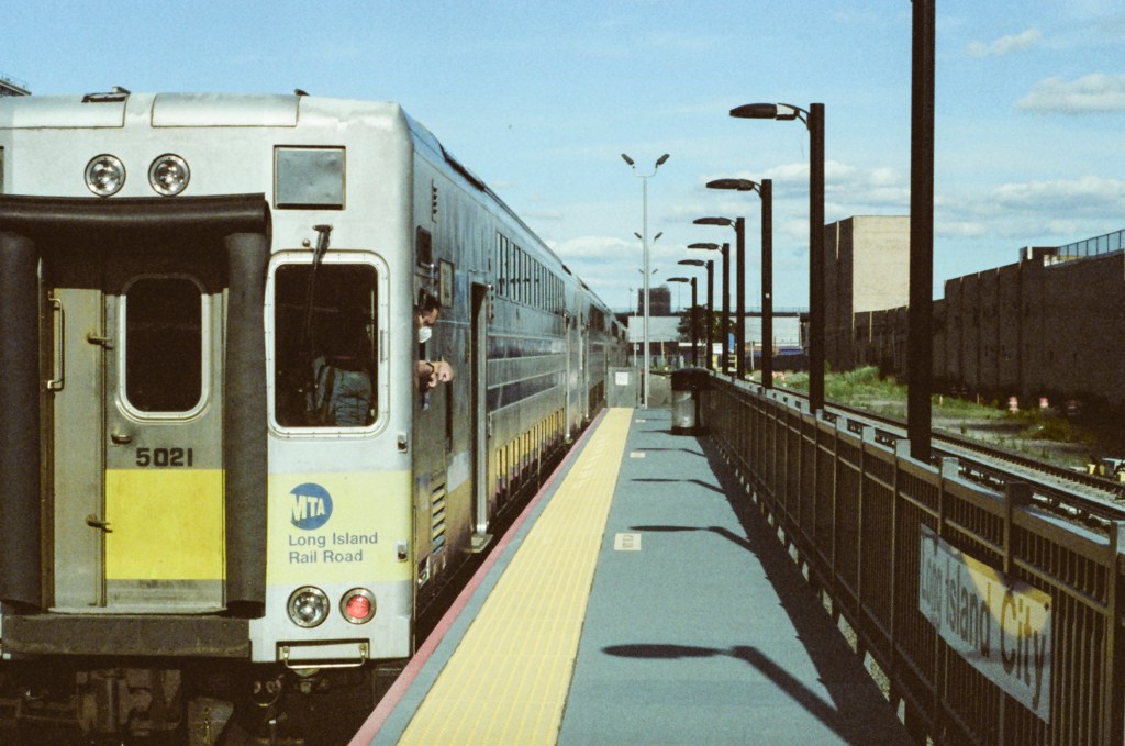
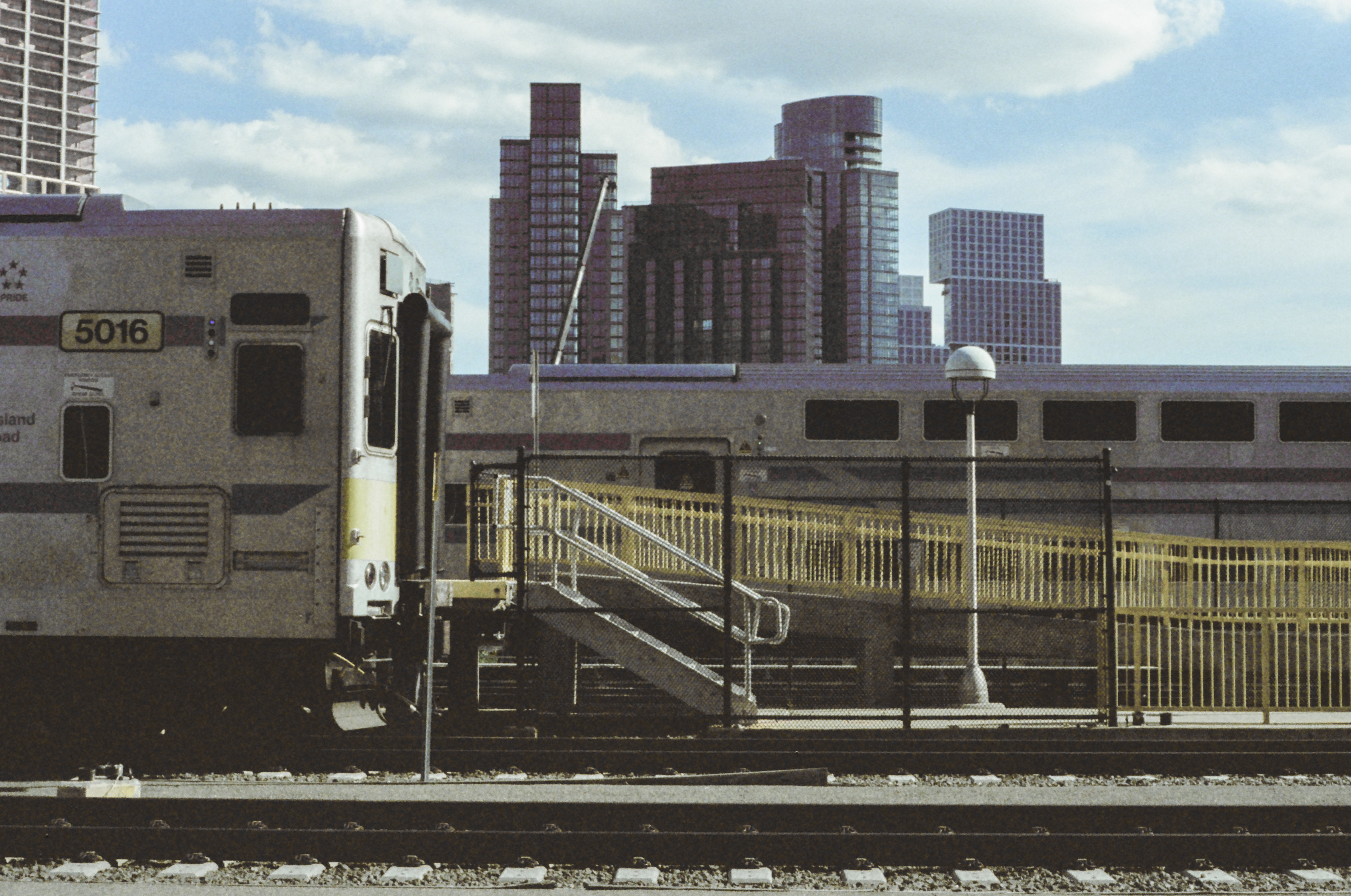
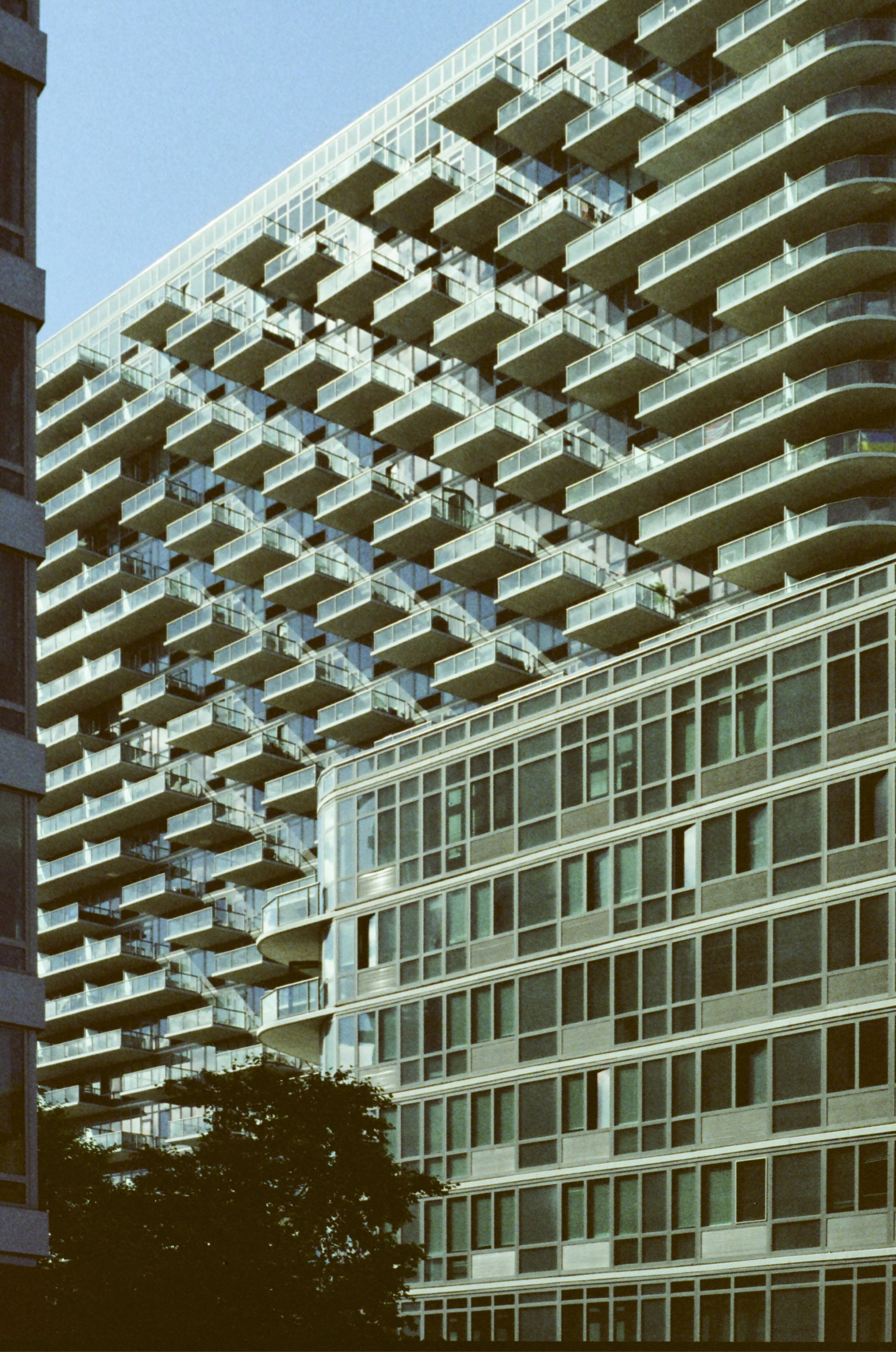


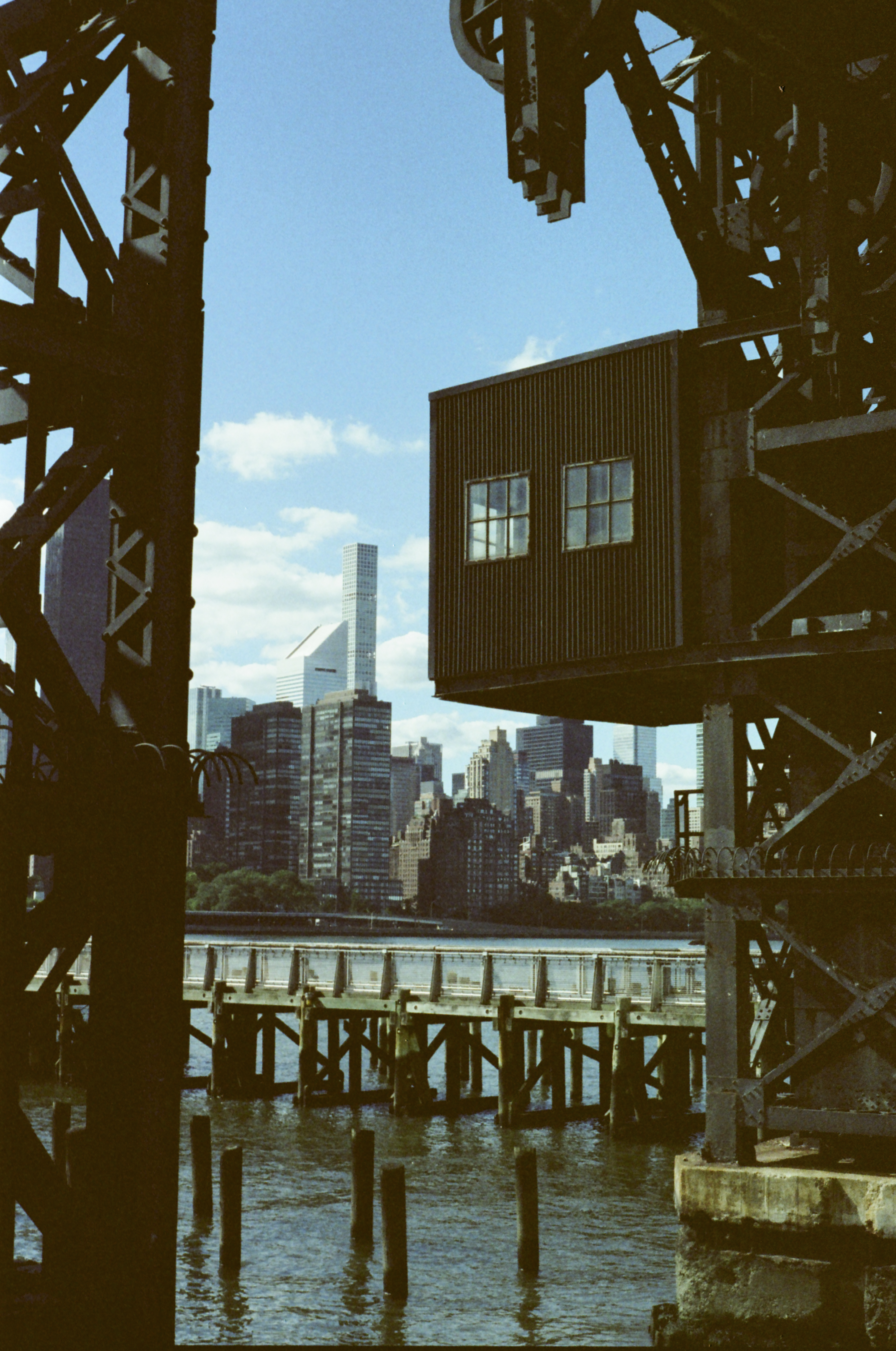
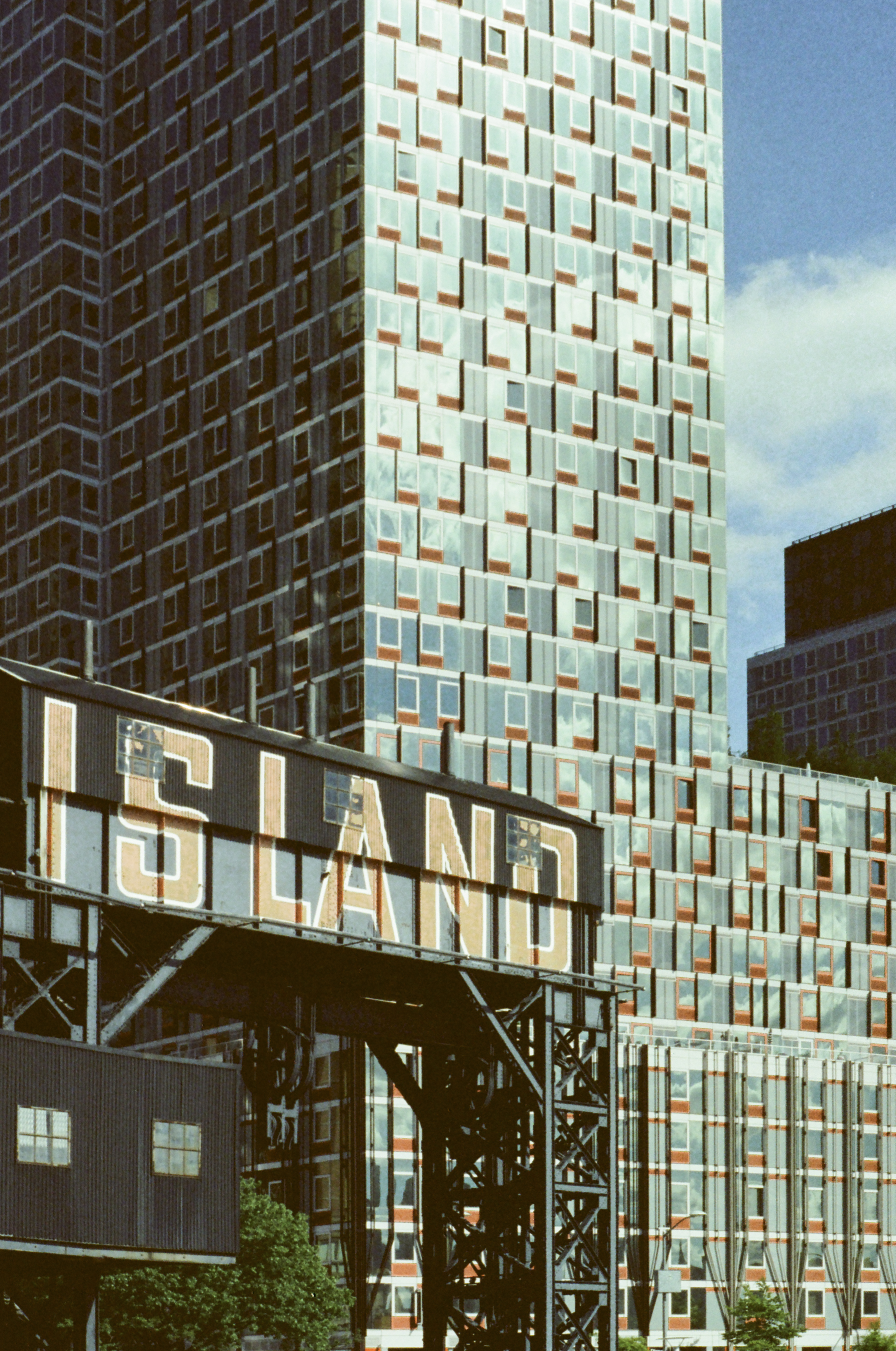
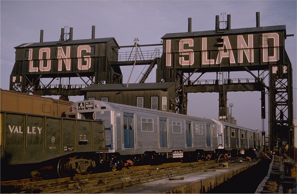
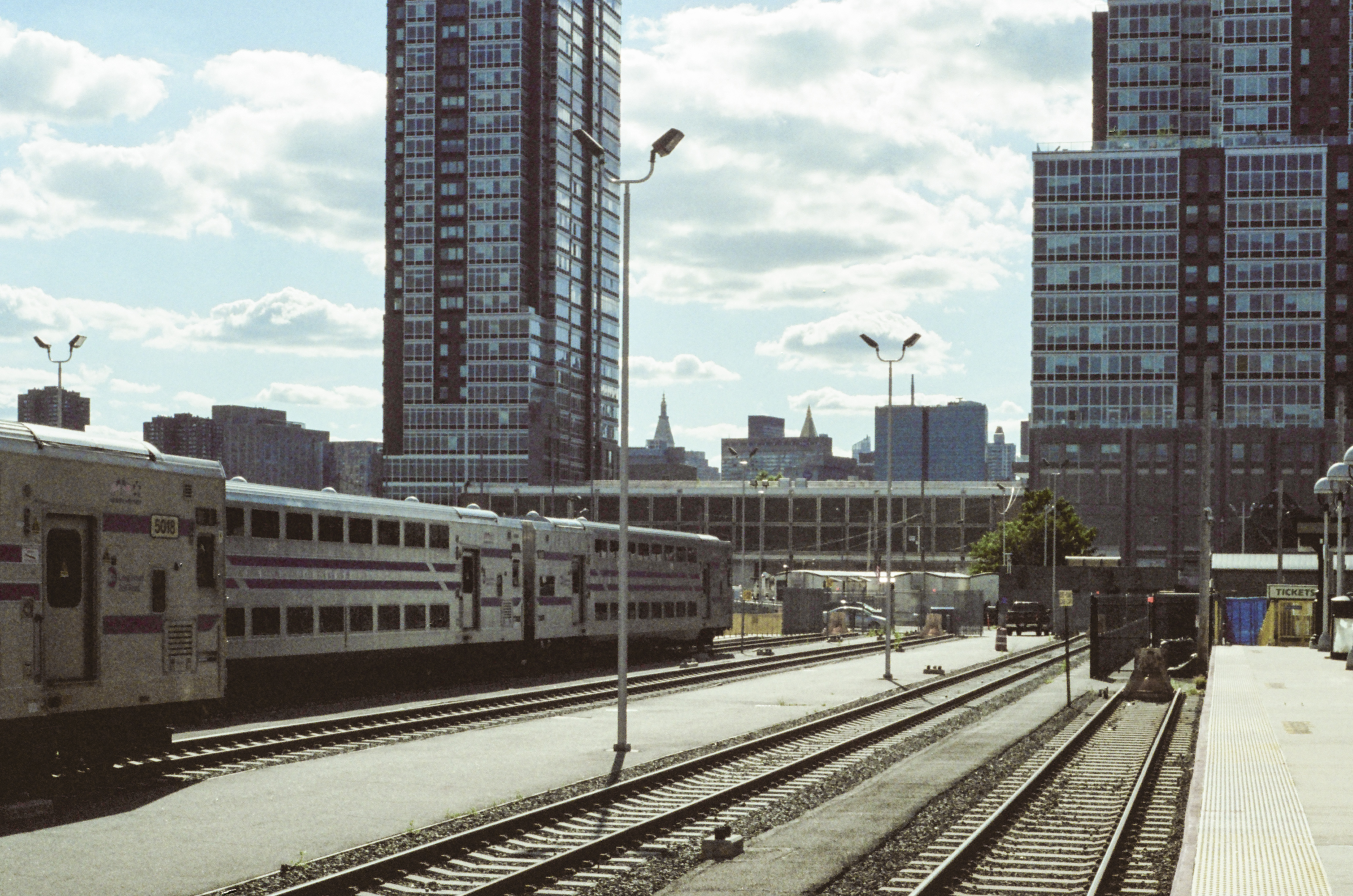
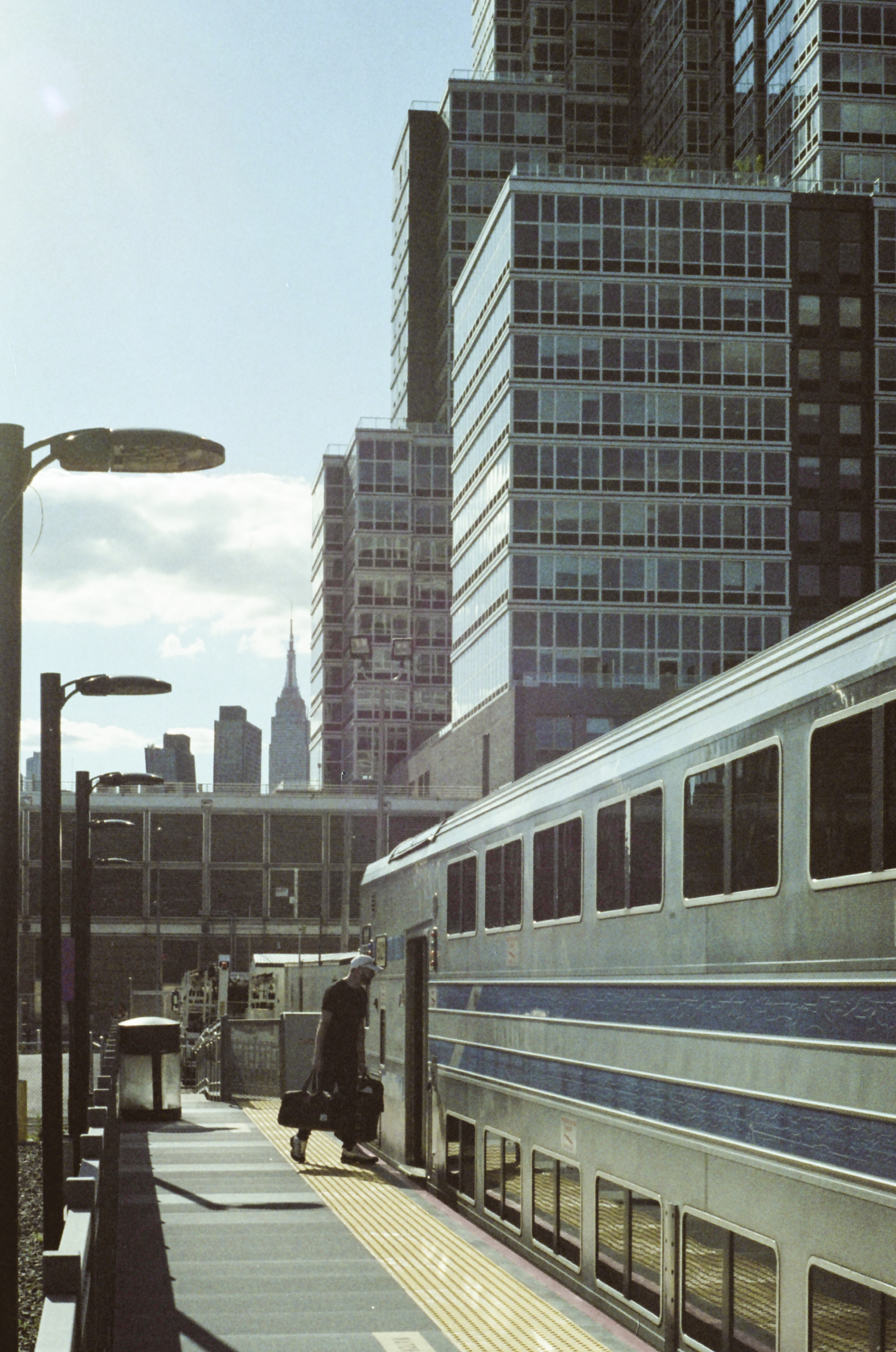
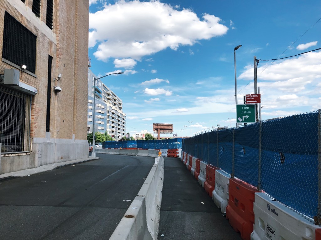
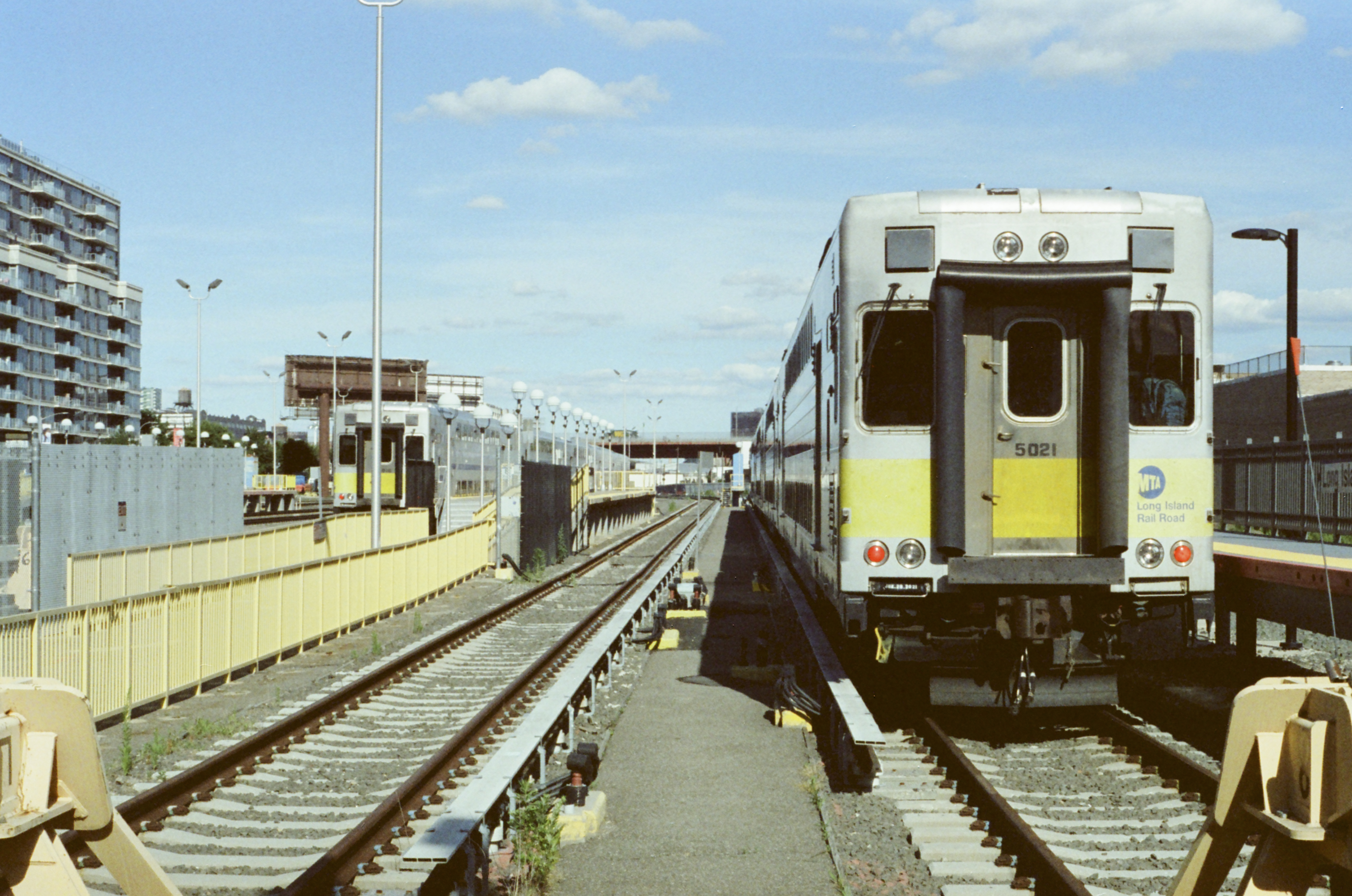
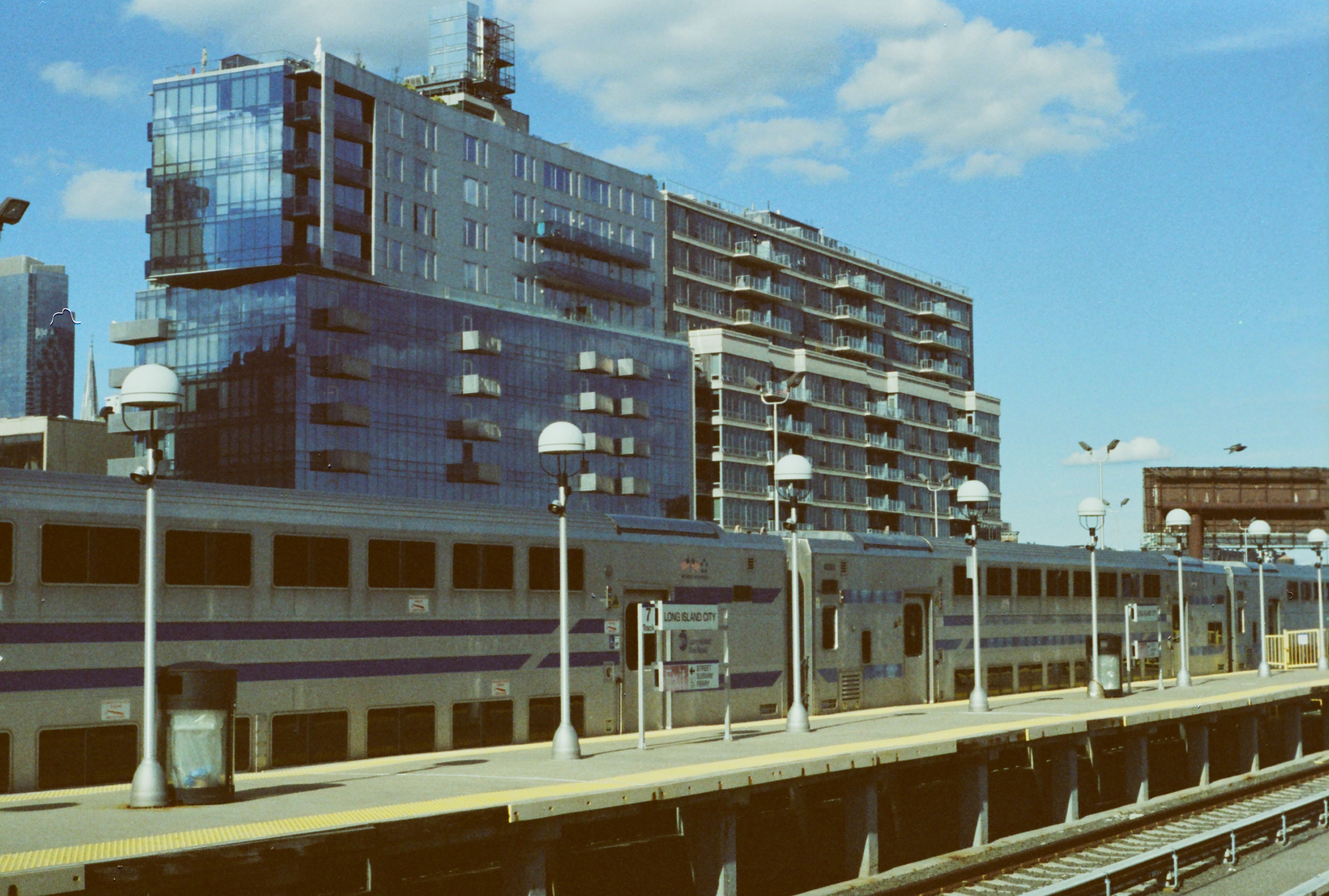
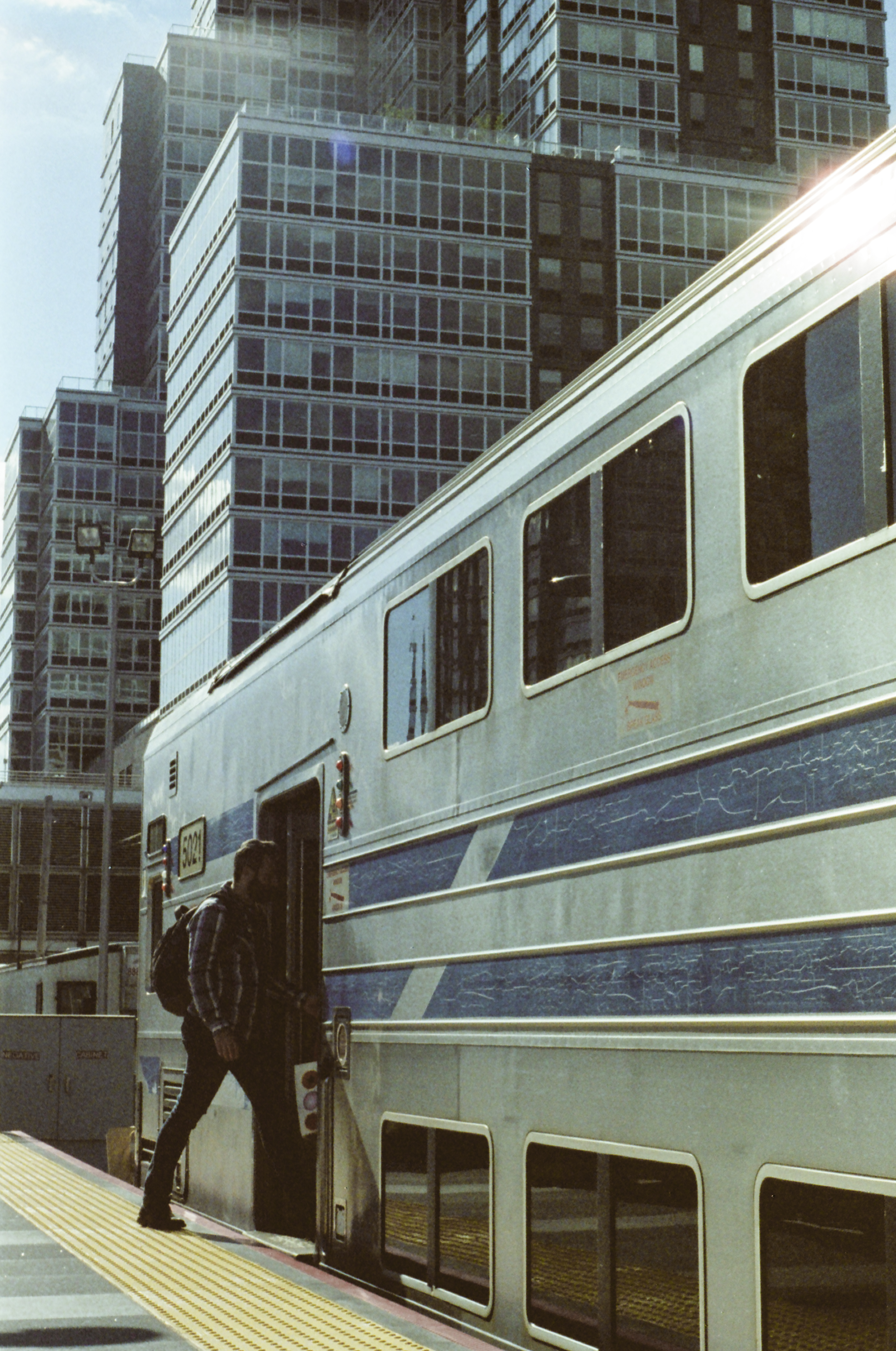
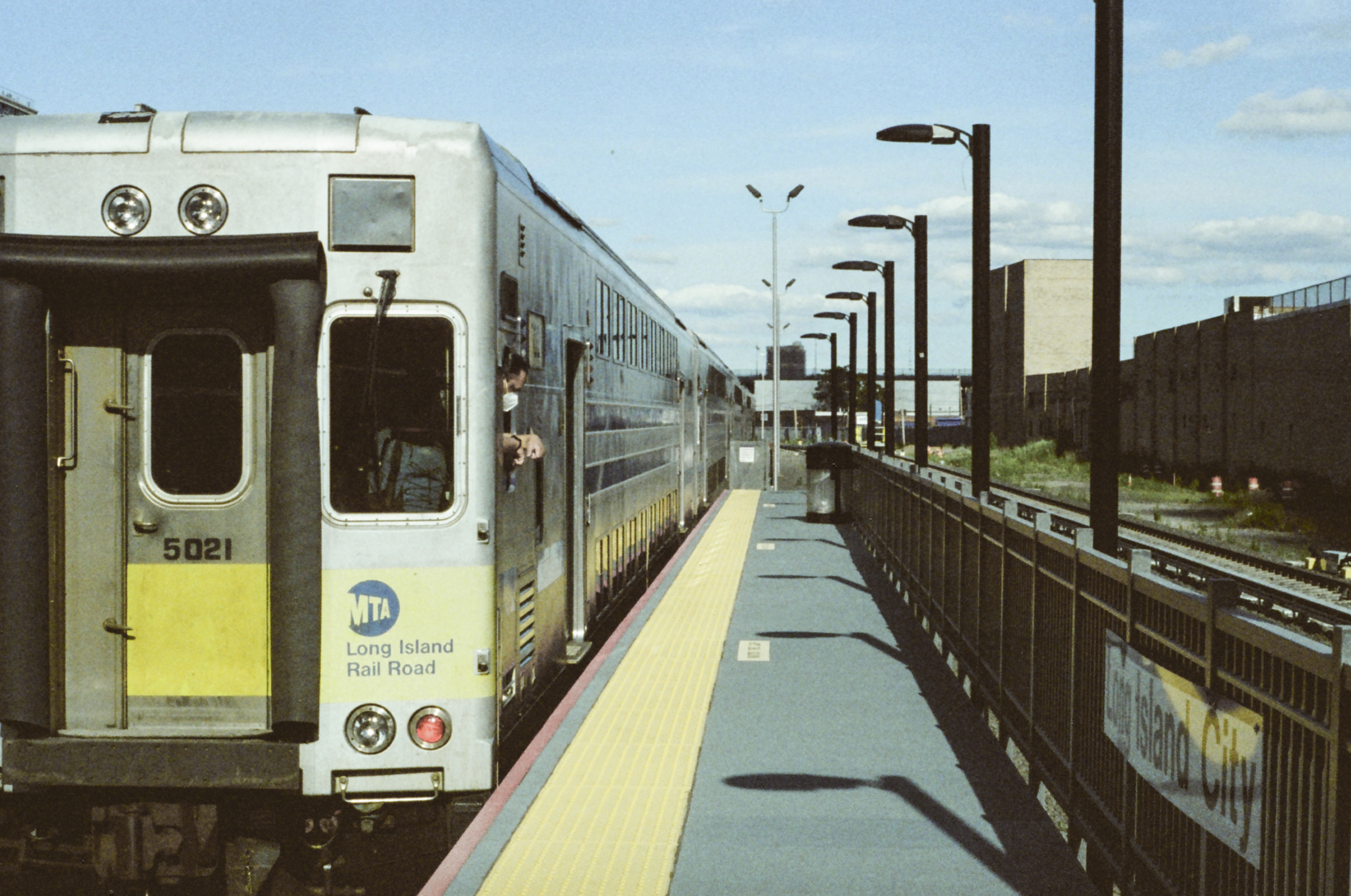
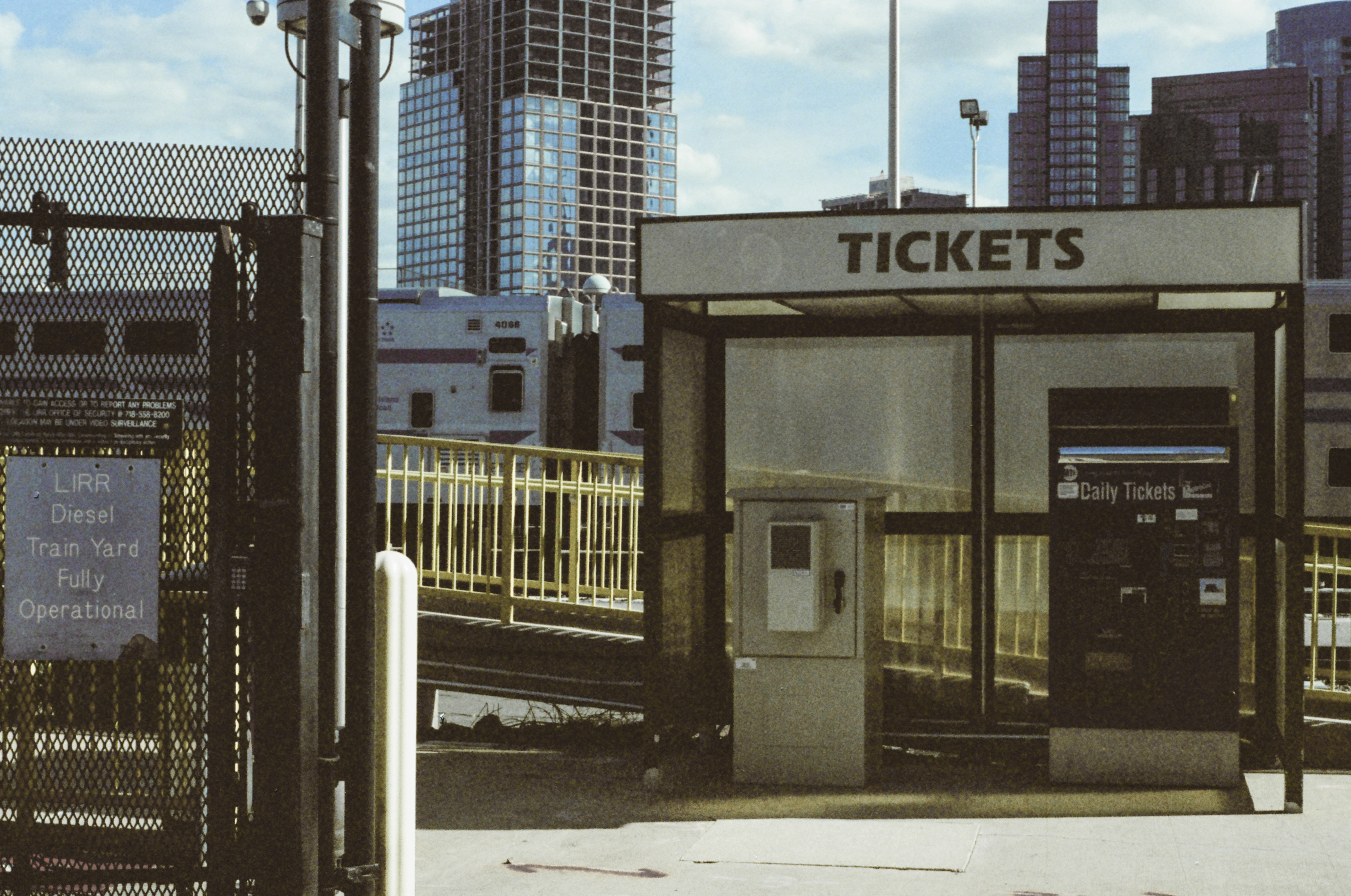
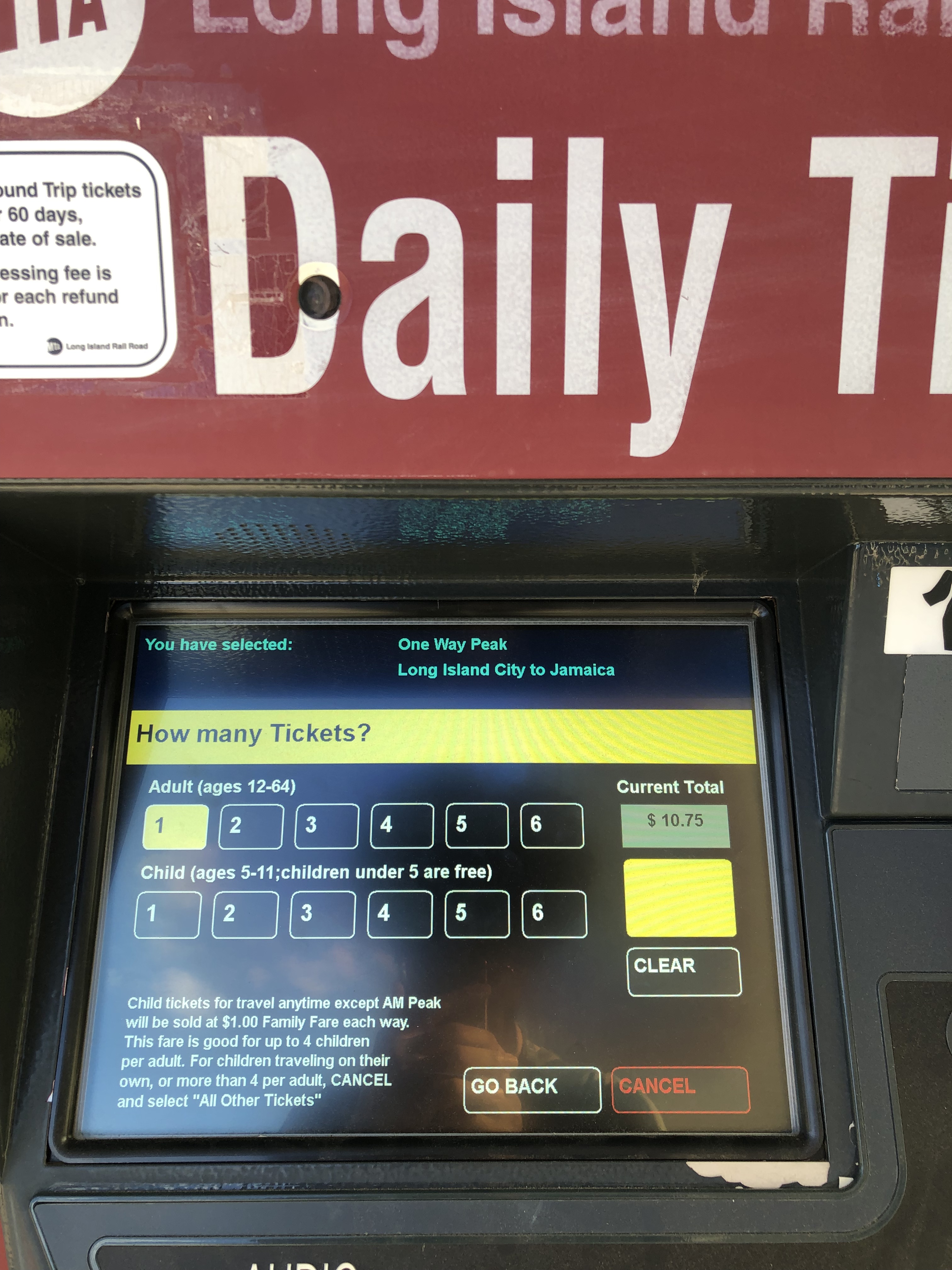
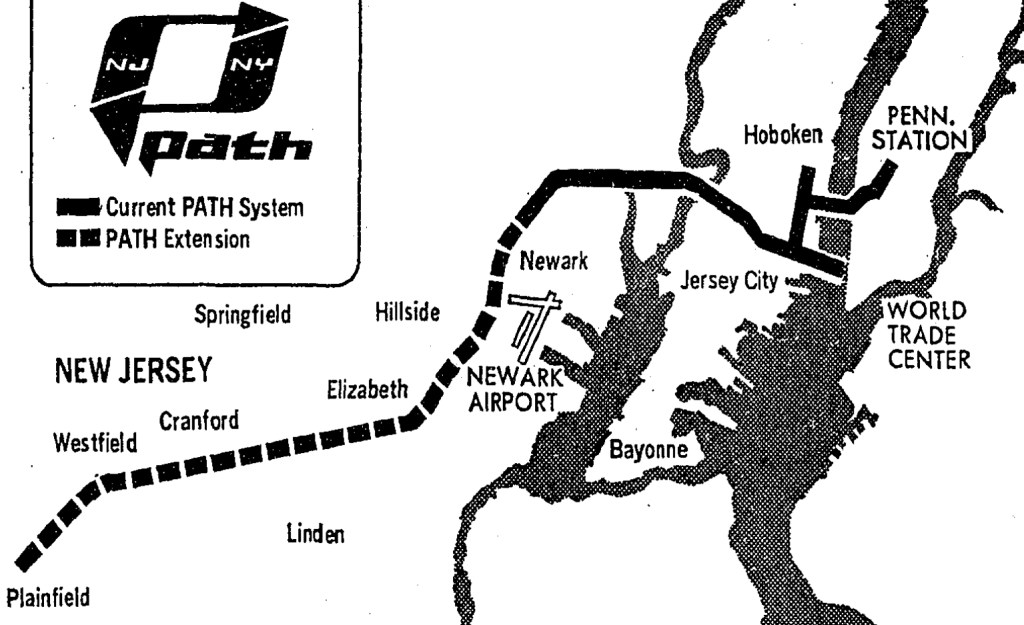
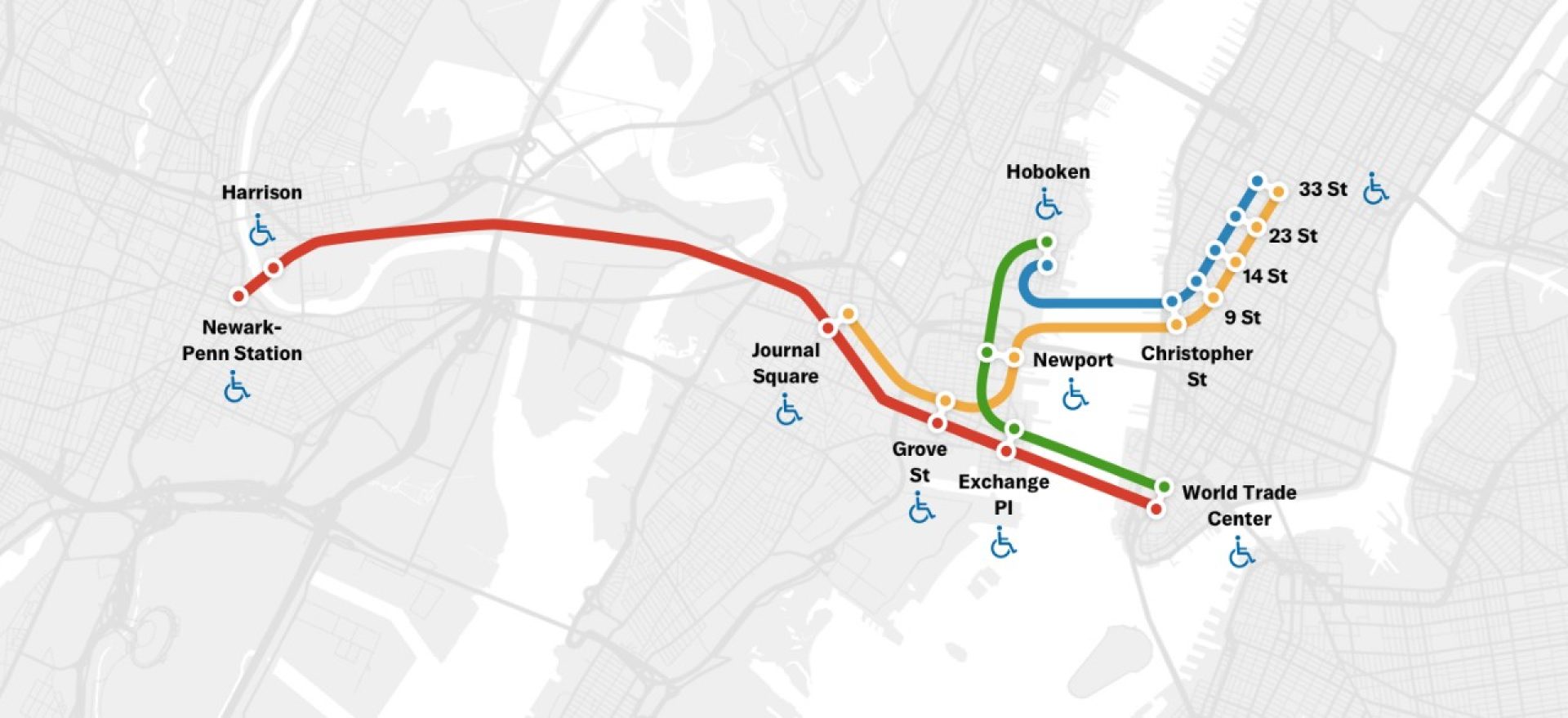
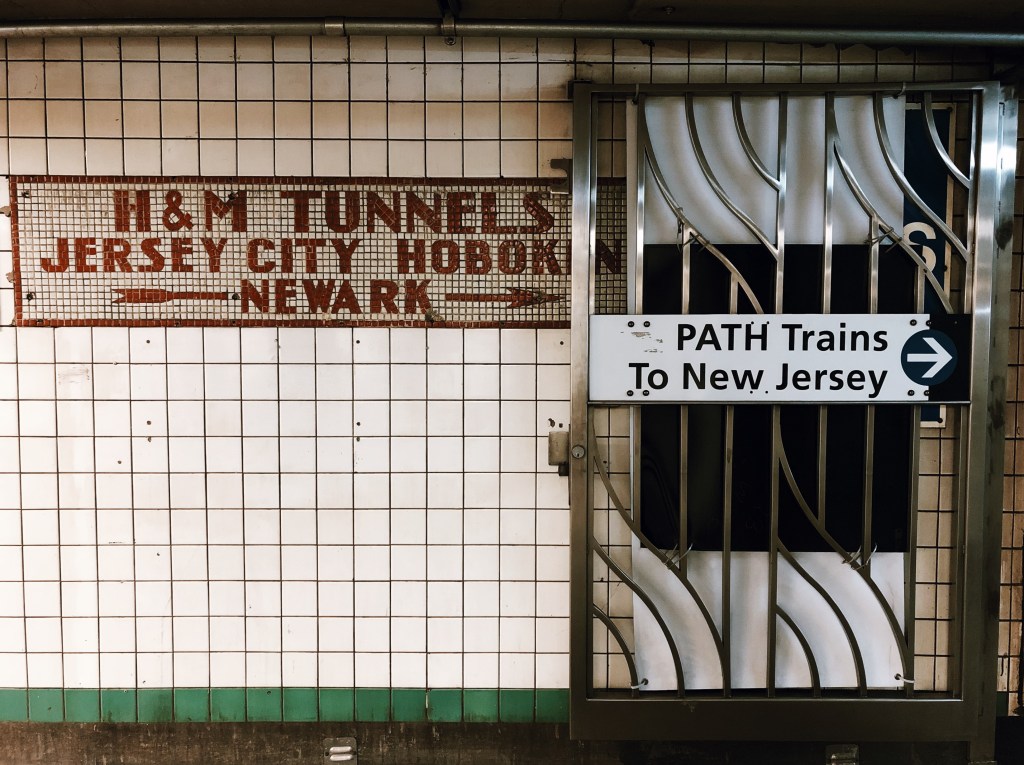
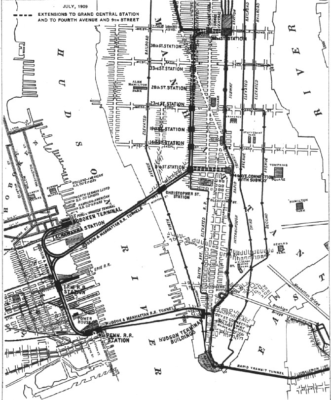
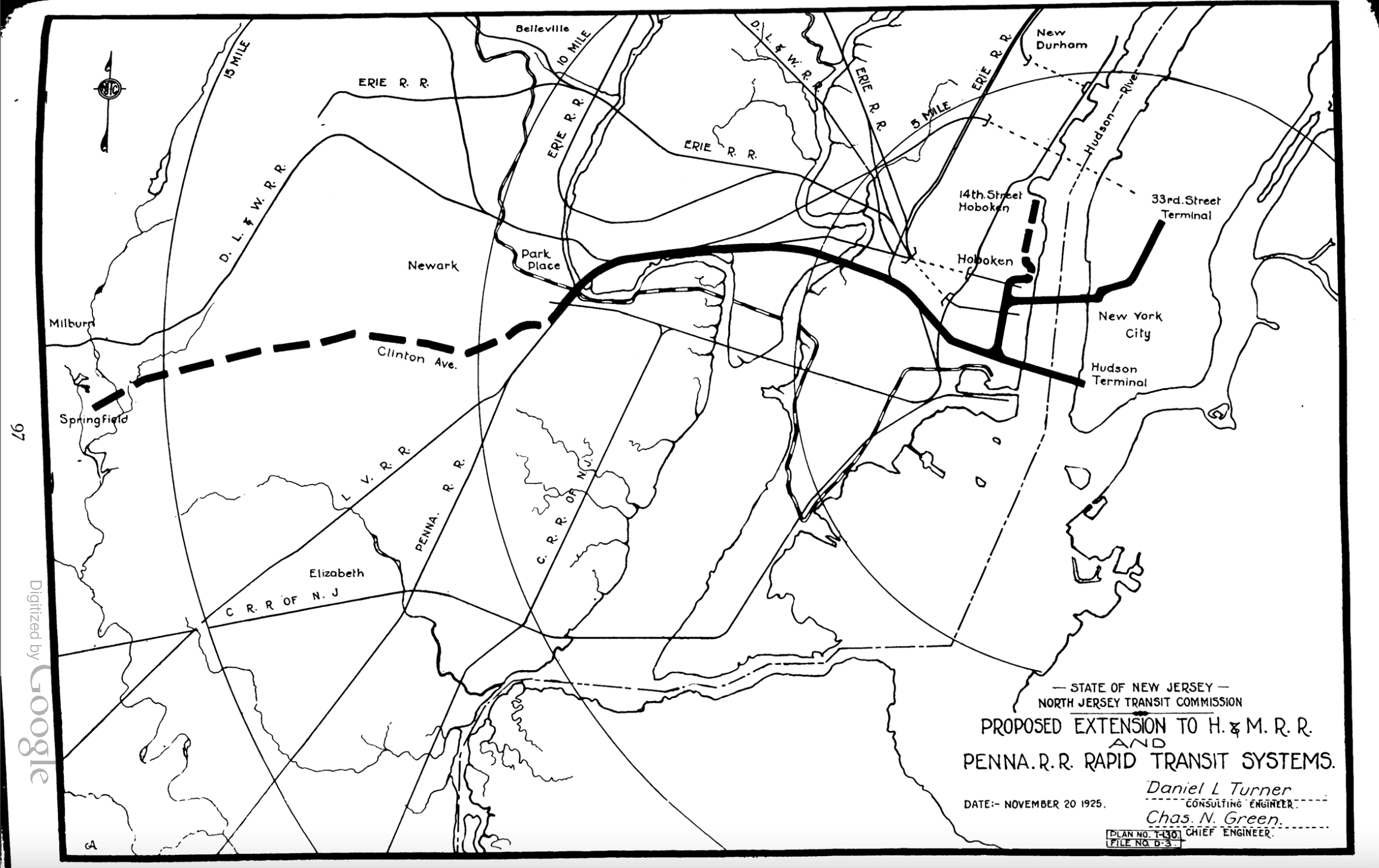
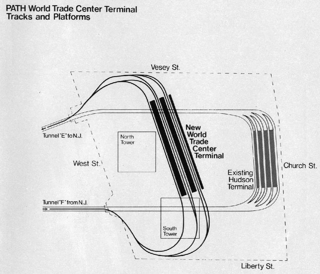
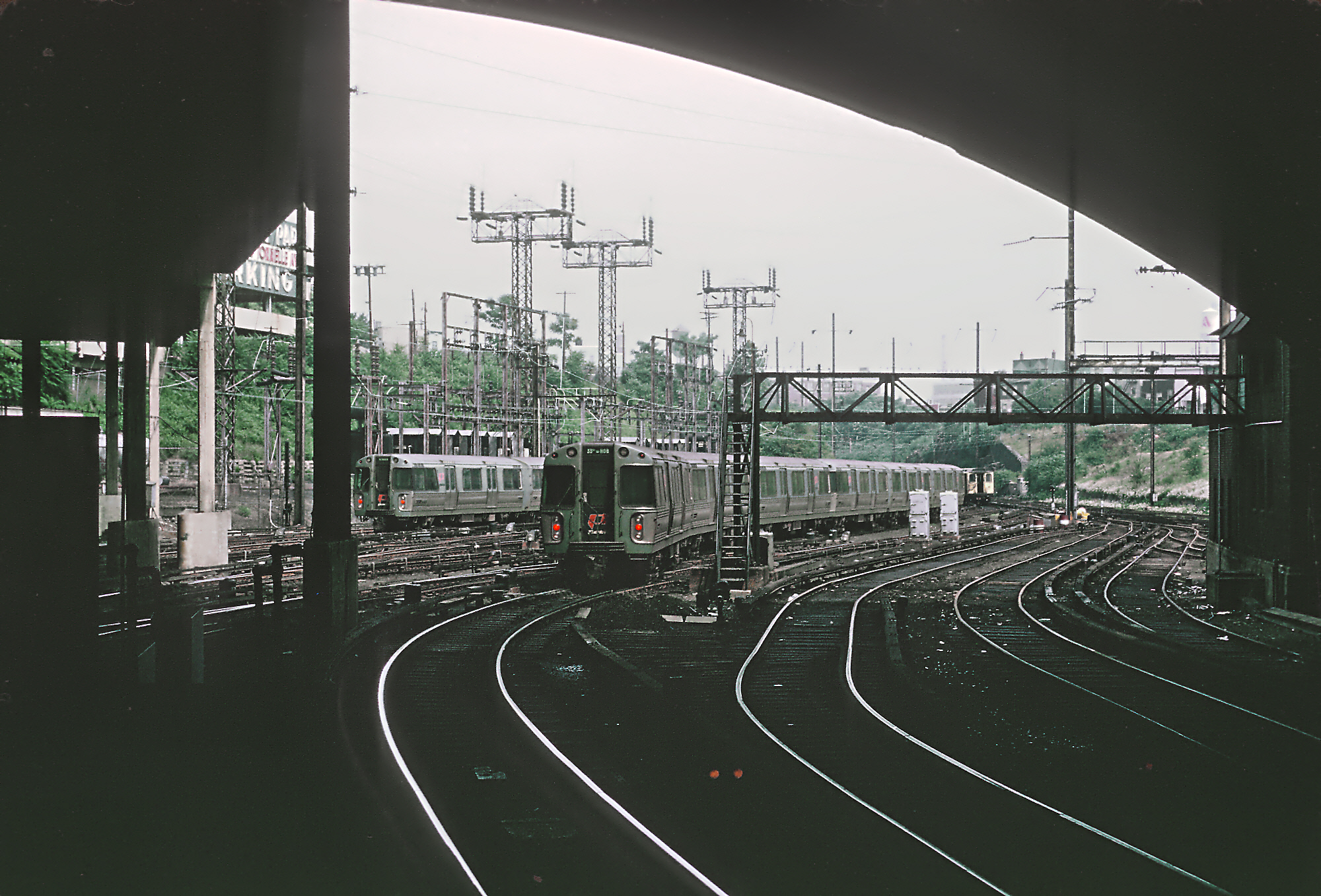
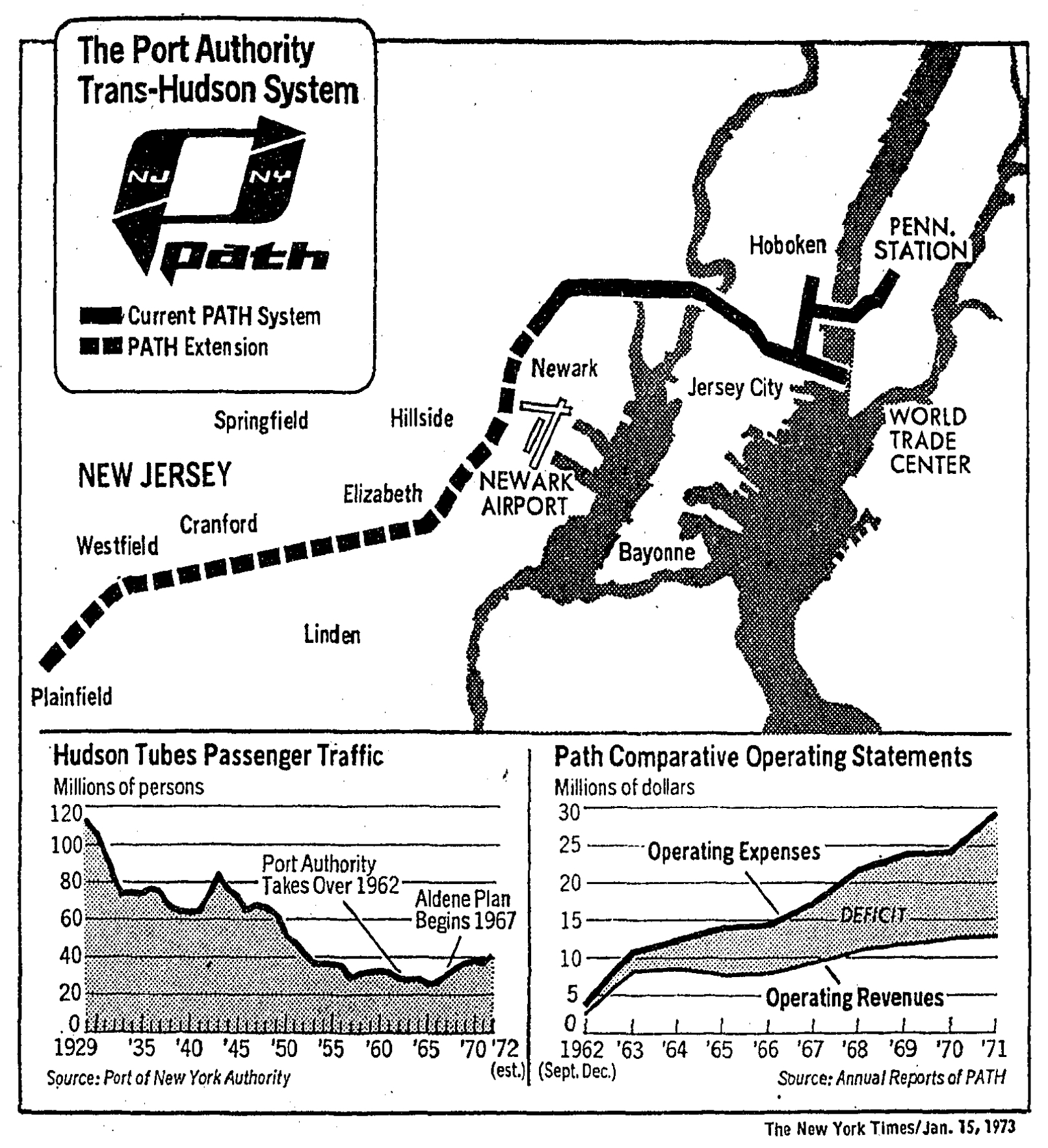
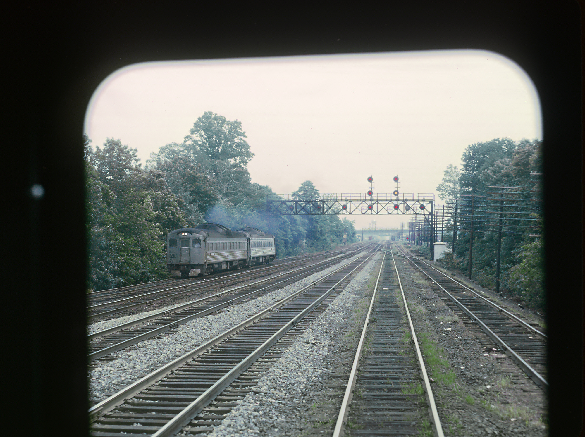
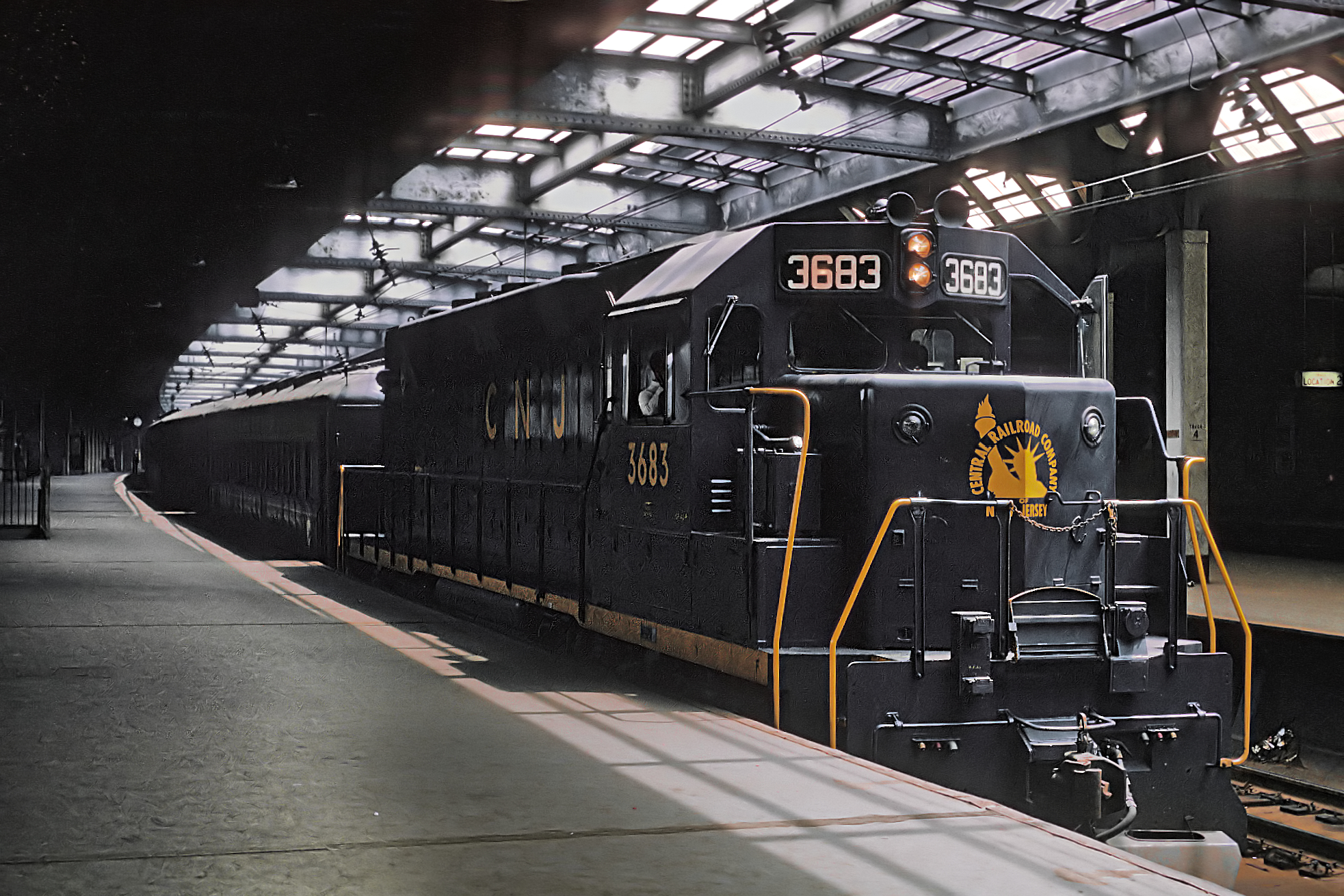
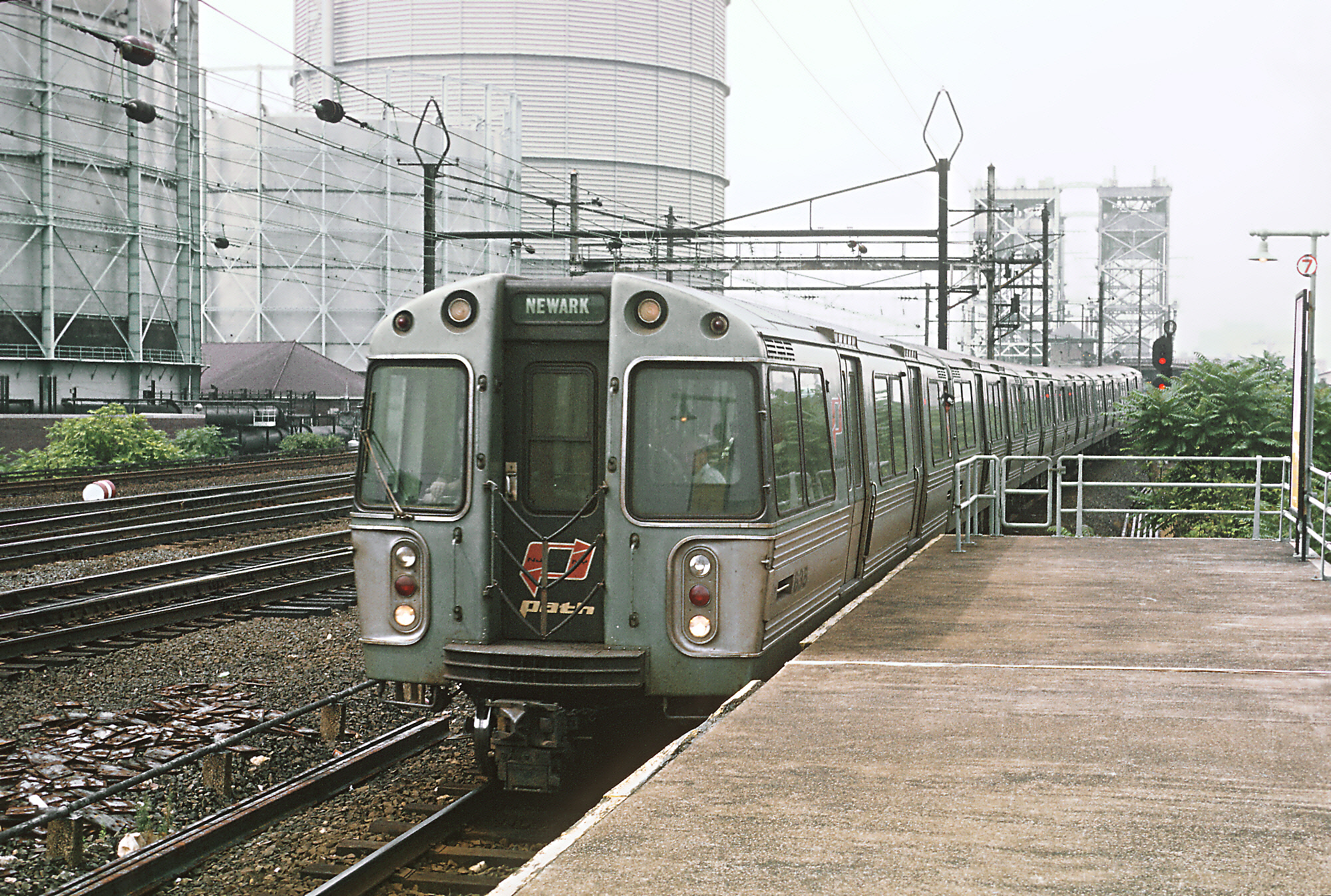
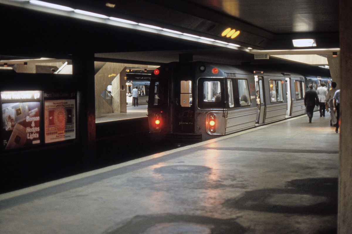
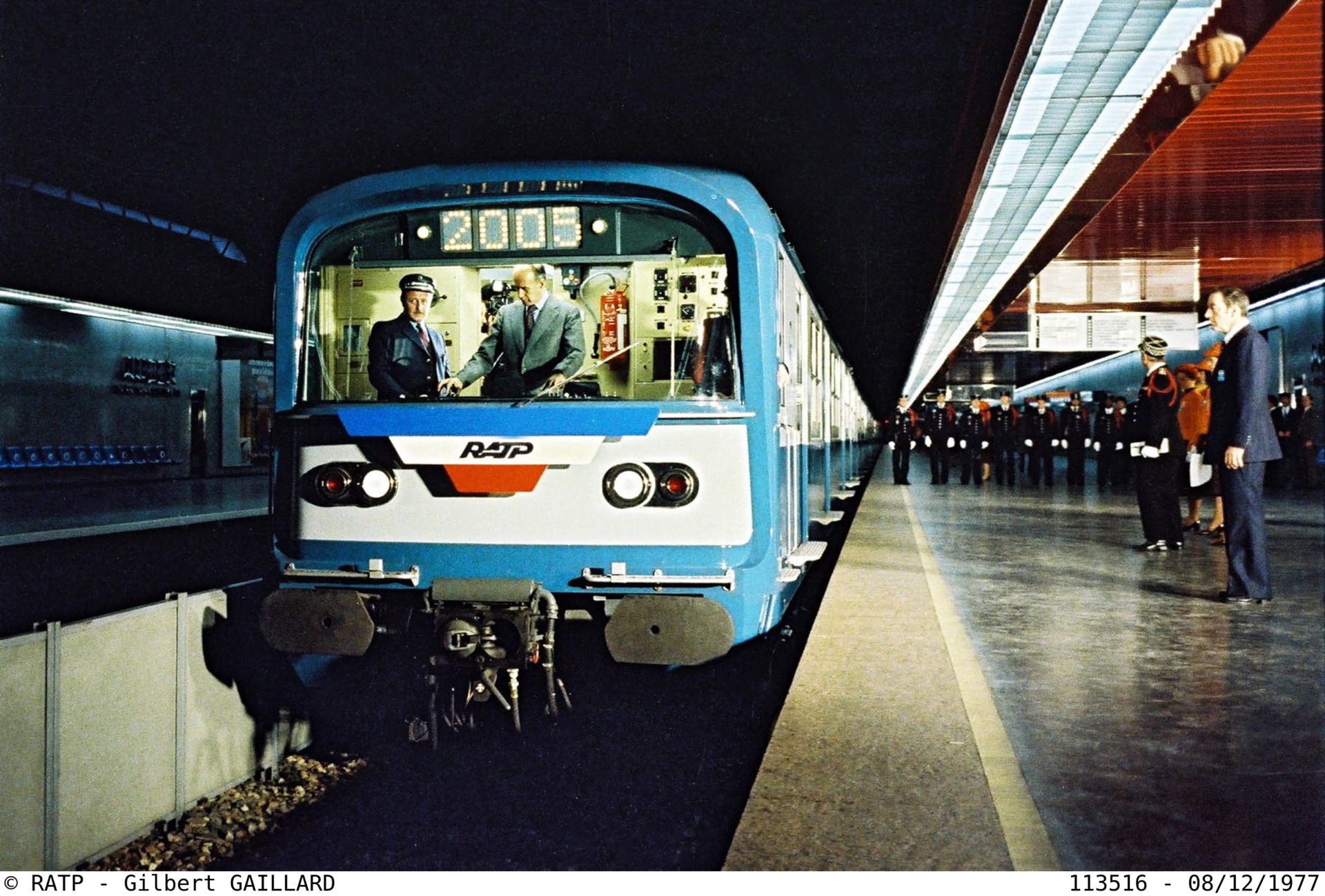
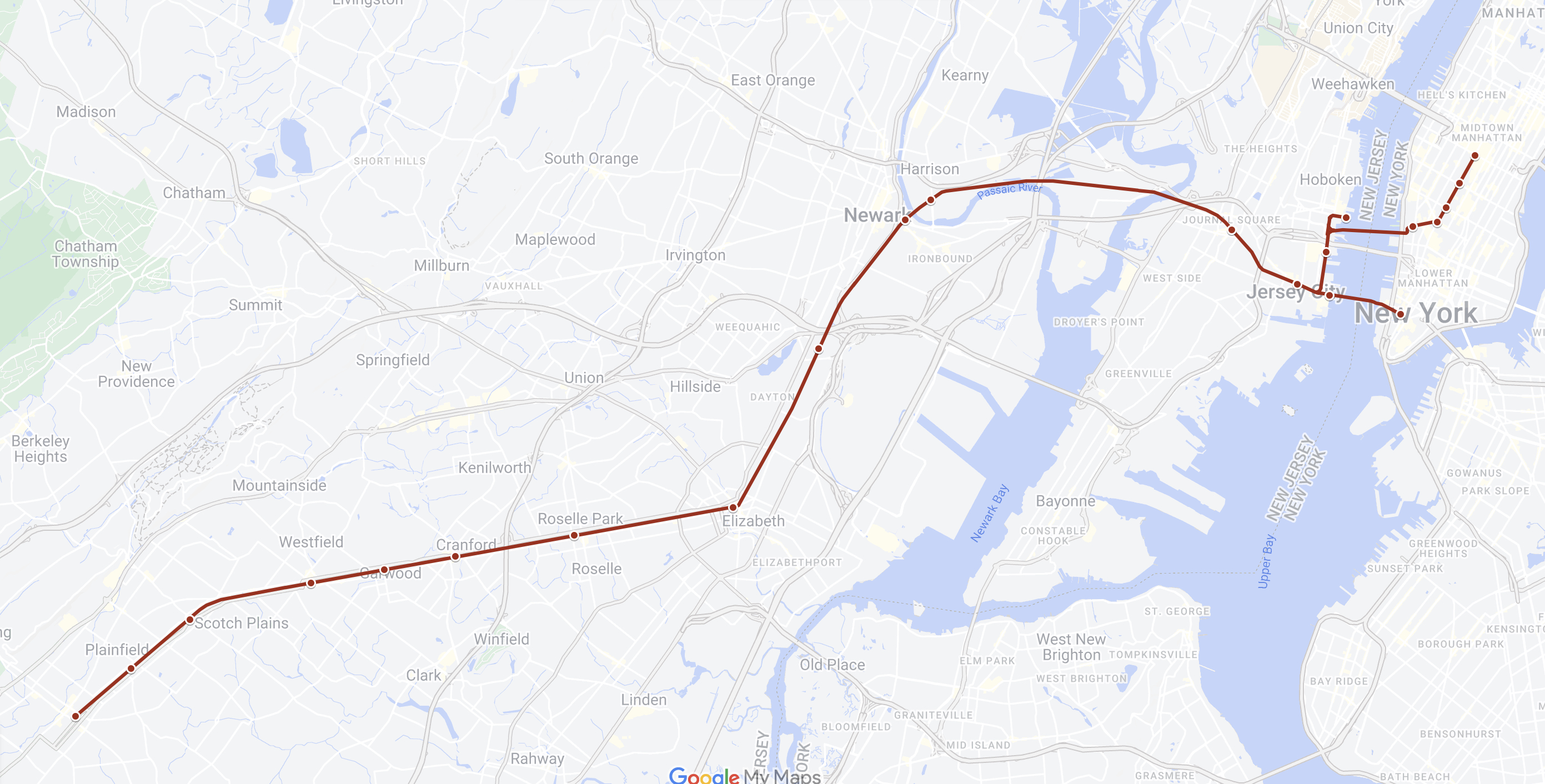
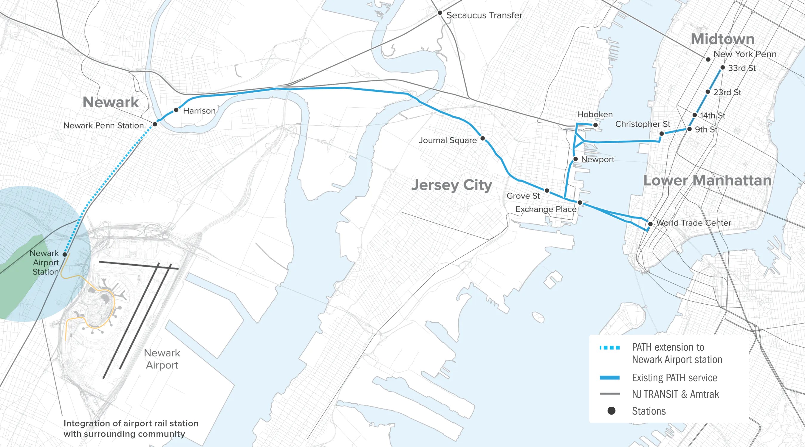
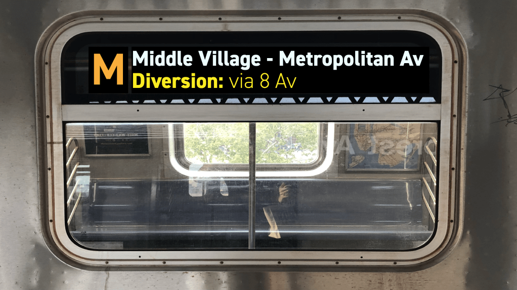
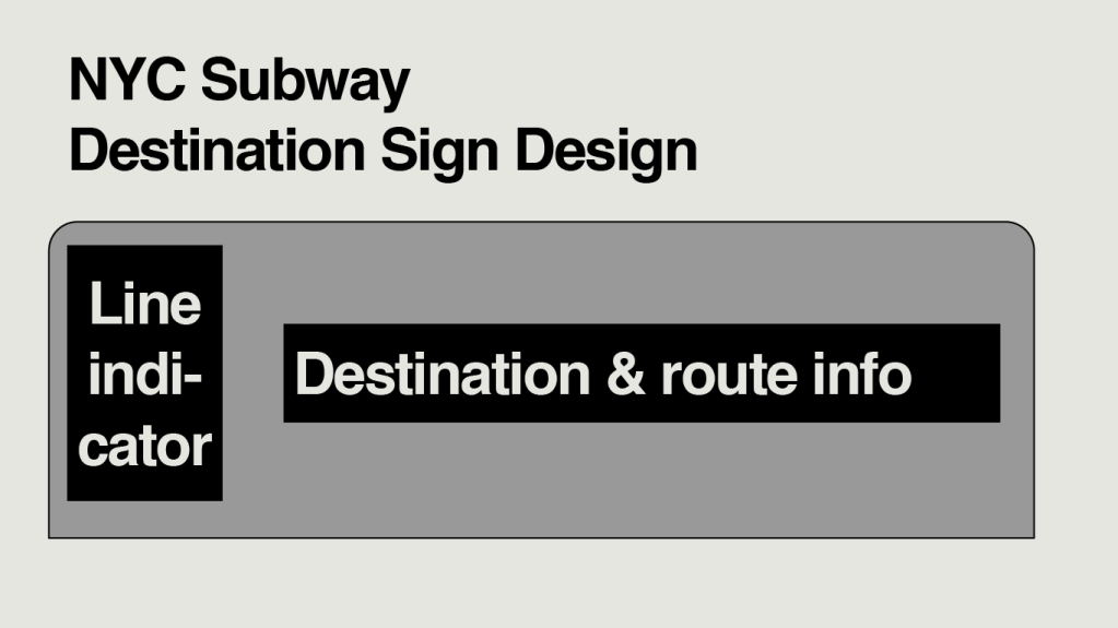
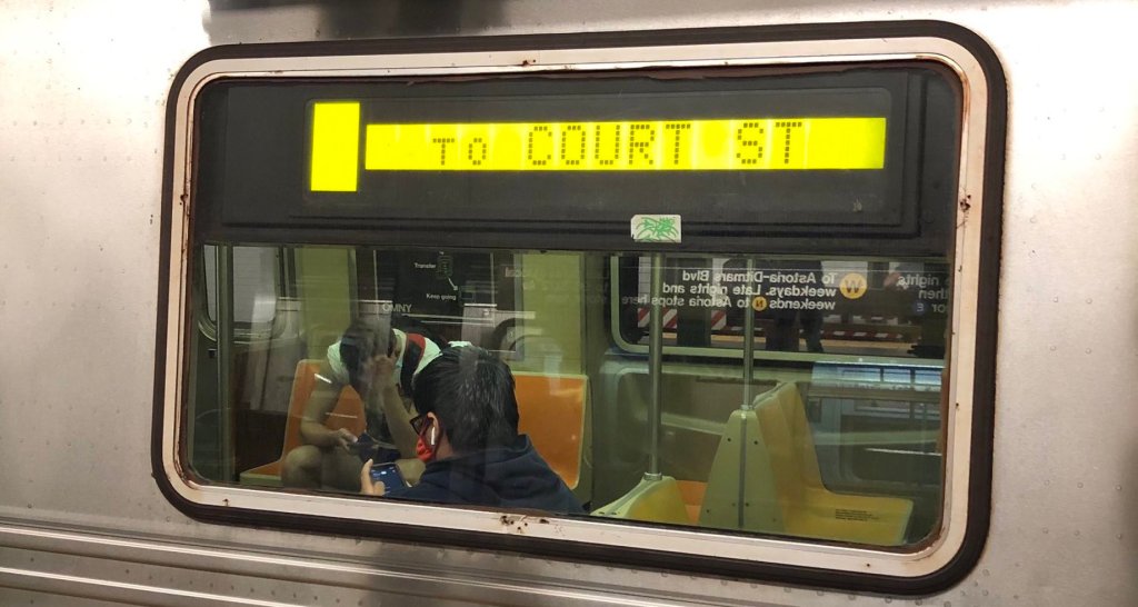
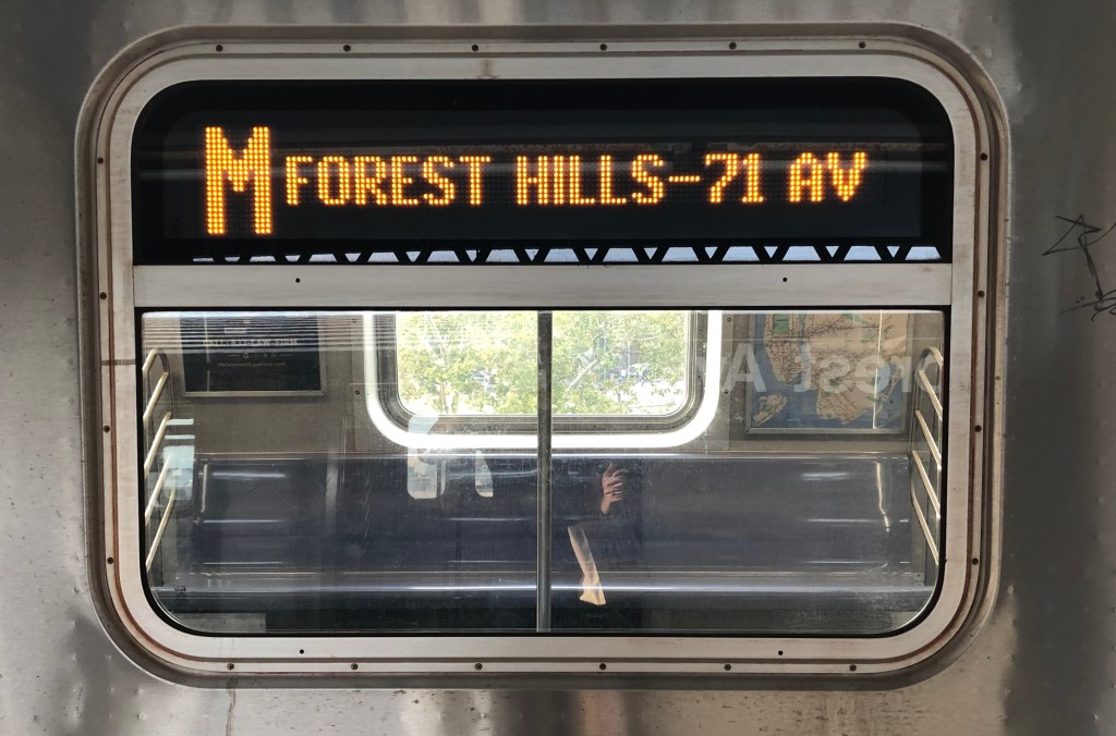
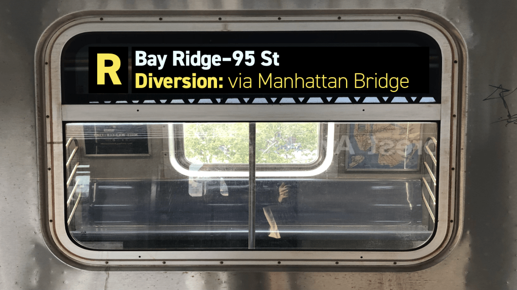
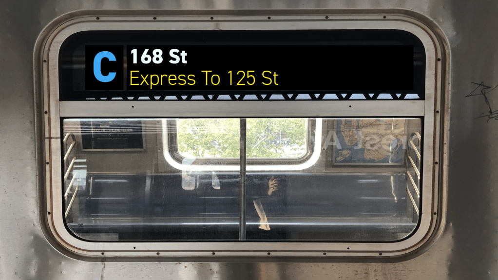
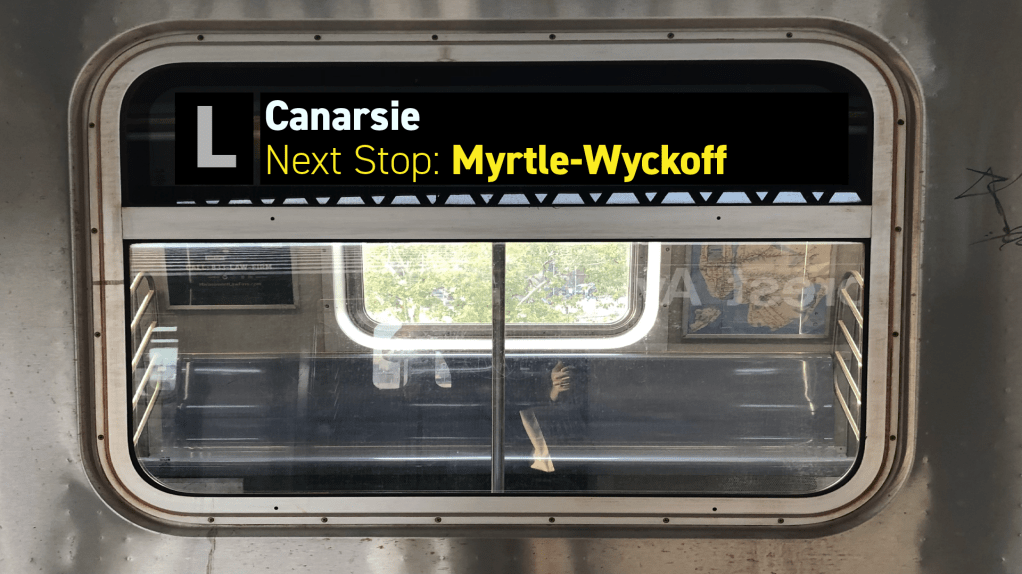
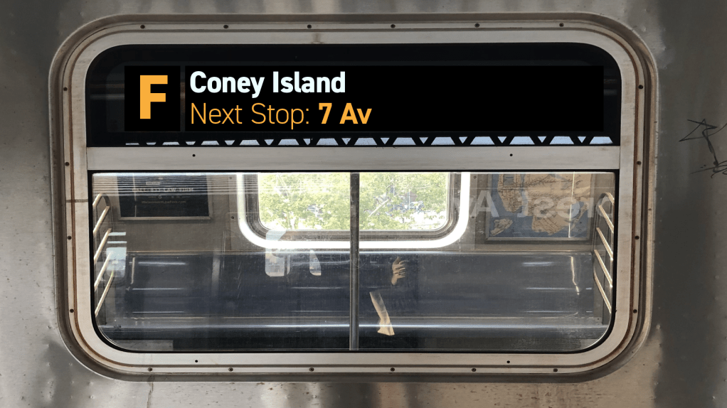
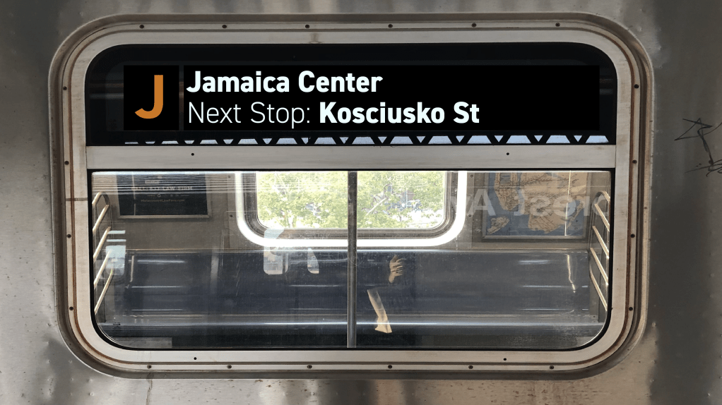
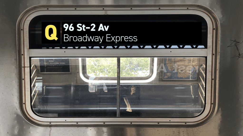
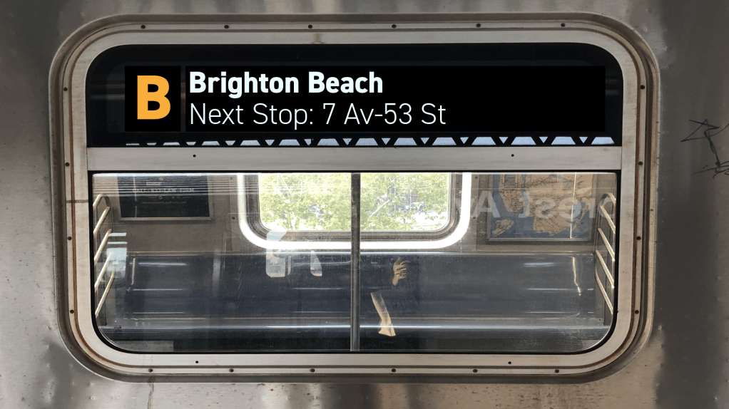
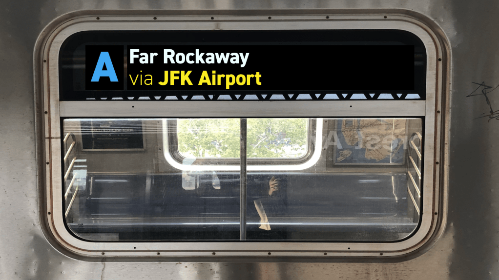
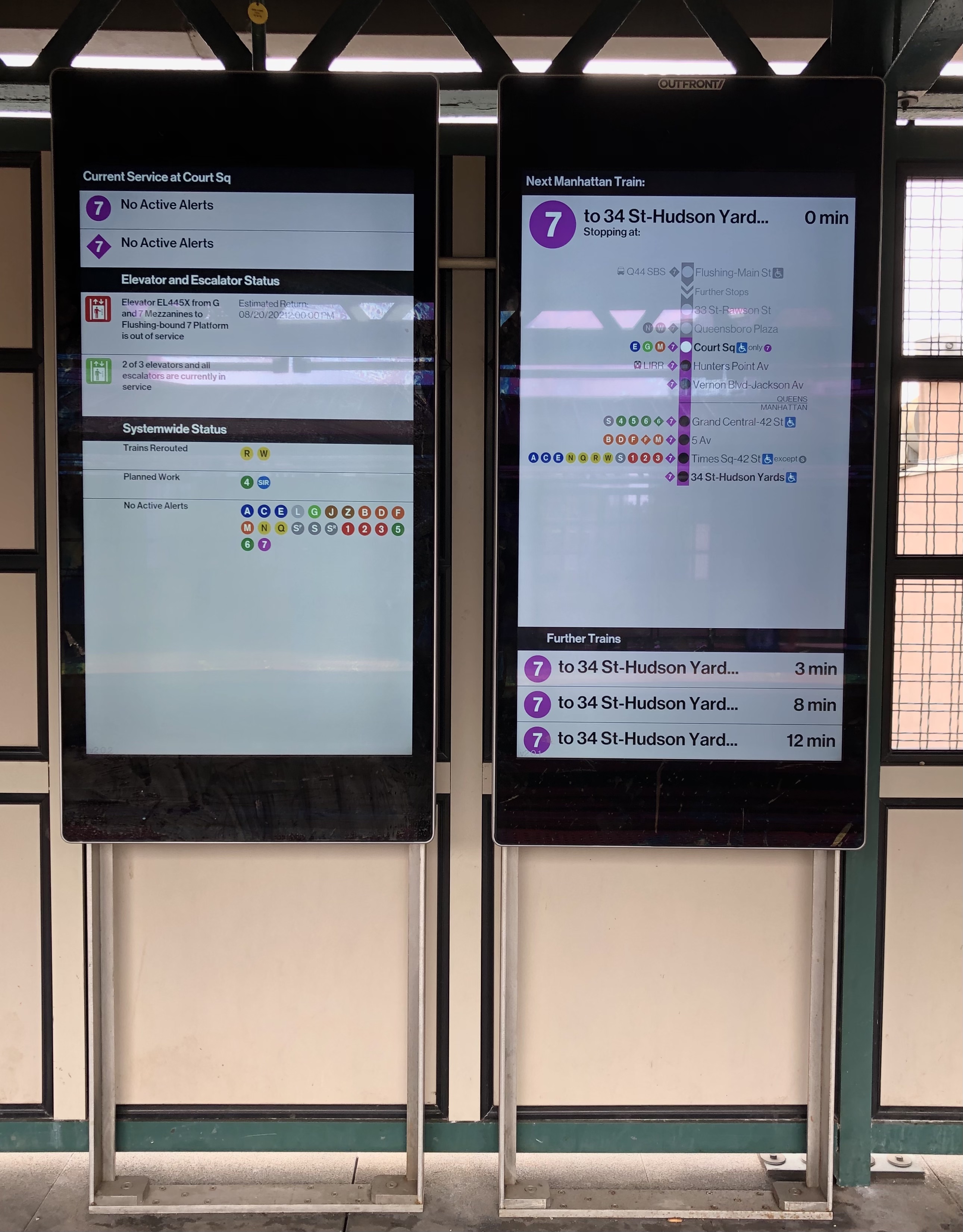
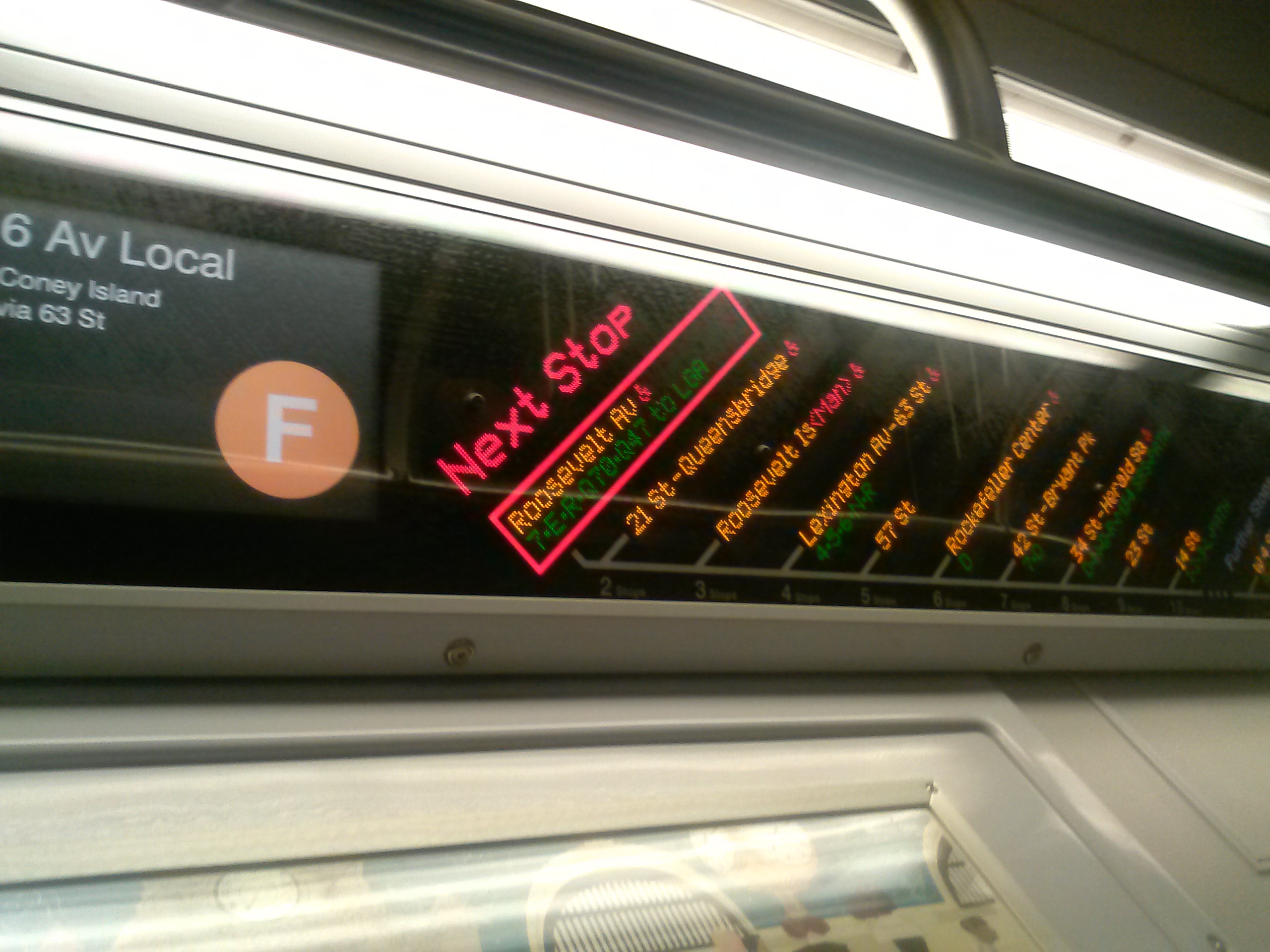
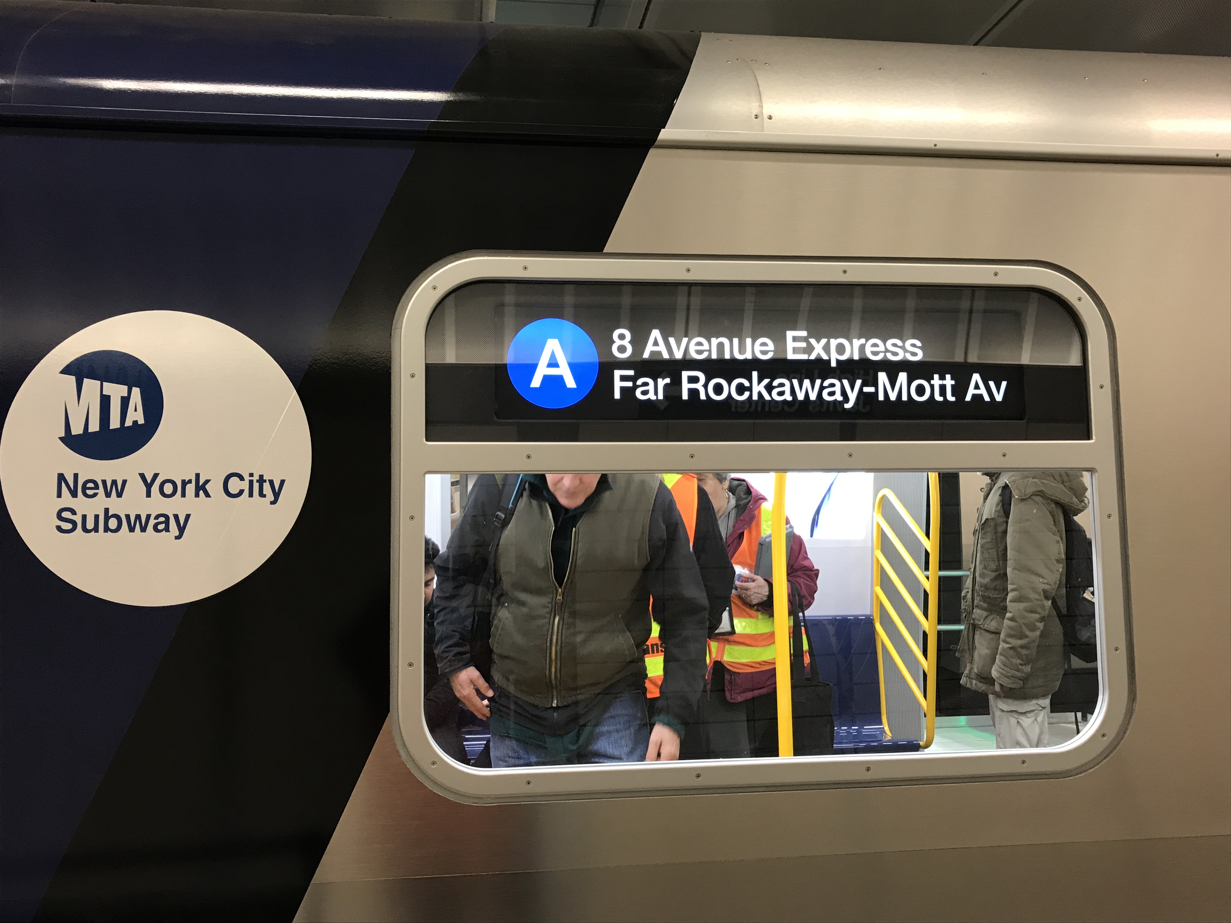
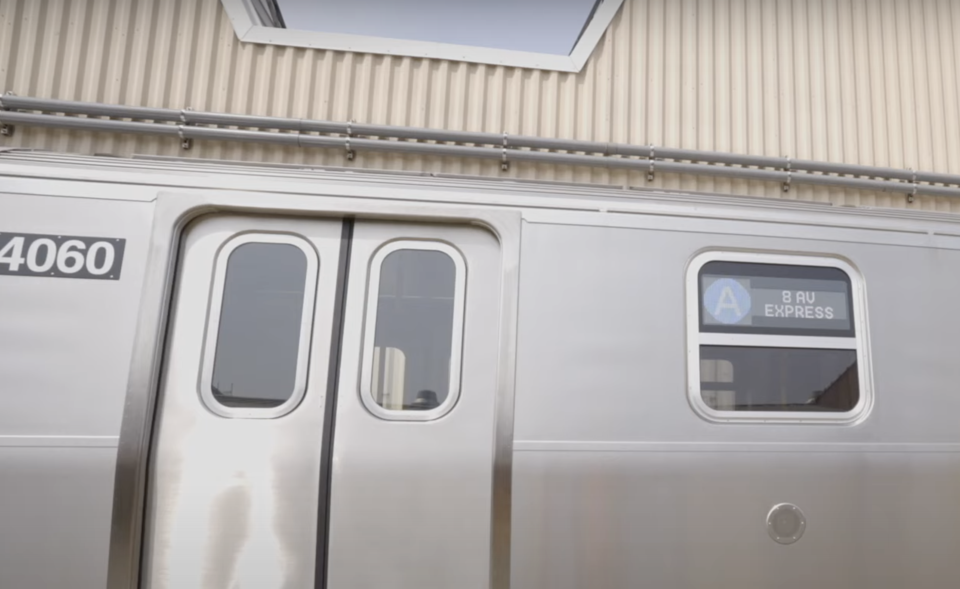
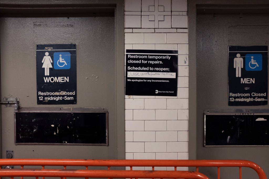
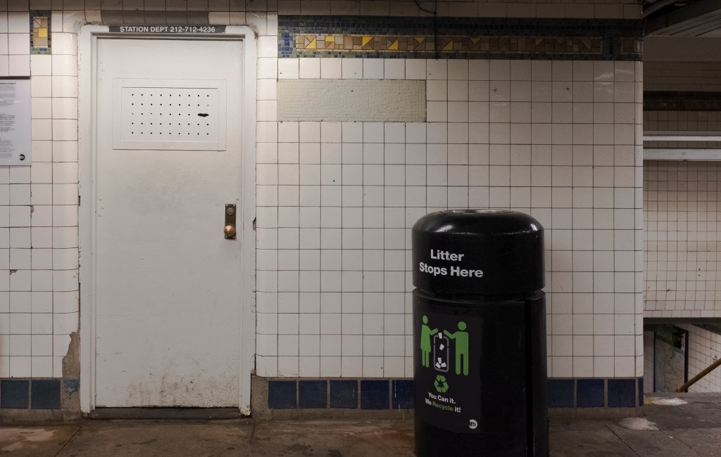
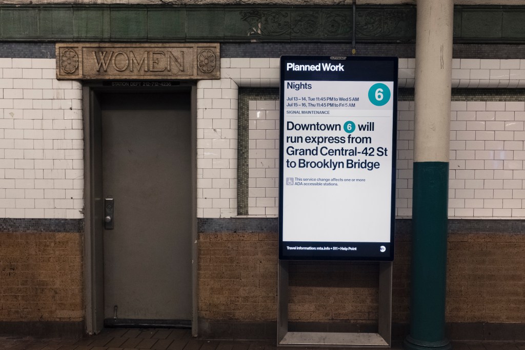
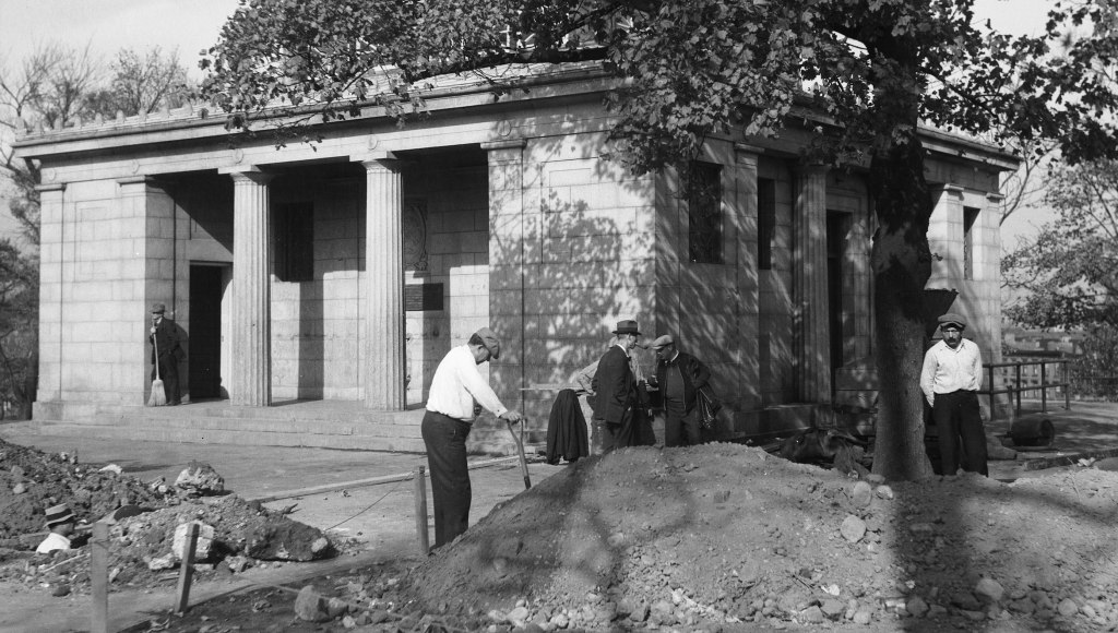
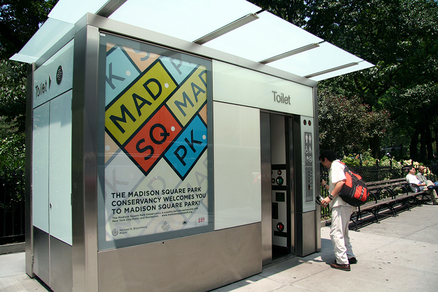
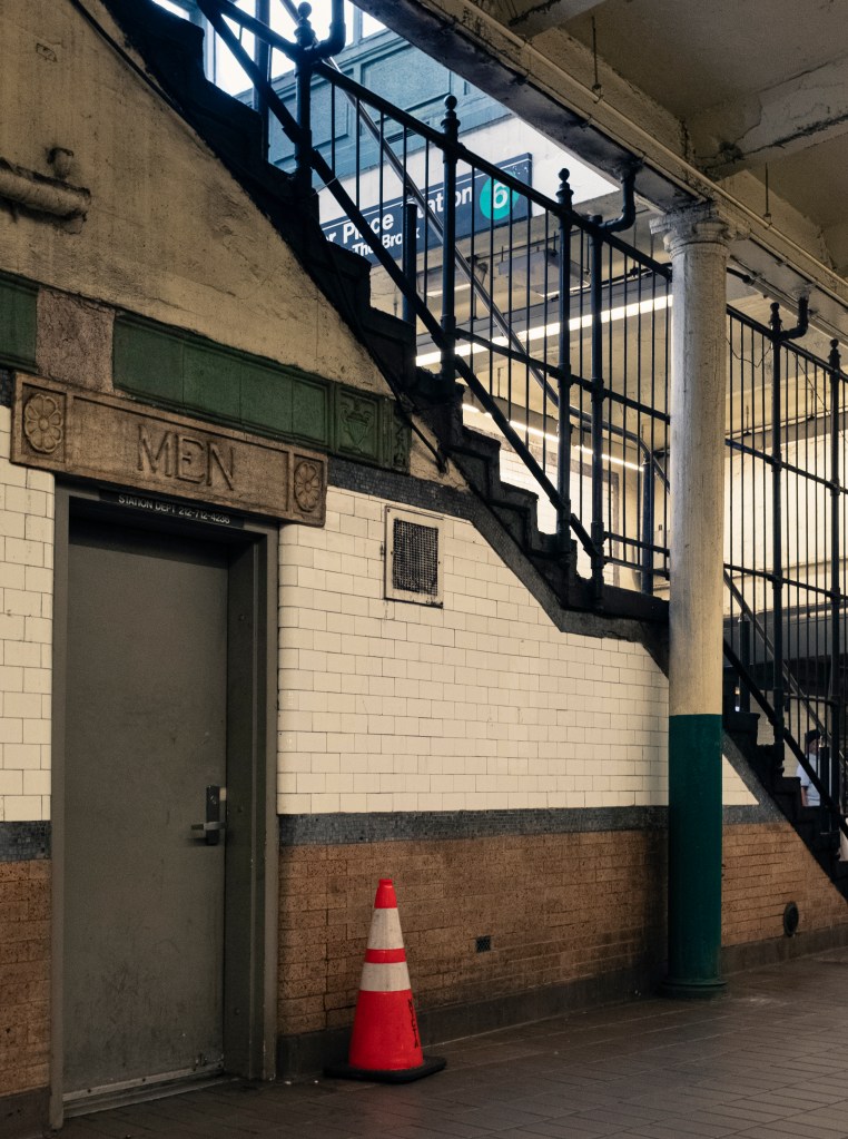
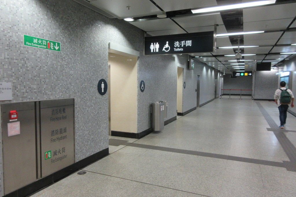
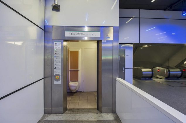
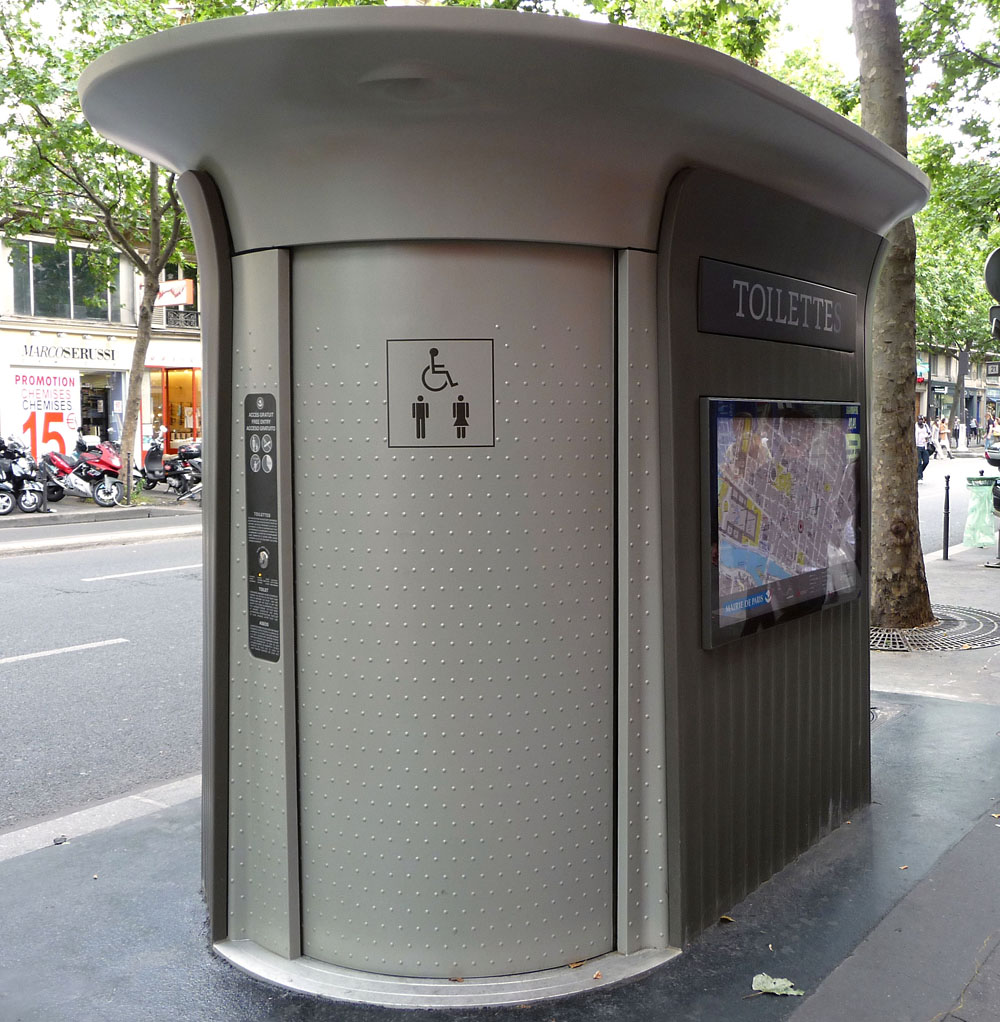
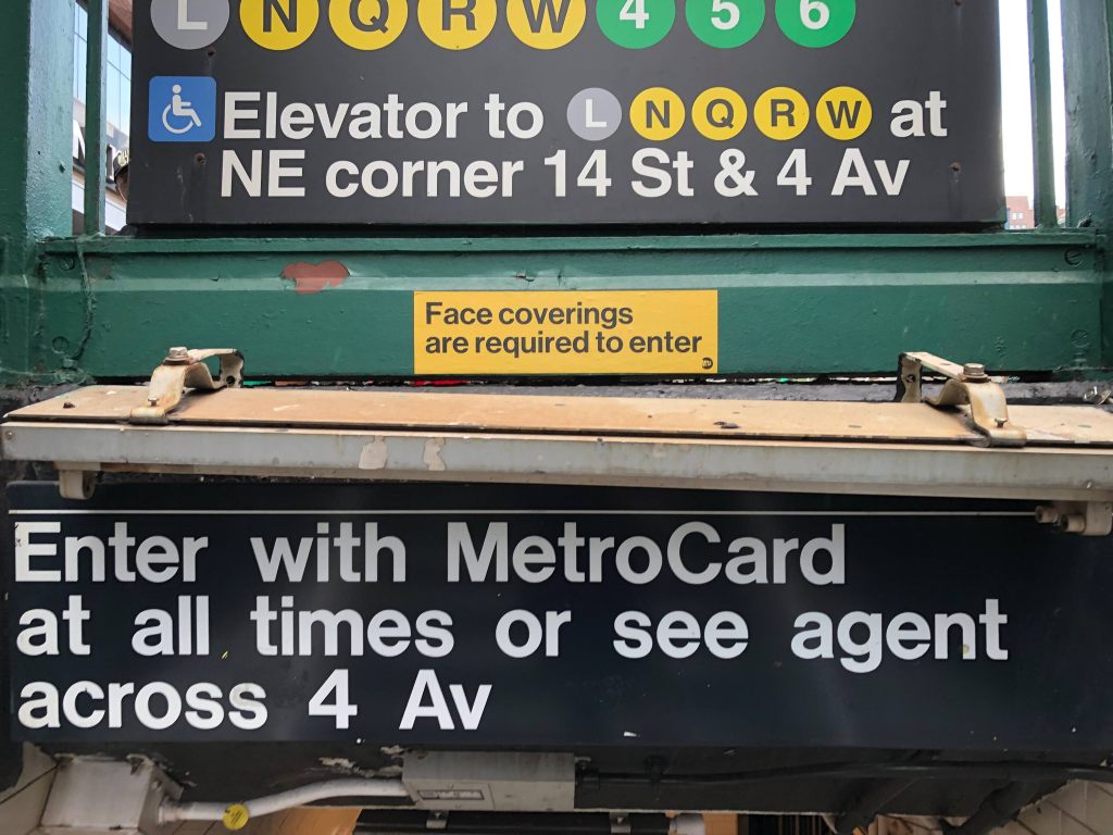
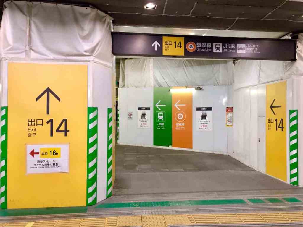
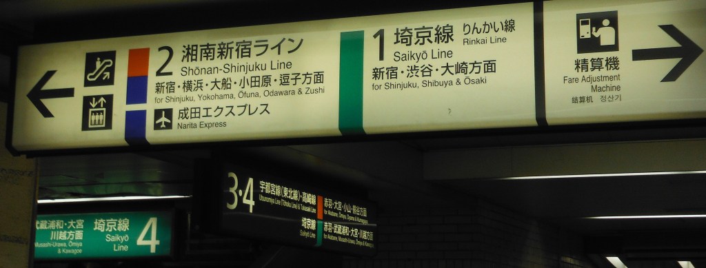
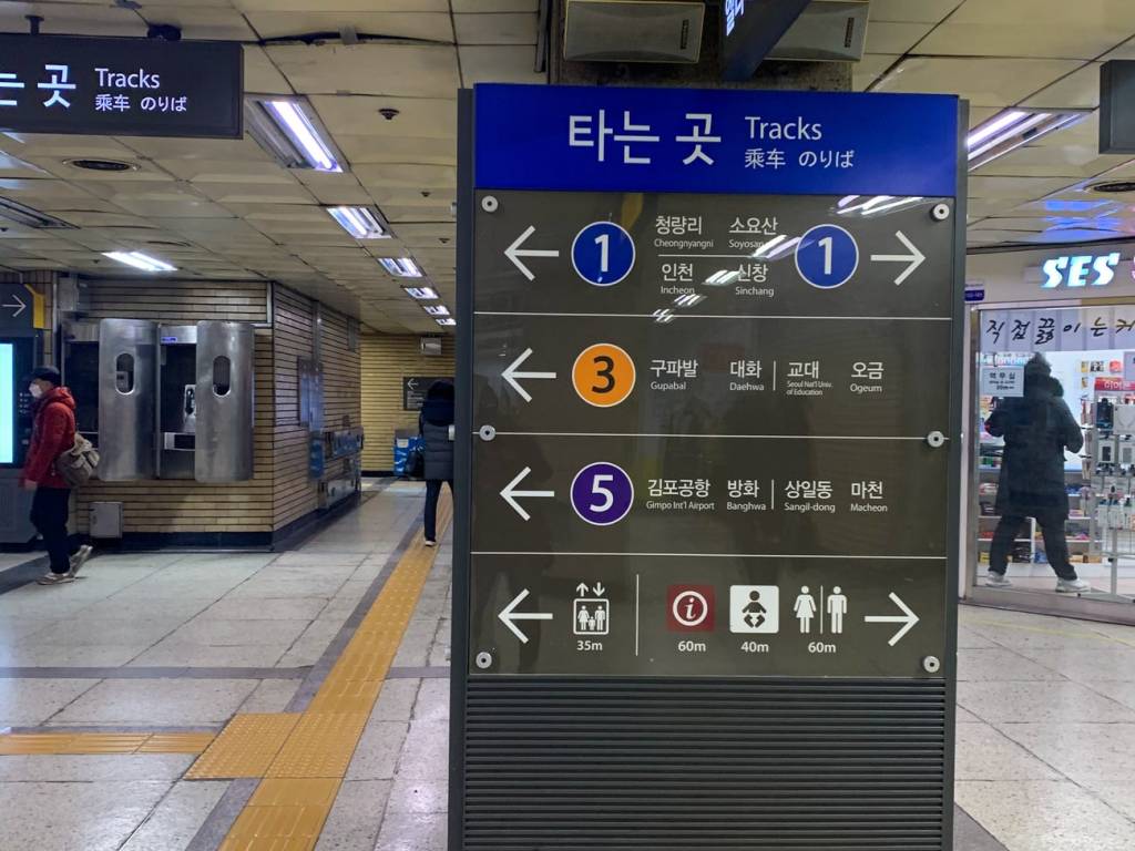
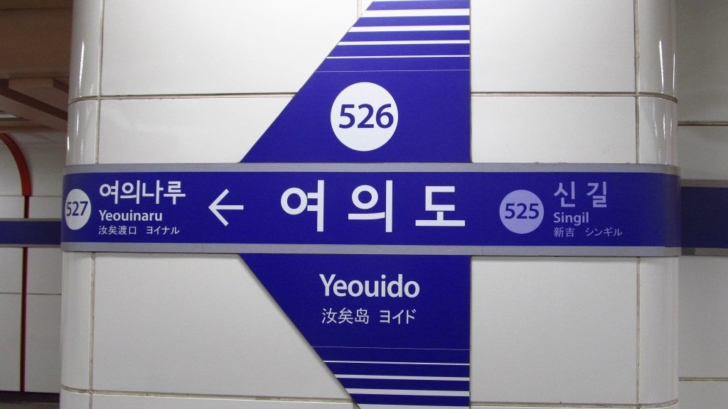
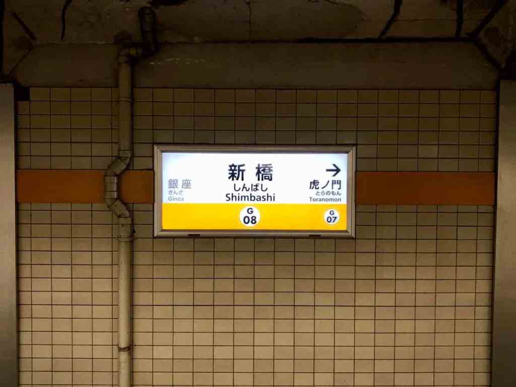
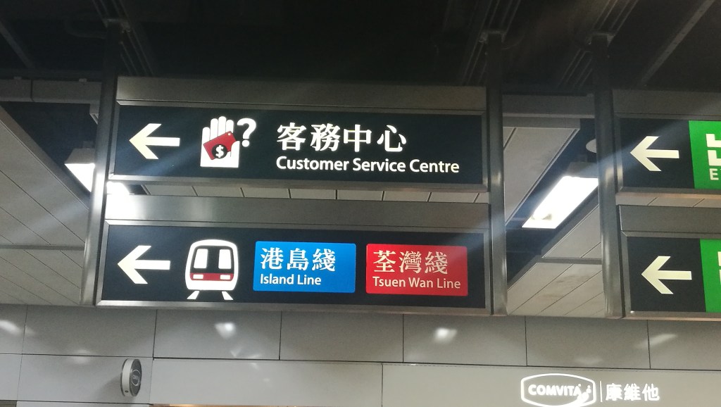
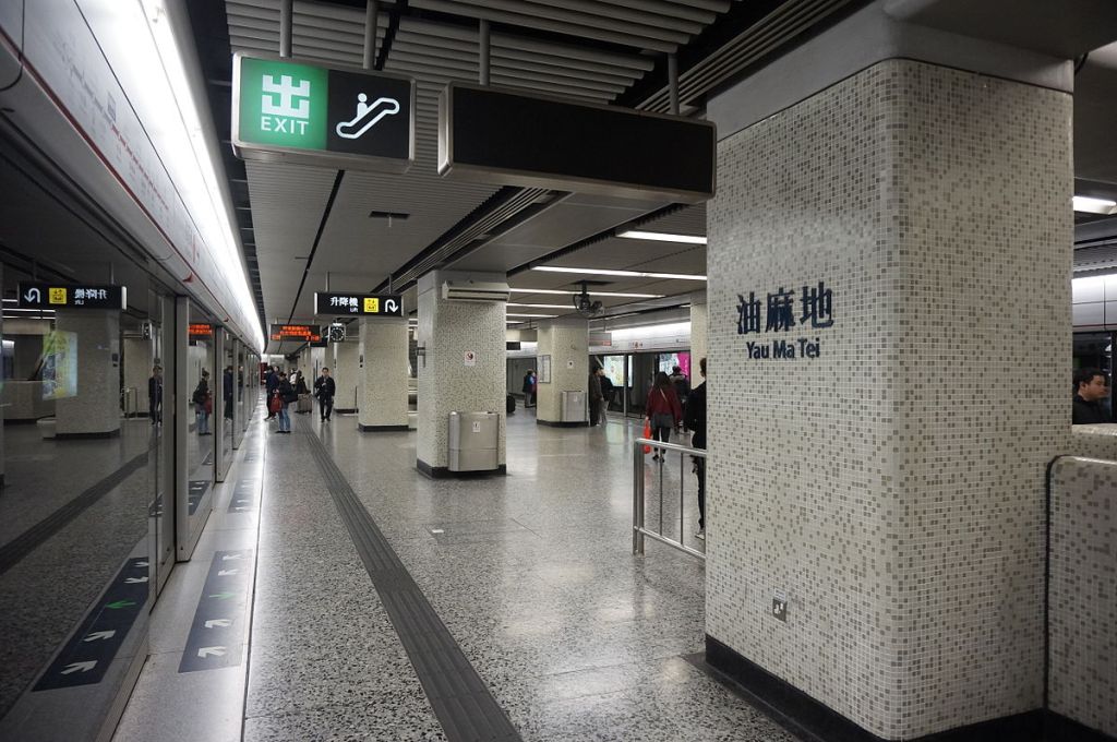
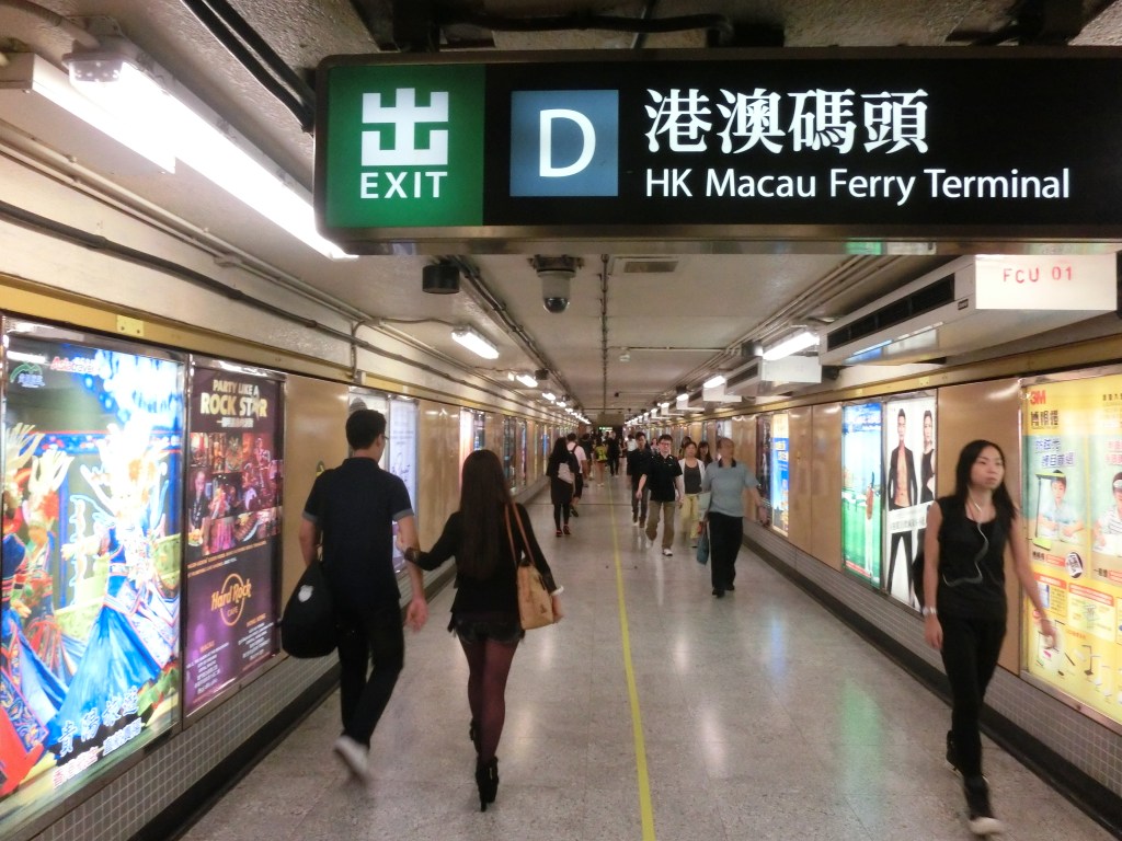
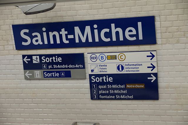
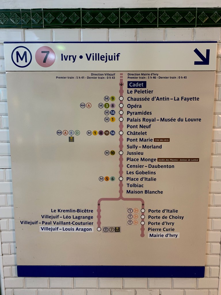
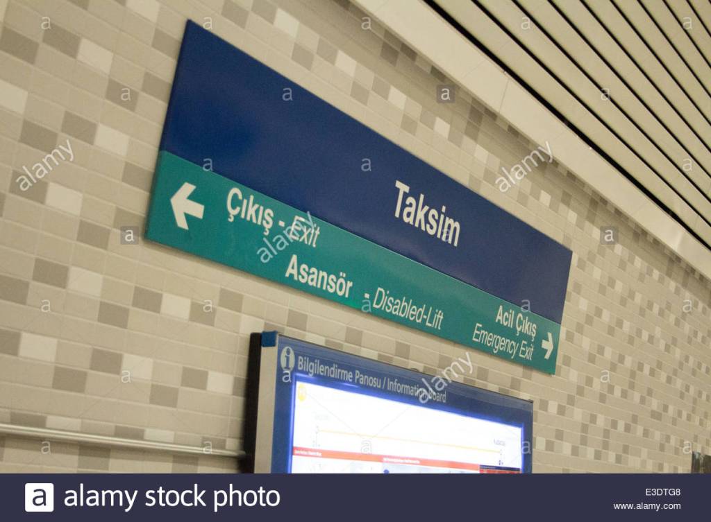
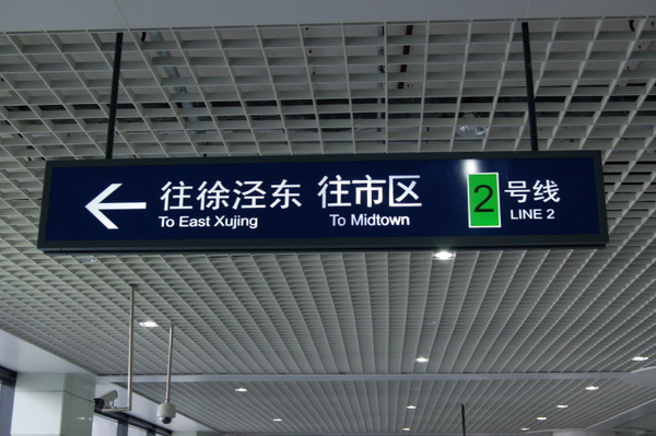
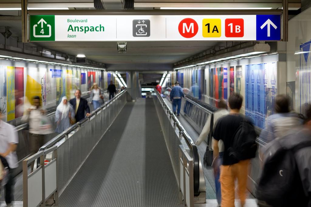
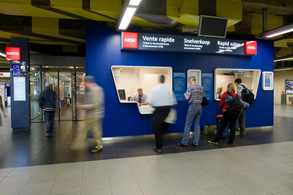
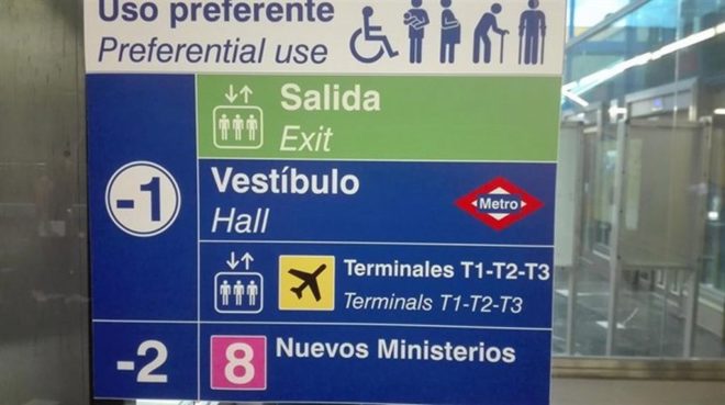
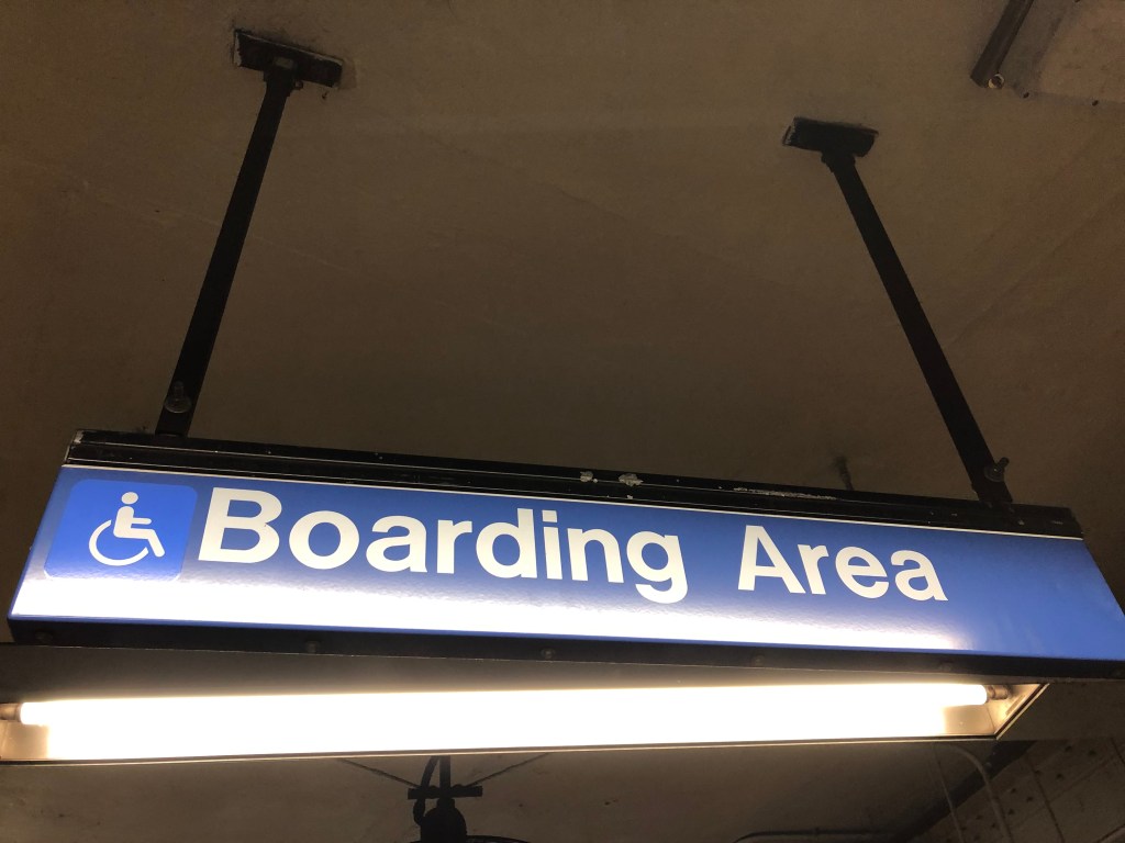
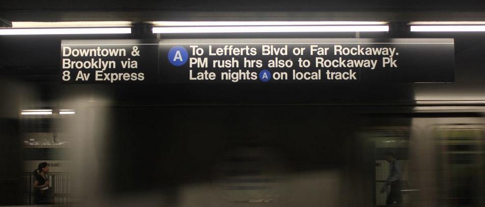
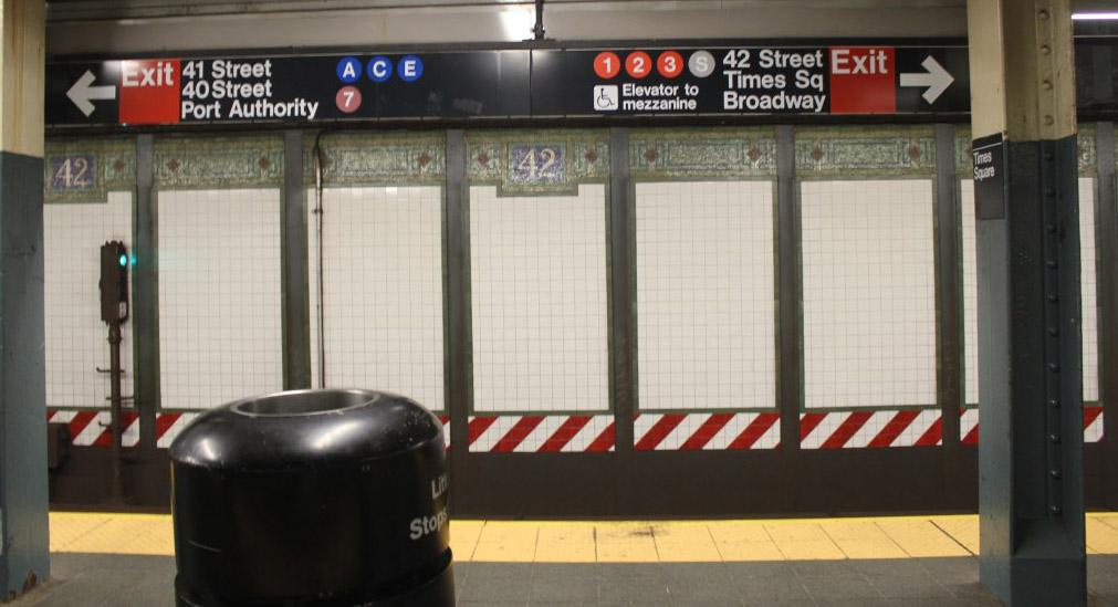

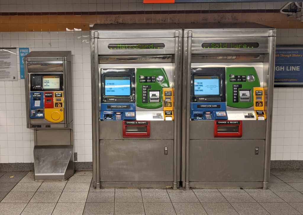
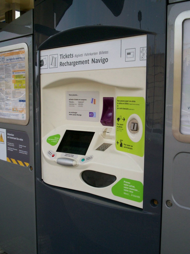
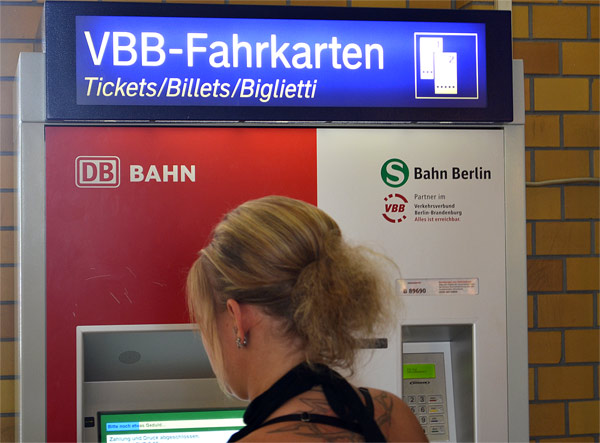
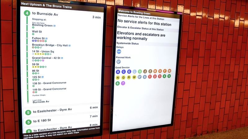
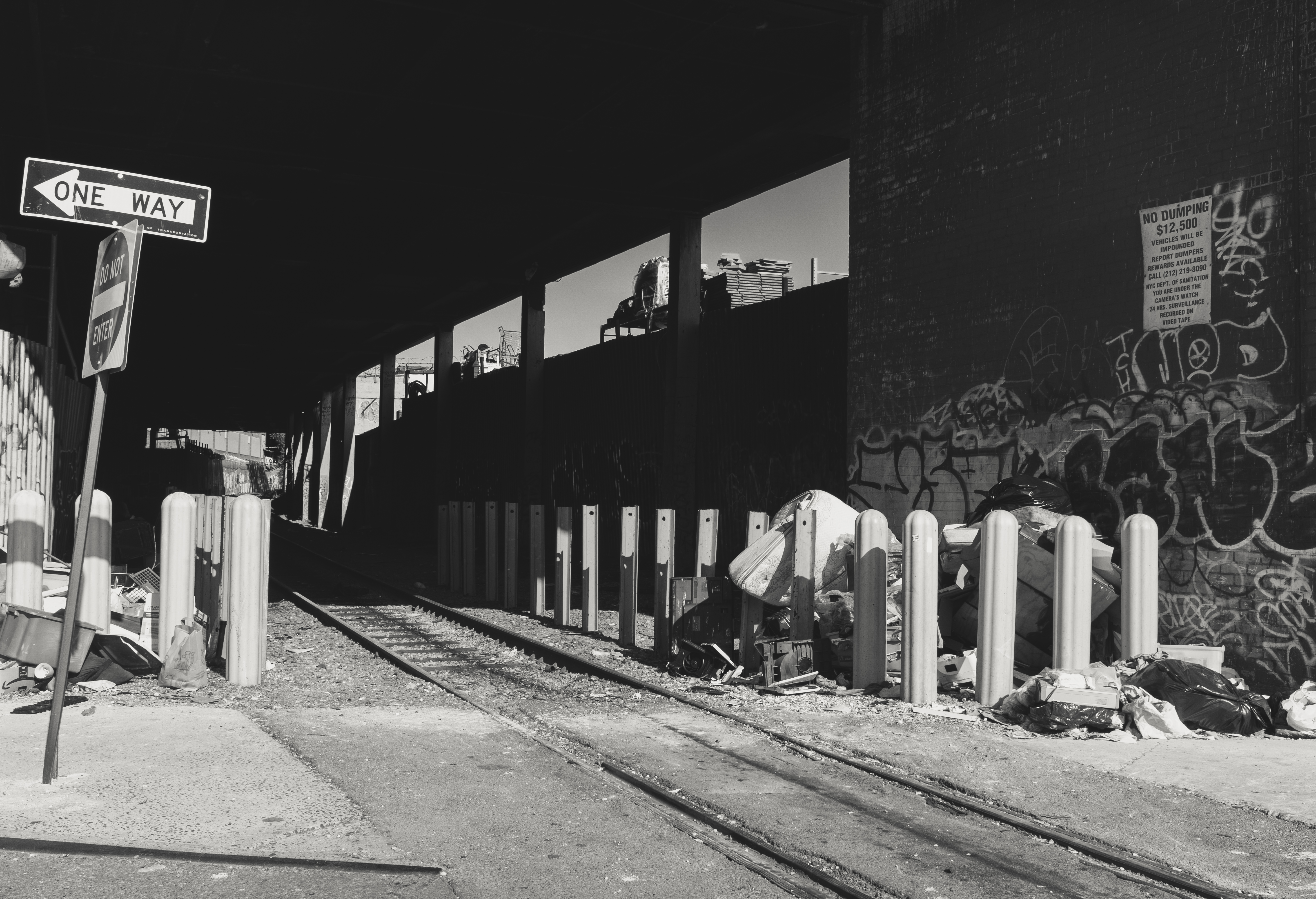
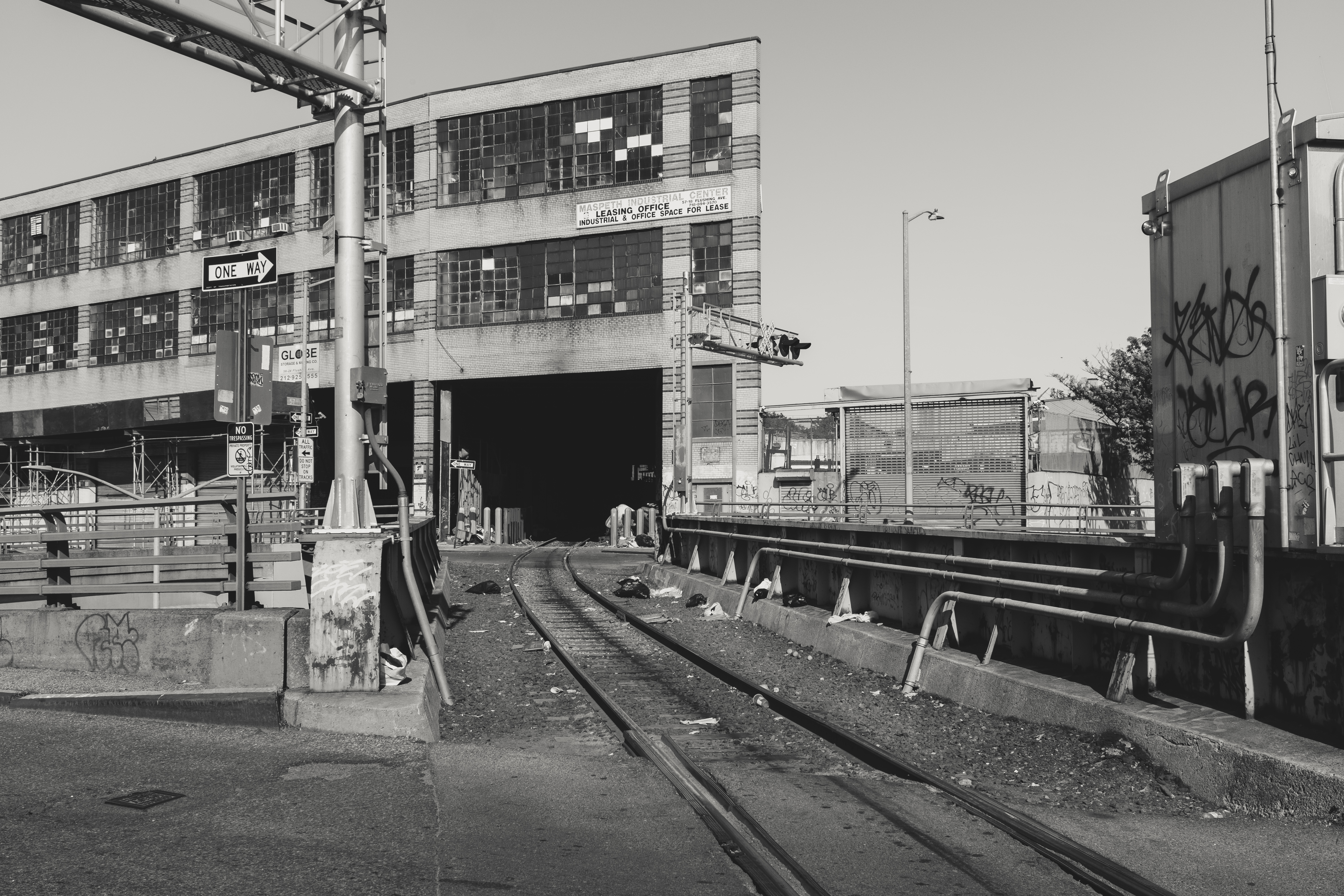
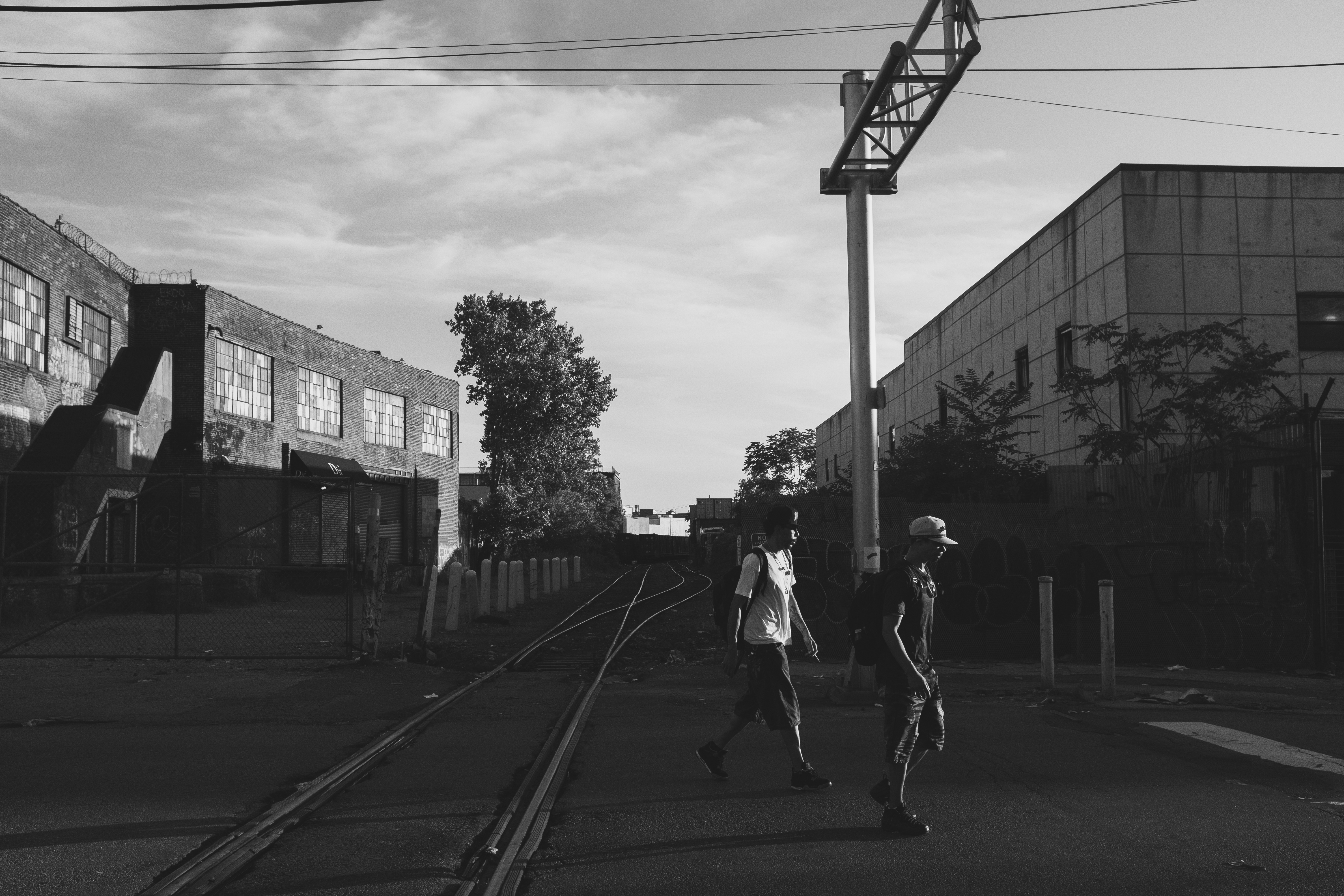
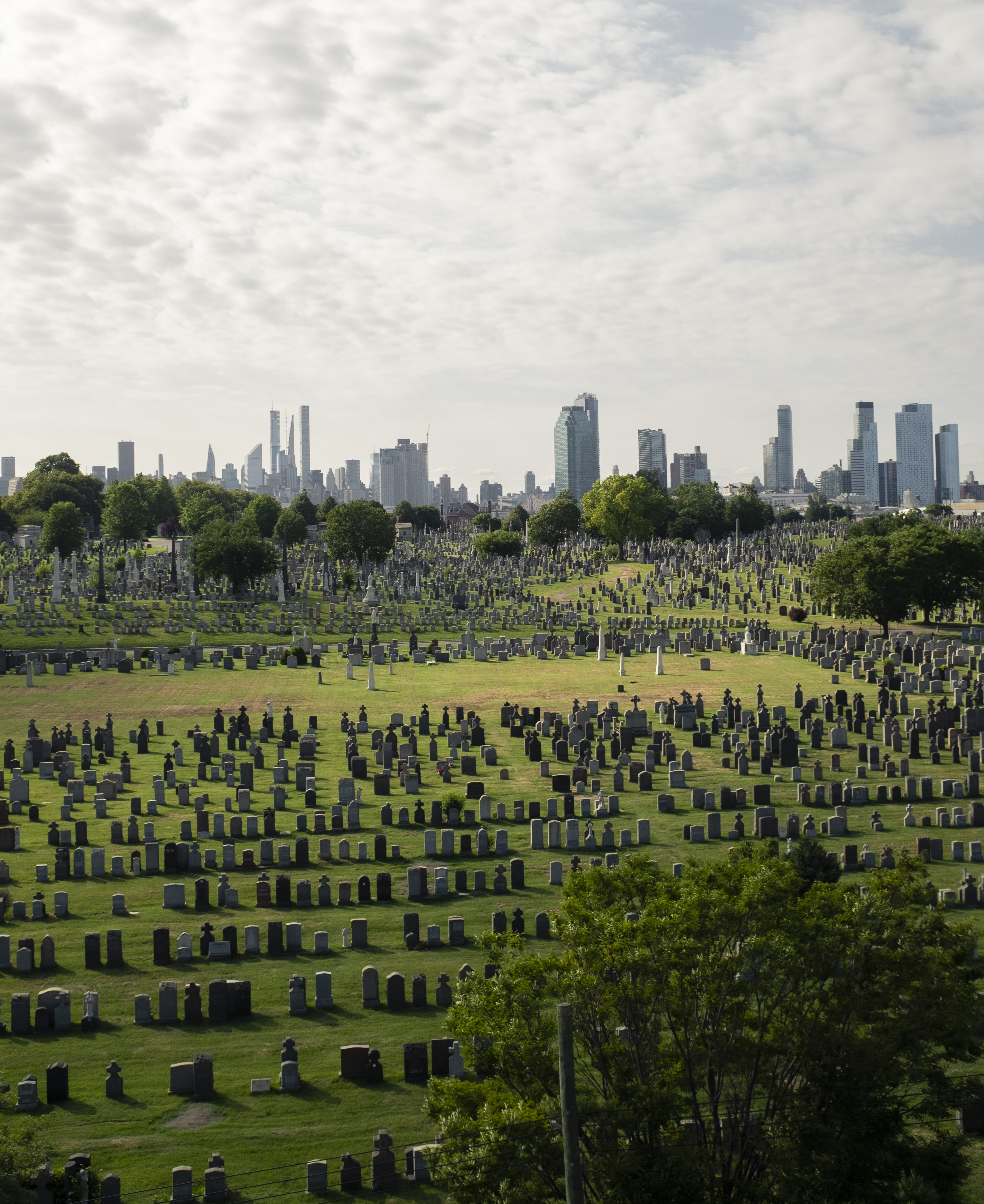
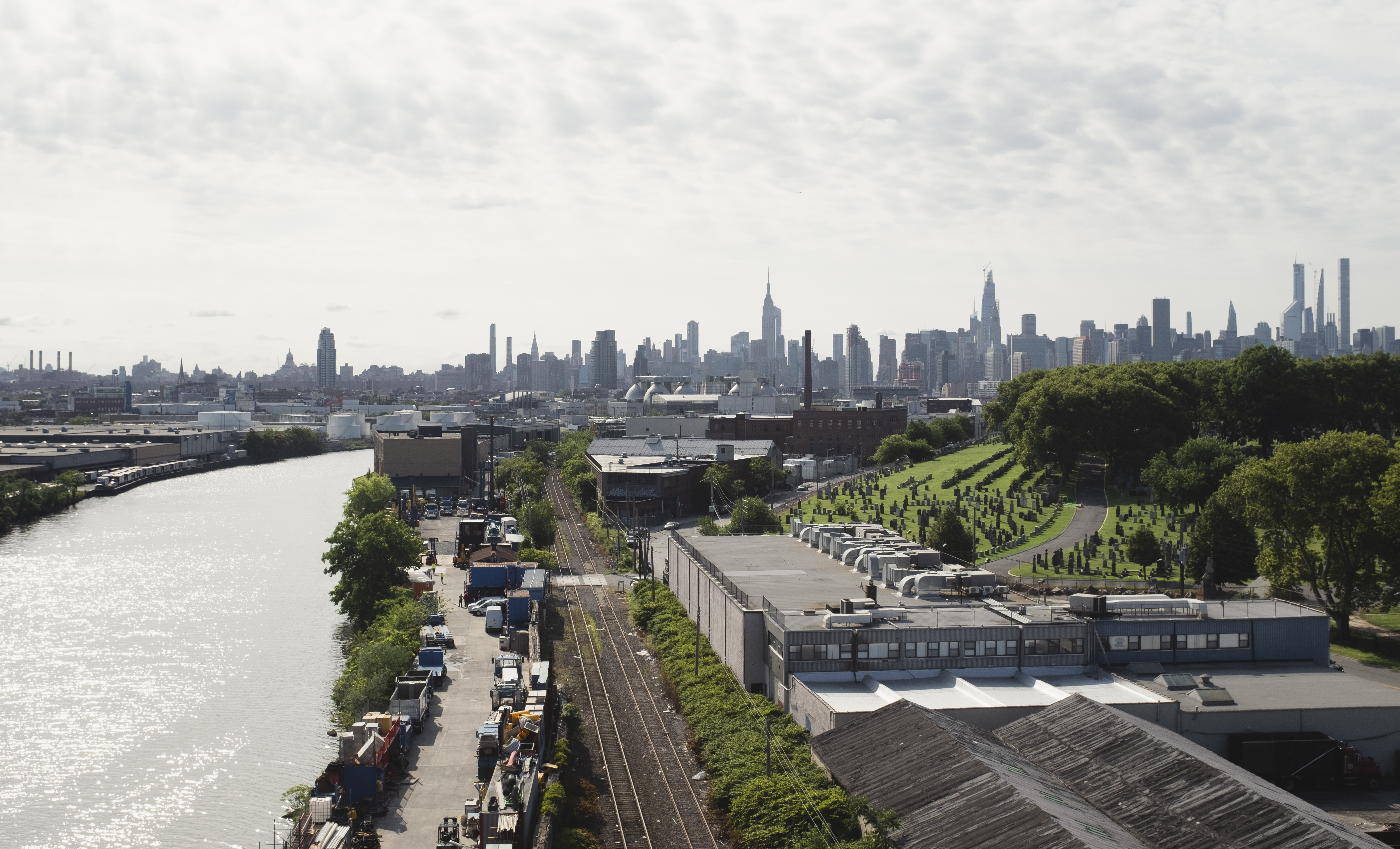
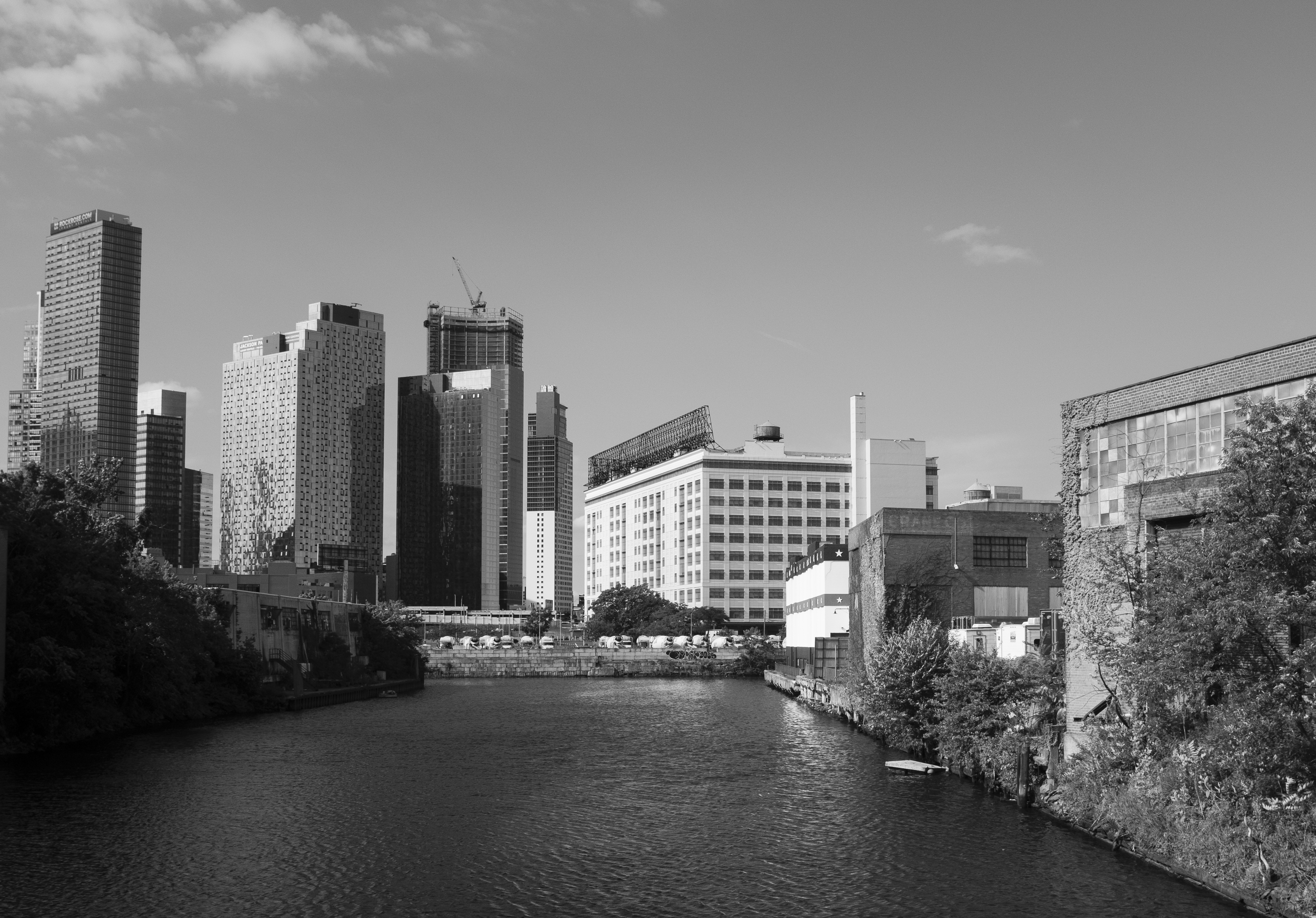
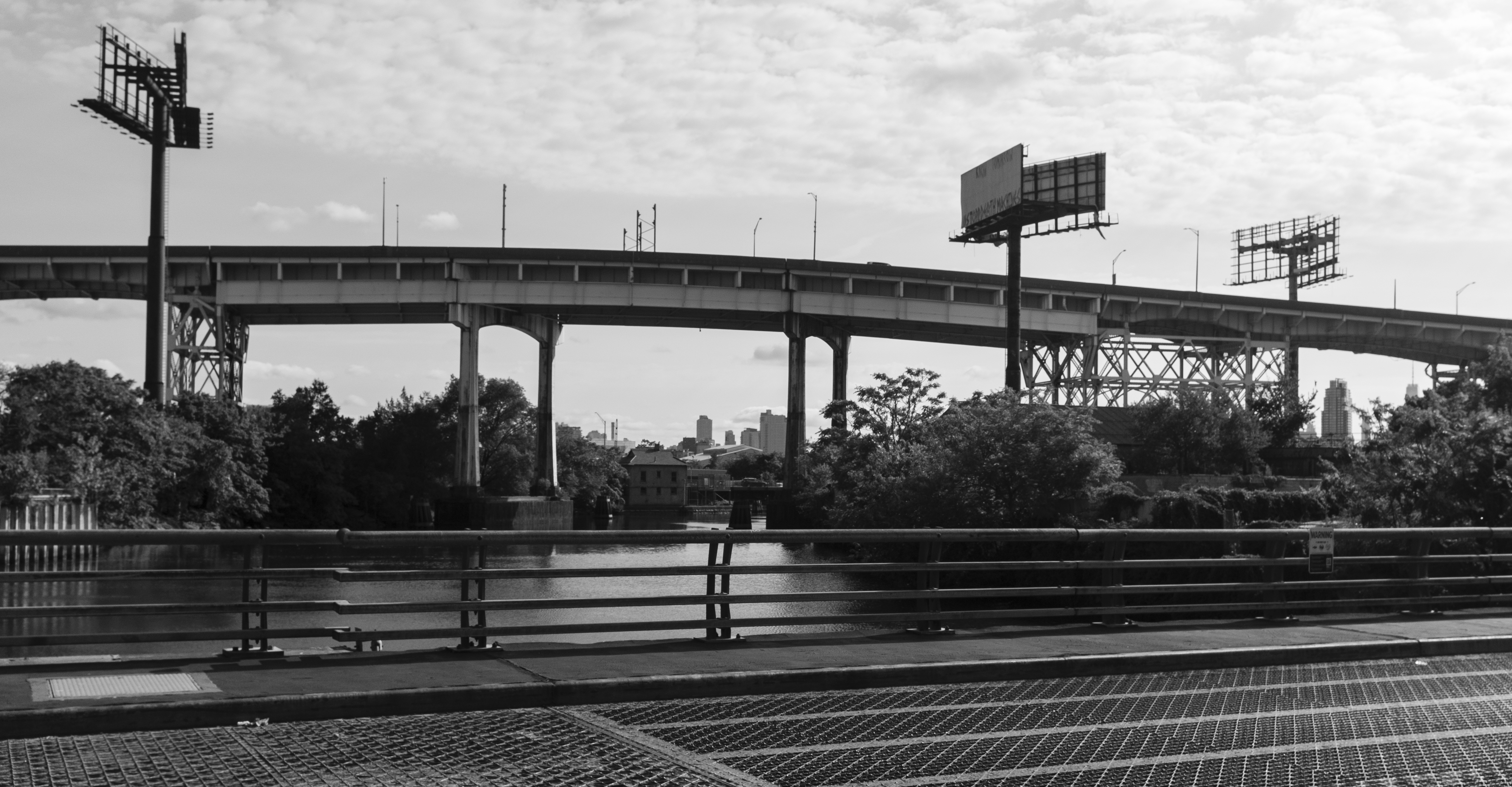
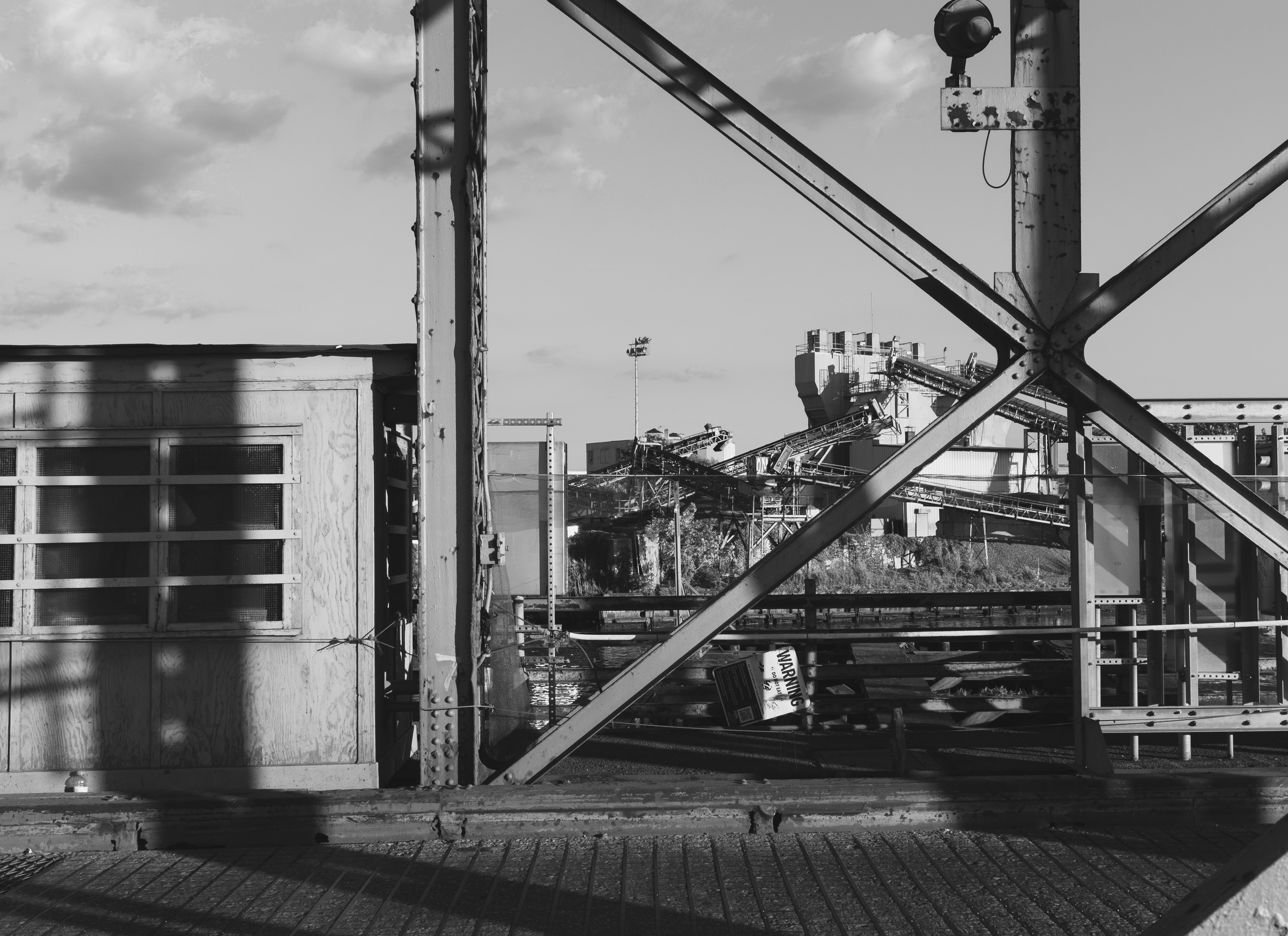

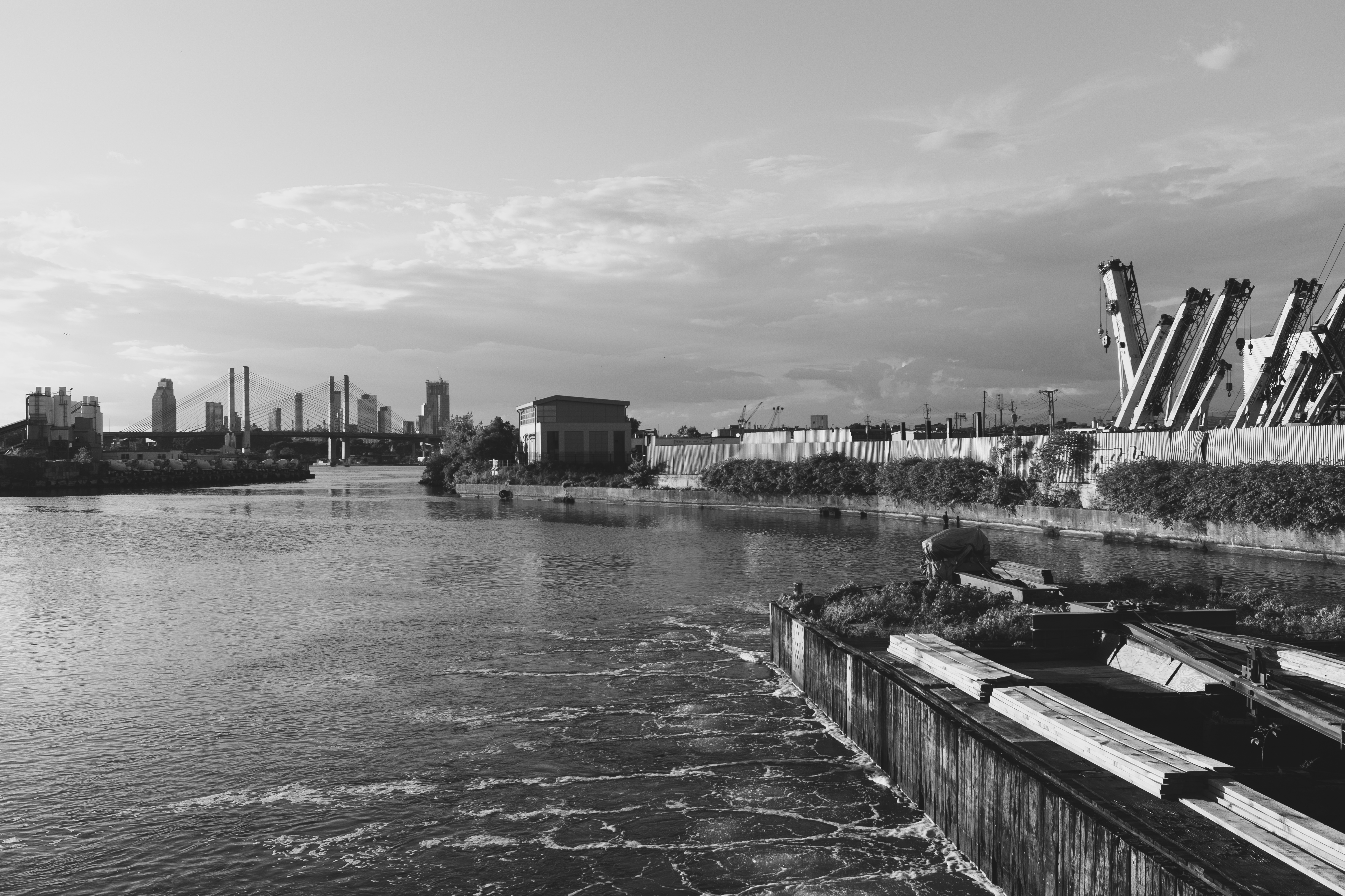
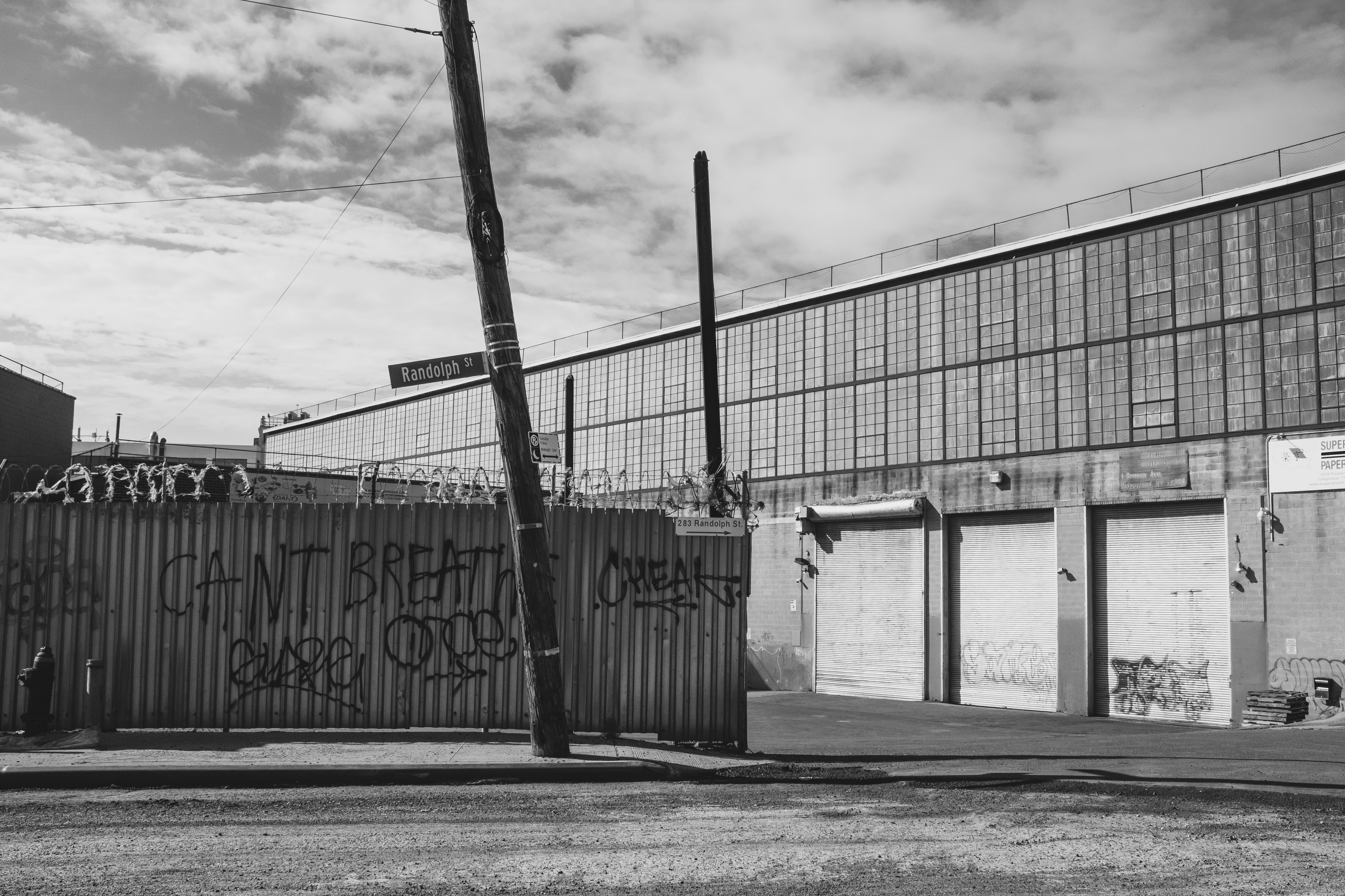

_09_-_Information_Screen.jpg)