I recently wrote a post about how New York City’s transit system could be made more accessible by incorporating more multilingual signage and announcements. That post included a few examples of other transit systems’ (especially Paris’s) multilingual wayfinding. This post is an addendum to that, and is meant to serve as a catalog of multilingual transit around the world, and provide further suggestions for non-multilingual transit agencies, specifically New York’s, on how to (relatively easily!) create a more inclusive public transit network.
Examples Of Multilingual Transit
In The United States
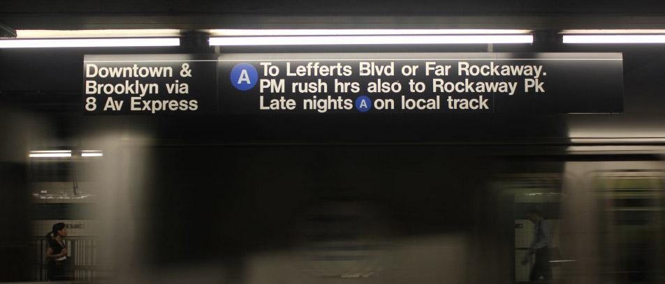
New York’s neighborhood-specific multilingual service change notices already make it one of the strongest multilingual transit systems in the country (even if the translations sometimes need some help). But provision of information in languages other than English does not extend to typical informational announcments or wayfinding signage.
Houston‘s Metro announces arriving light rail trains, as well as bus routes and destinations, in English and Spanish. San Francisco‘s MUNI buses—seemingly so far on a trial basis—announce opening doors in English, Spanish, and Cantonese.
Outside The United States
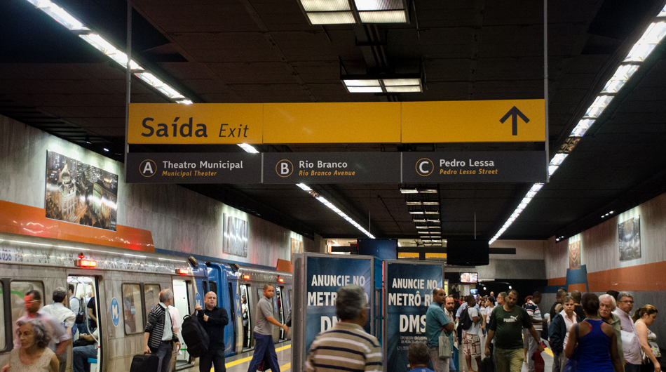
The best examples of multilingual wayfinding in transit are outside of the United States. (And, generally, outside of the English-speaking world, with the exception of bilingual Canada). Bilingual signs with English translations are common, but systems which regularly employ trilingual signage are not difficult to find either.
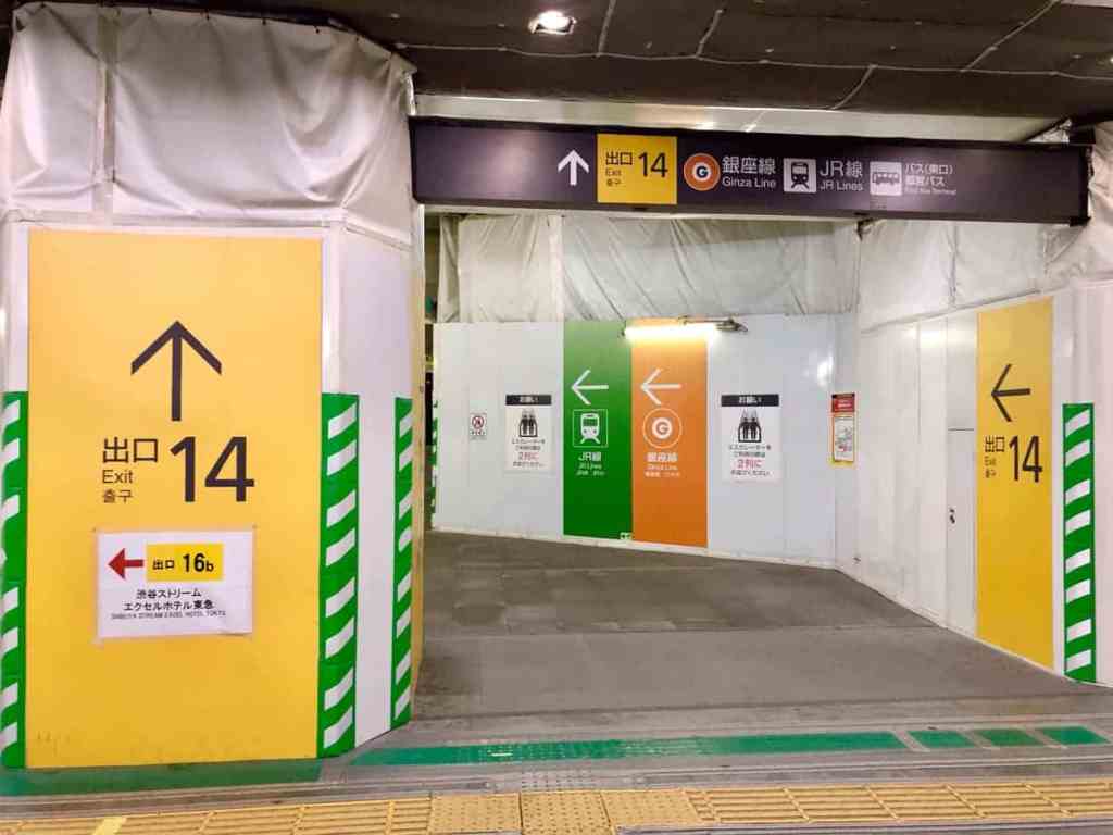
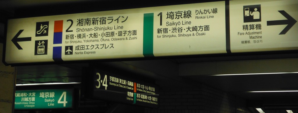
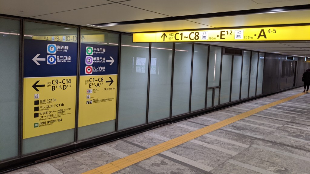
The Tokyo Metro (and associated JR and other mainline stations) provide the majority of signs in Japanese and English. Exits are generally distinguished with yellow signage (see Shibuya example, left) and transfers emphasize line colors (both examples). Platform and train announcements are also typically bilingual, as are the digital information screens common on trains (since these are coming to NYC—both retrofitted to current trains and on new fleet deliveries—the example provided by Tokyo is worth copying).
(There are a lot of really good blog posts on the internet about wayfinding in the Tokyo Metro and across transit in Japan—such as here, here, and here—which I would highly recommend).
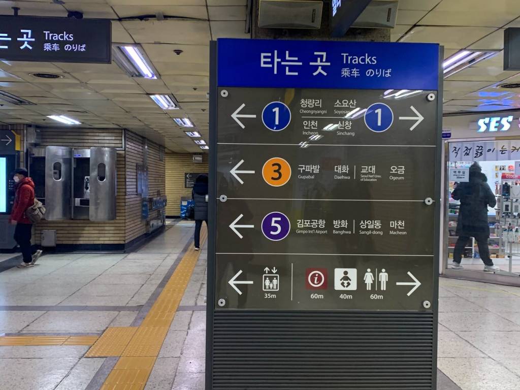
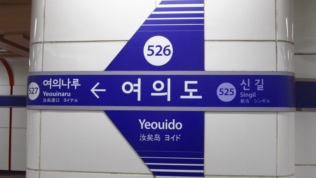
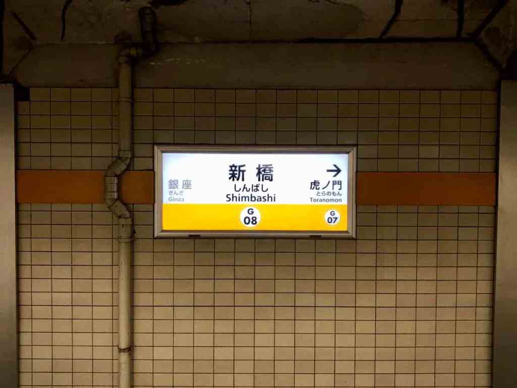
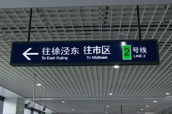
In Seoul, most Metro signs and announcements are given in Korean and English. In at least one case—Metro Line 1 at Seoul Station—the station announcement with transfer information is made in four languages (Korean, English, Japanese, and Mandarin).
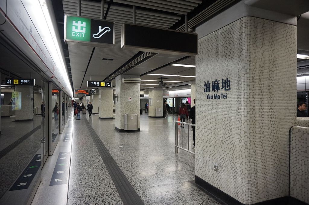
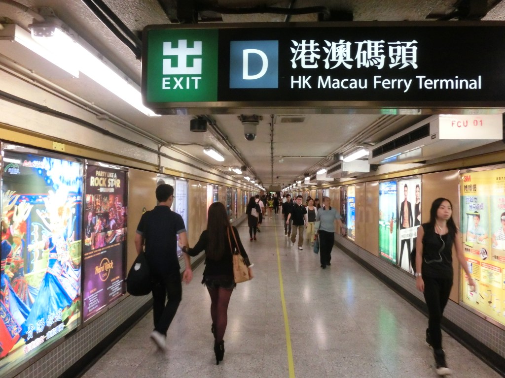
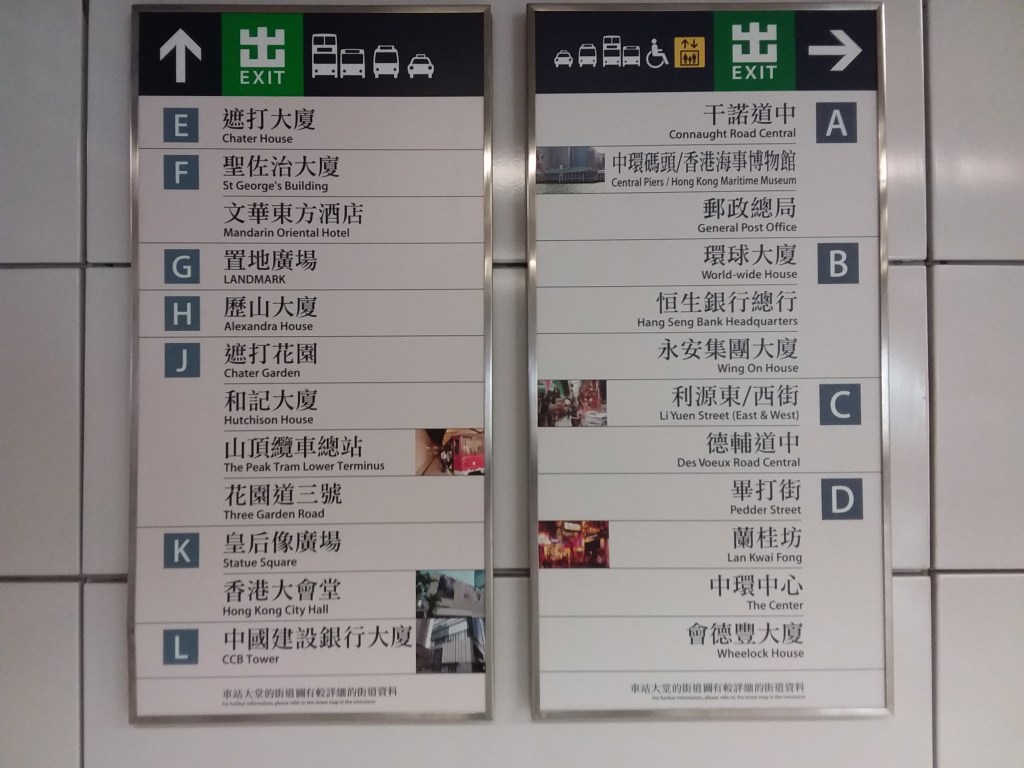
The Hong Kong MTR system is also multilingual: all announcements on trains are made in Cantonese, Mandarin, and English, and all signs include Chinese and English text.
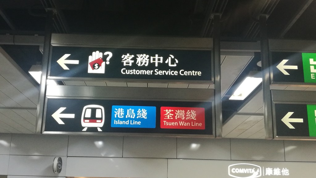
The above systems all additionally employ symbology to direct riders towards important station facilities, such as exits, elevators, restrooms, and information kiosks. These systems also number (or letter, or in Tokyo’s case, both number and letter) their stations’ exits—this might reduce confusion among those unfamiliar to the system and the city, or to those who do not understand the given languages on signage (as exit numbers can be included on mobile maps).
Even Metro systems without multilingual signs, such as Lisbon, use symbols for exits—arguably the most important information a rider should know upon stepping off the train. This is a contrast to systems which are heavily text-based, such as London and New York. Even when exit signs are visually distinguished—as New York’s and London’s typically are—what reason is there not to provide commonly-understood iconography in addition?
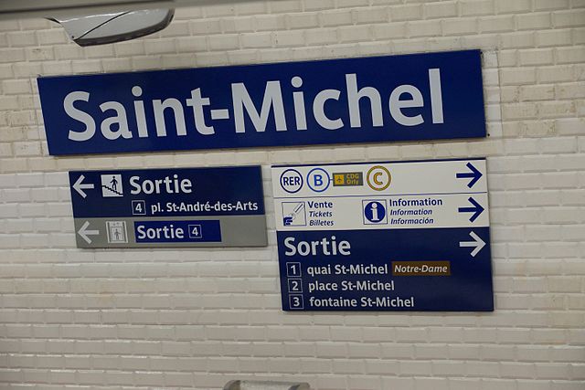
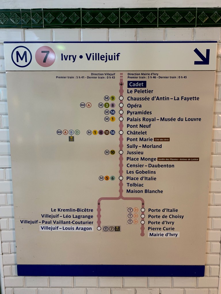
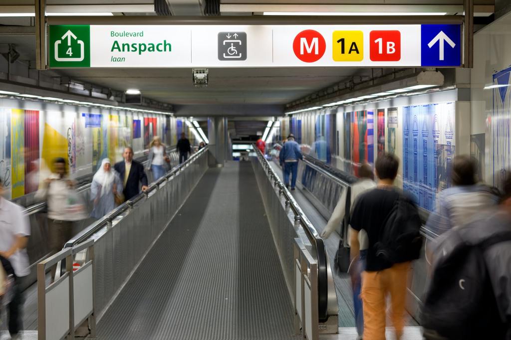
Paris is one of the world’s more multilingual metro systems. The RATP provides most important announcements, in stations and on trains, in multiple languages. Some examples of Paris Métro (and RER) multilingual announcements include: momentary delays, arrival at a terminus, advice for traveling in hot weather, disruption to airport services, operation of shorter trains, notices of pickpocketing, and, of course, “mind the gap.” Signs in Paris are include some multilingual directions—for tickets and passenger information—and the RATP employs several methods to keep wayfinding accessible, such as symbology for station facilities, numbering exits, and line maps at platform entrances, which allow passengers to confirm they are on the correct platform to reach their station.
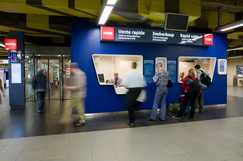
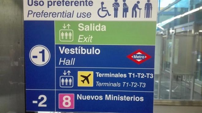
Many more metro systems include basic multilingual signage. There are too many to list here, but some examples include those of Santiago, Dubai, Istanbul, Shanghai, Brussels, Madrid, and Rio de Janeiro.
Back To New York
The previous post had several suggestions for multilingual signage on New York City’s transit network. Those were to improve translation options on the MTA website, add multilingual informational announcements as in Paris, and clarify wayfinding. This post will have a few other more random ideas: some thoughts on clarifying wayfinding and making important information more accessible, and more on how and which announcements can be made multilingual.
On The Subway
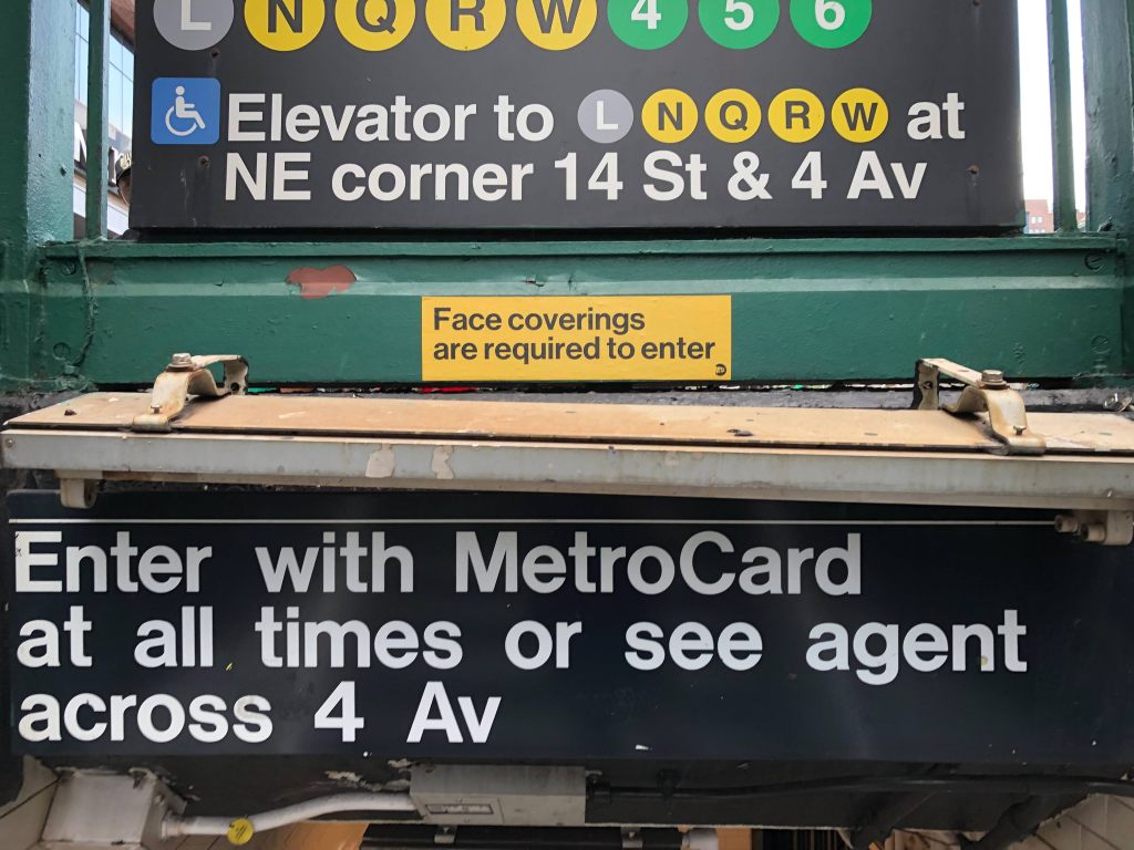
Firstly: it should not need to take this much (somewhat awkwardly phrased) text to communicate to people where they can get information and assistance on fare payment (from an agent, at a 24-hour booth). Other metro systems get by with a commonly-recognized icon for information—which could easily replace the directions to “24-hour booths” within stations. If this icon was also labeled—ideally multilingually—one of the most important station facilities could be located by riders without having to scan rows of text. (Hopefully, rethinking the wayfinding around fare payment can accompany the rollout of the MTA’s new fare payment system throughout the next year).
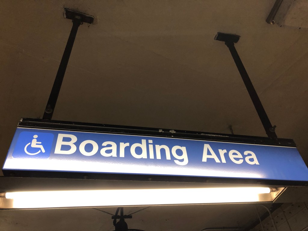
Some busier stations include designated accessible boarding areas—typically sections of the platform which are level with the train floor. This is an example of a sign which should be translated, and supplemented with platform additional signage directing riders towards the accessible boarding area. These same directional signs should also direct people, using symbology, to the nearest elevators (if the platform has them, which, of course, it should).
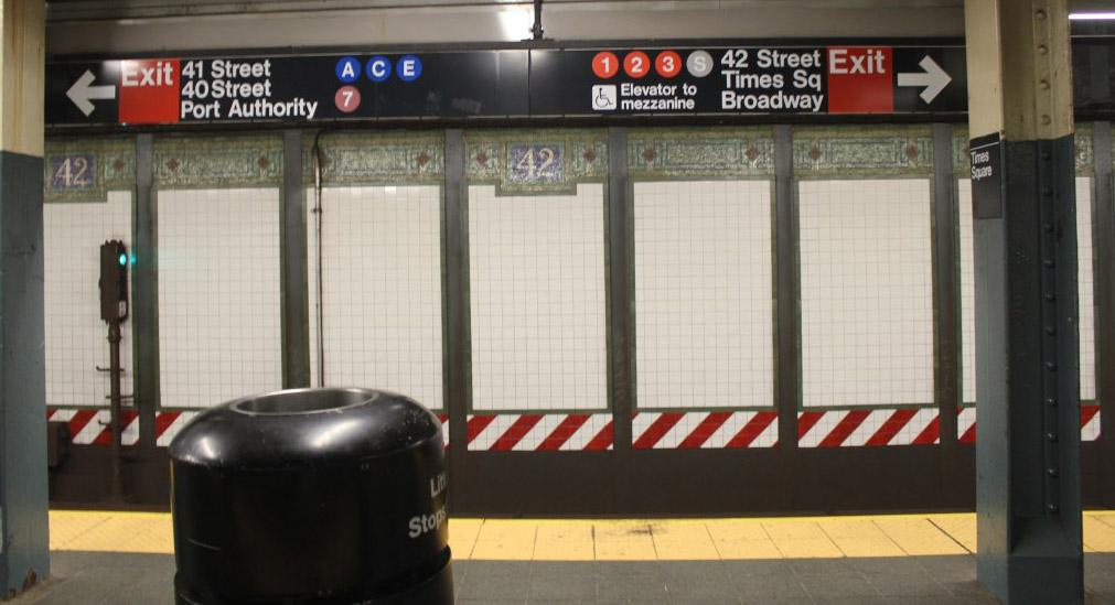
There are other wayfinding lessons which New York can learn from international metro systems. Route information on platforms would be welcome in New York. The previous-and-next stop signs used in Seoul and Tokyo may work well. Knowing the immediate next stop is often relevant on New York platforms which mix local and express service, while dynamic digital signs are better for full route information, given our system’s penchant for shuffling and diverting subway routes. Numbering or lettering exits is worth considering, but could very easily become more confusing than not, given station signs are already saturated with numbers and letters used to describe subway lines.
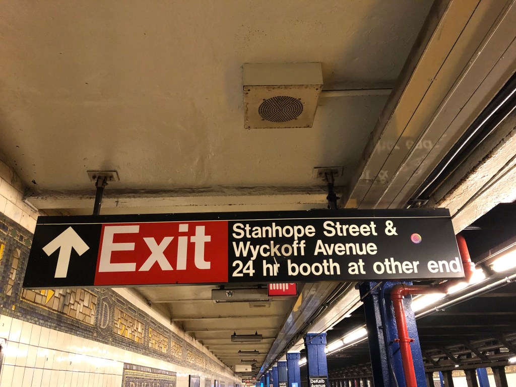
Existing platform signs with route information should be considered obsolete. They are difficult-to-decode walls of text describing often-complicated and changing service patterns. Signage facing riders as they exit trains would be much better used to direct riders towards exits and transfers (this is already done at Times Square, though this sign could probably be made clearer). The Paris and Lisbon examples show how this type of signage working.
Buses
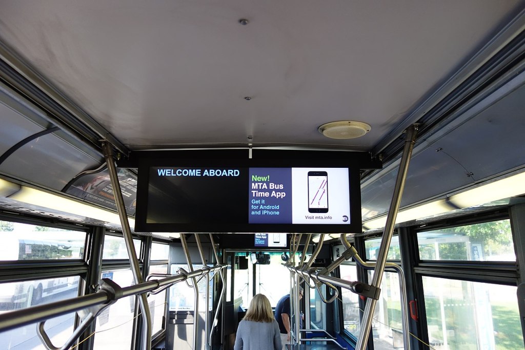
The MTA has recently added digital information screens and announcements to its buses. Generally, I think that the interface on these screens is due for an upgrade (as are the basic text-to-speech announcements), and this is an easy way of adding more inclusive navigational information to the bus system. Digital screens can easily cycle through various translations of information, and informational announcements on buses can be played in several languages as well (ideally, the choice of languages can be made based on the communities served by a given route—as the MTA already does with service change posters). As noted above, buses in Houston already announce their route and destination bilingually upon arrival at bus stops, and this is a good example to follow.
Conclusion
In New York, we lag behind the rest of the world when it comes to multilingual accessibility and clear wayfinding. This is not difficult to change: printing signs and reprogramming digital displays is not a major capital expense, and does not involve construction, but can go a long way to improving the usability of transit for native New Yorkers, newcomers, and visitors alike. Issues like wayfinding have, understandably, taken a backseat in recent months, as transit in New York City and across the US have faced dire, at times existential, threats posed by the pandemic-related plummet in ridership. But a less-confusing transit system is one that people will be more eager to ride. If the MTA is considering a general refresh of the system’s wayfinding (and if not, they should be, it’s been a while), it is imperative they look to other systems’ examples of how navigating public transit can be more inclusive.

_09_-_Information_Screen.jpg)
Leave a comment