(This post is an elaboration of a Twitter thread on the same topic).
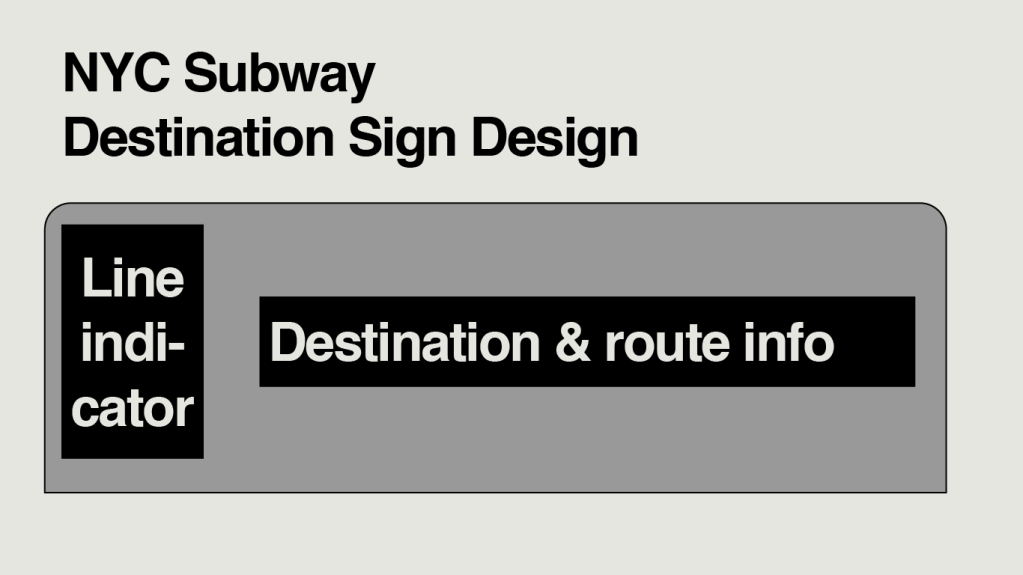
Digital destination signs have occupied their familiar place on the side of subway cars for nearly thirty years. In the early 1990s, the original rollsigns on the R44 and R46 cars were replaced with digital displays, and since then, digital signage has been included on every subsequent order of new subway cars. There are clear advantages to using digital signage, especially when it comes to flexibility. Rollsigns—which once dominated the subway fleet, and remain on many older subway car models—need to be changed manually, and individually, so are easily rendered inaccurate when a train’s destination changes in service (which, on a system where services are diverted as easily and frequently as they are in New York, is often). In contrast, digital signs can be programmed to just about anything and, importantly, can be easily changed on the fly. But in the thirty years they have been in use, the basic design of these signs has remained almost entirely unchanged: one box on the left of the screen identifies the line the train is operating on, and another box to its right cycles through the train’s destination and routes taken.
The Problem
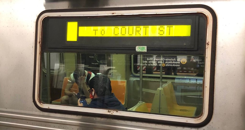
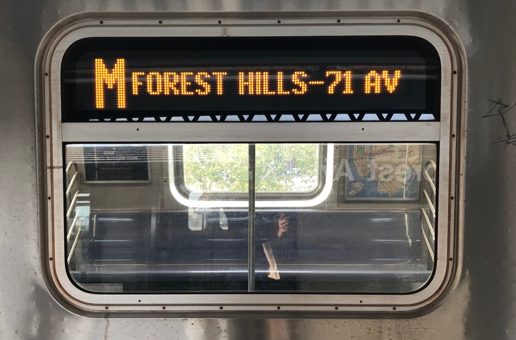
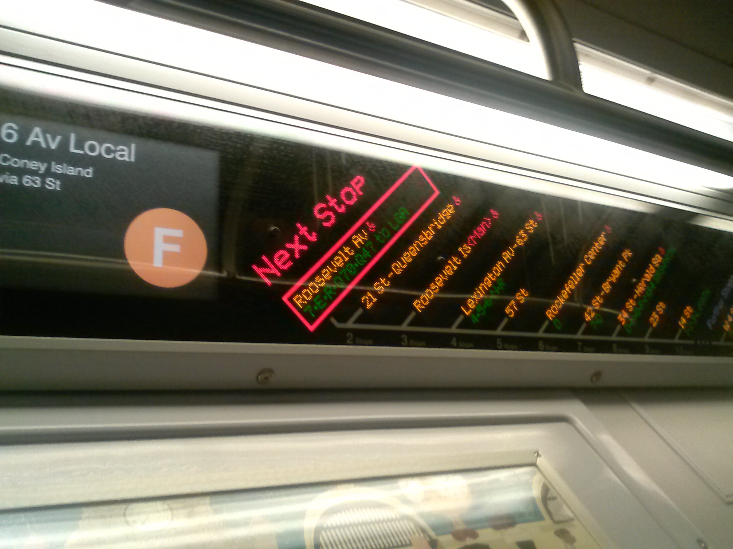
There are a handful of simple subway routes: they mostly keep to themselves, can claim an entire line as their own, and can’t really be diverted on to others—the L, 7, G, or the shuttles are the best examples. On lines like these, single-line destination displays might be perfectly adequate. But the majority of subway routes share lines with one another. The M, for example, is a service that stitches together four subway lines: the Queens Blvd, 6th Avenue, and Myrtle Avenue lines in their entirety, and part of the Jamaica line (and if you count the 53rd Street Tunnel as its own line, five total lines). This has to be communicated through rotating lines of text on destination displays. To keep things from getting too overwhelming, the MTA seems to limit the number of text rotations to three (see example GIF below). The result of this is that a lot of really important information about where trains are going—and where they’re stopping on the way—has to be compressed down to fit on three lines. In the M train example, below, “6 Av Local/53 St” might make sense to those more familiar with the route, or with the subway system, but would not be as easy for someone not used to subway geography to understand.
The Solution
I think the solution here is really obvious: destination signs simply need a second line. This can be done by retrofitting new displays on the New Technology Trains—the R142s, 142As, 143s, 160s, and 179s—within the existing window display frames. With a second line, the train’s destination—arguably the most important information, as this confirms to riders that they are getting on a train in the correct direction—can be displayed constantly on the top (first) line, while route information rotates on the second line. If we were to keep the second line to 3 rotations, as the signs are currently, we could clear up a lot more information: that the M train runs via 53rd Street can be displayed separately—which makes a lot more sense if you are less familiar with subway geography but going to either of the M stations with “53rd Street” in their name.
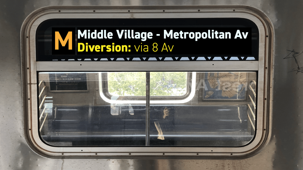
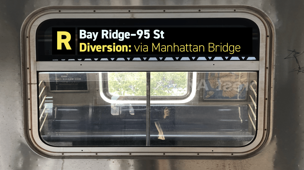
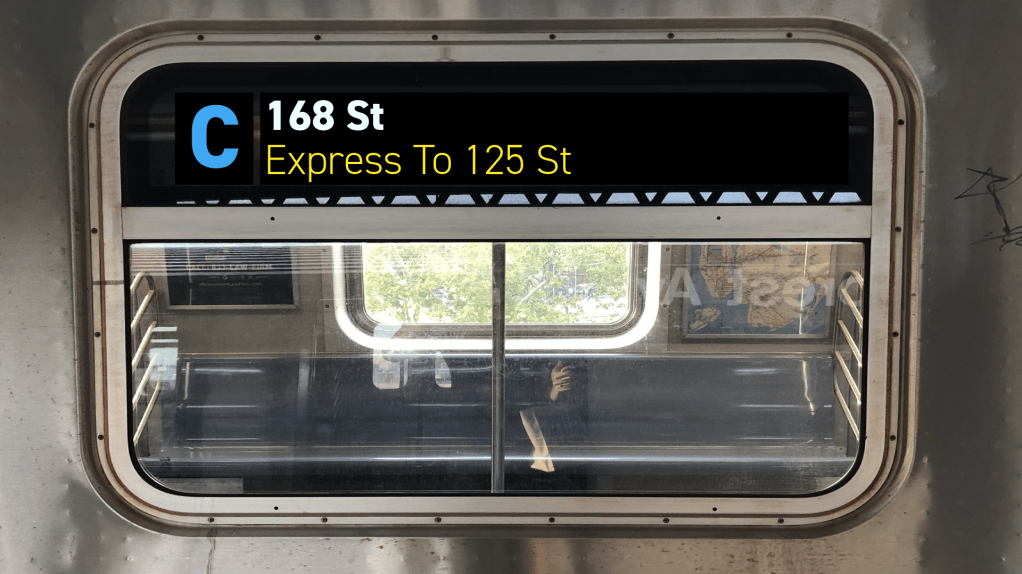
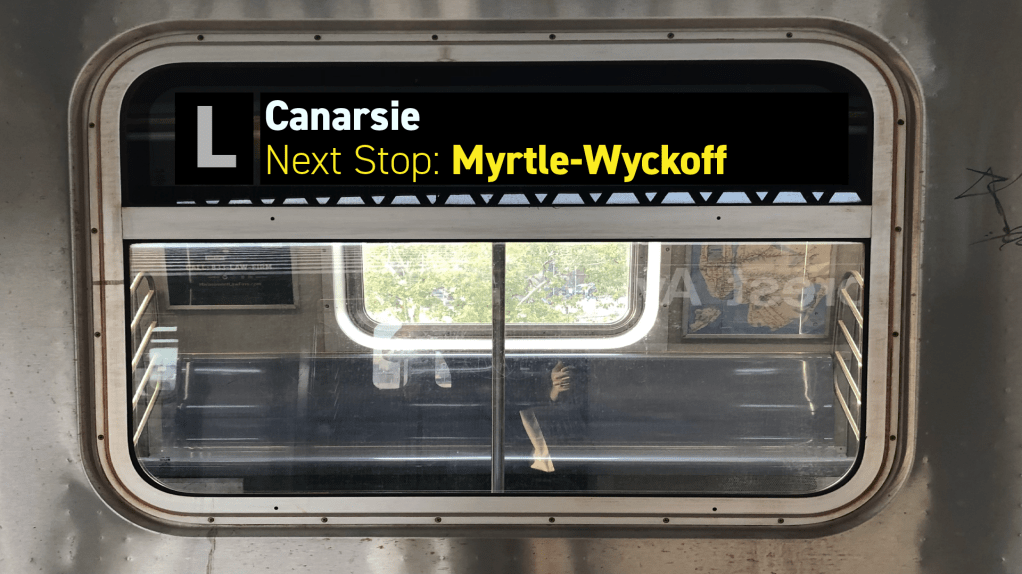
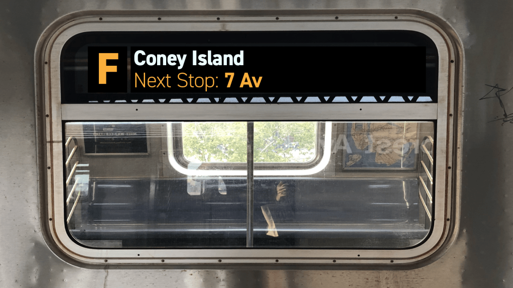
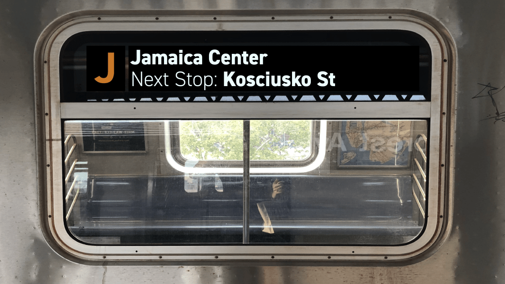
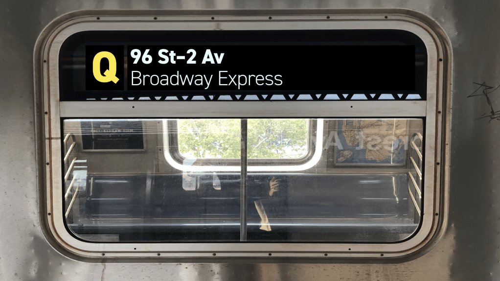
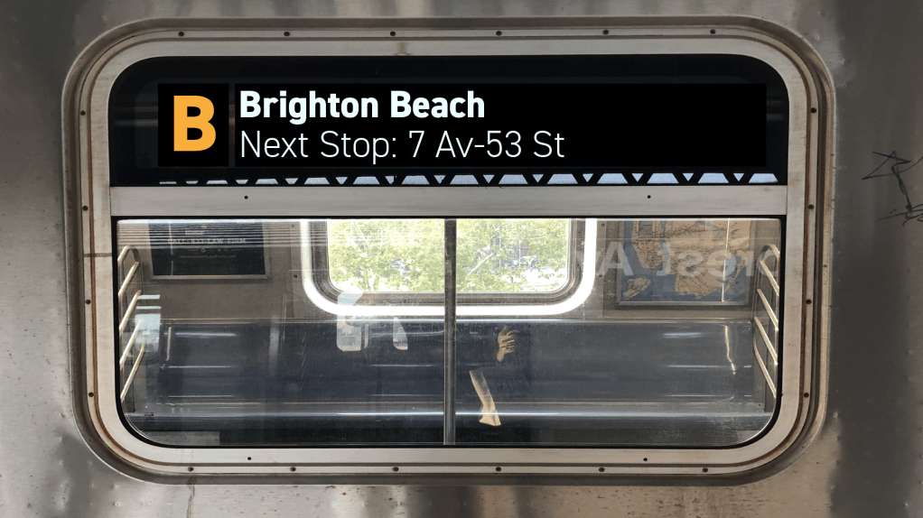
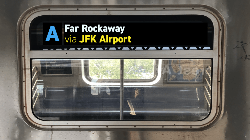
But the much larger strength of the second line is how much additional information can be clearly communicated—and how much more flexible it can make subway signage. For instance, we could display a train’s next stop at platforms shared between local and express or skip-stop trains (such as Marcy on the J) or where lines branch (like 59th on the A/B/C/D)—an important way for riders to ensure they board the right train. (This also applies when a service makes an unscheduled express run). The second line can also highlight that a train is on diversion—like a 6th Avenue service running via 8th, or vice versa—while keeping the train’s final destination in view at all times. This can help to reduce the moment of confusion which invariably occurs when passengers find a diverted train arriving at their platform. Ideally, new signage should take advantage of full-color LEDs, or use an LCD, to further emphasize important information or unusual service. I’ve shown diversions and unplanned changes, as well as service to important destinations like JFK Airport, in yellow. Part-time express service, such as the F in Brooklyn, could be similarly highlighted in yellow, or in the line color (though this may not always be practical). Full-color displays might seem extravagant in comparison to what we have now, but both color LED and LCD displays are becoming cheaper and more ubiquitous (the MTA have retrofitted LCD ad panels into a handful of subway cars, and are ordering new cars with them pre-installed).
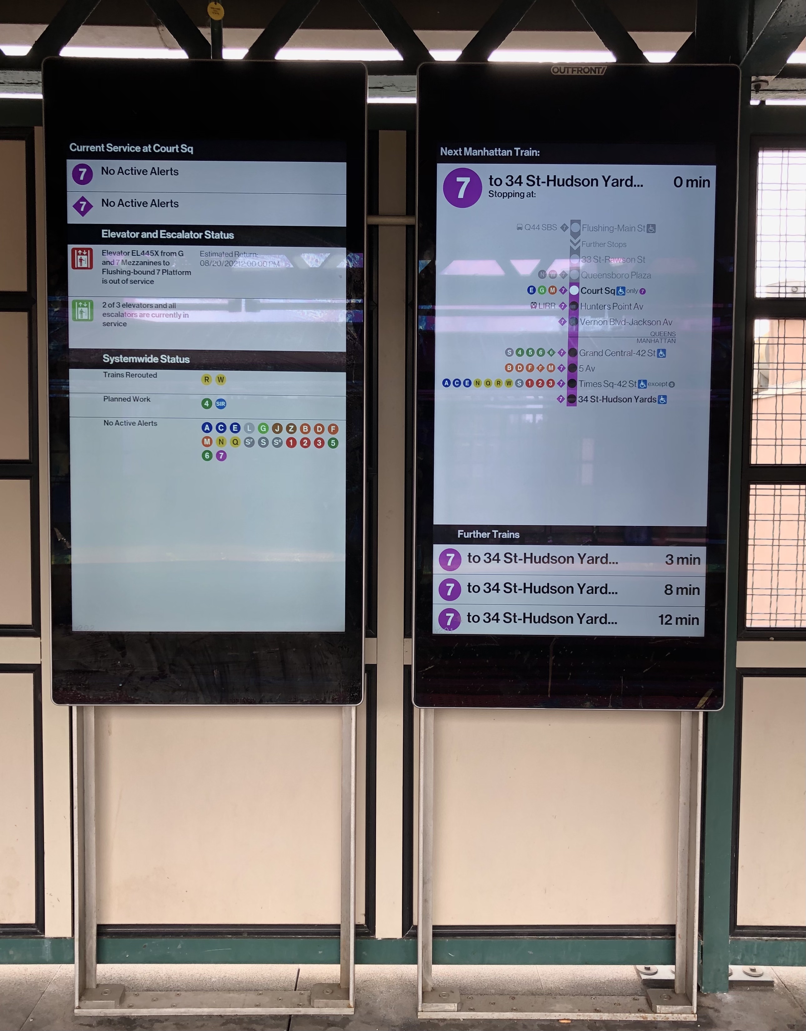
With the recent (and welcome) advancements in platform information displays, it may not seem necessary to enhance those on the trains themselves. For a number of reasons, I would disagree: firstly, even in an ideal world, it would be difficult to guarantee that there is always a real-time display within view anywhere on any platform. Secondly, clear information on trains serves as an important verification of platform displays. While platform screens such as the one pictured to the right will always be more helpful for general journey planning and communicating a train’s entire route, on-train displays can serve as a final confirmation to passengers that they are about to board the correct train. Though this can be done with the displays as they are, it would be much easier to make this confirmation at a glance with a two-line display (and of course, there are those times when you’re running for a train and may not be able to wait as long for the display to cycle through!)
Conclusion
Technology has progressed a lot since the 1990s, and this should be reflected in the rider experience of our subway cars. The most recent such advancement was introduction of the Flexible Information Display (FIND) maps on the R160s in 2006. The R211 cars, fresh from the factory this year, take some further technological steps, restoring the subway’s iconic bullet line indicators in full-color LEDs and refreshing the FIND displays, but they unfortunately fall just short of what could be a comprehensive re-think of subway information.
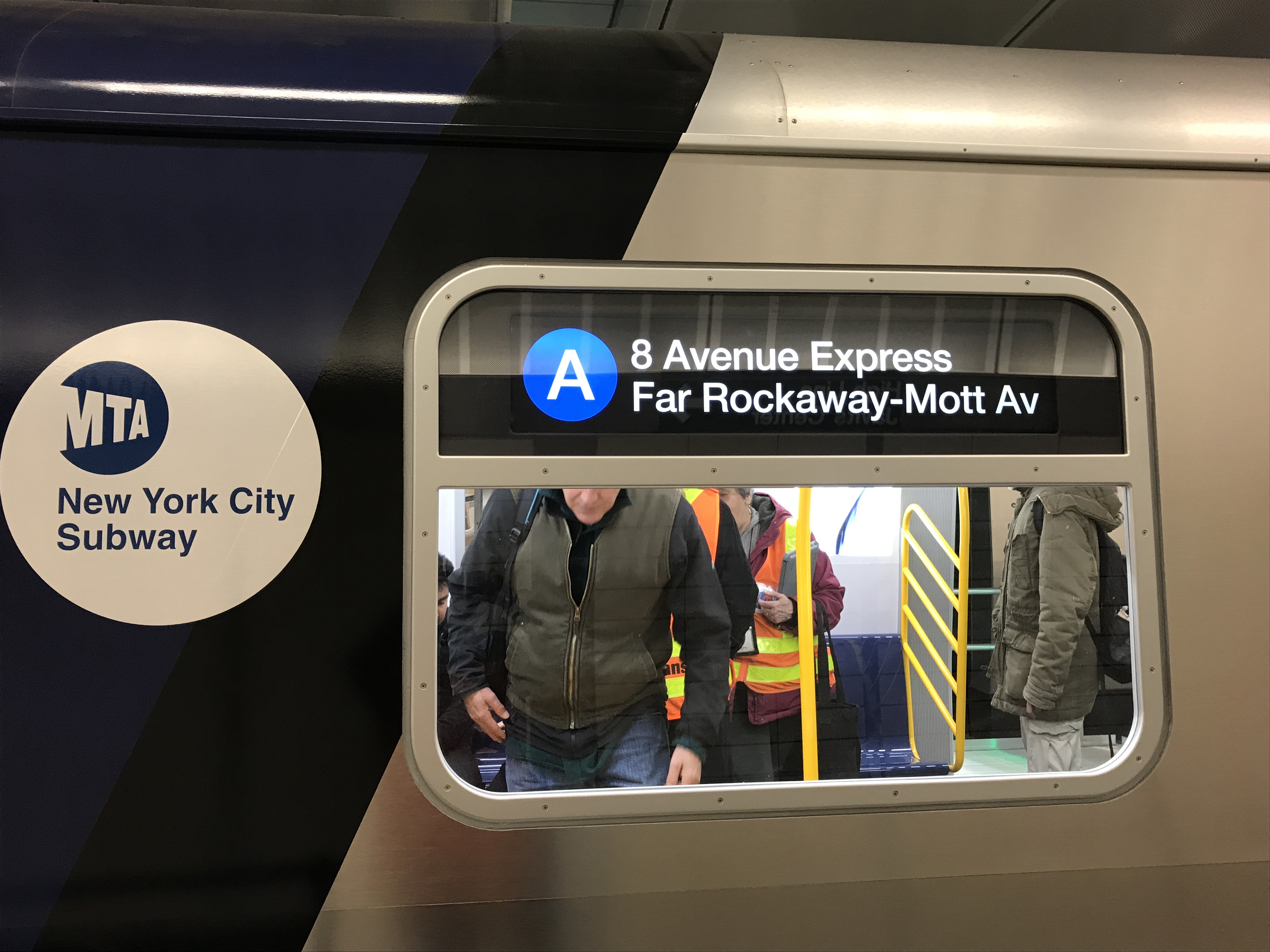
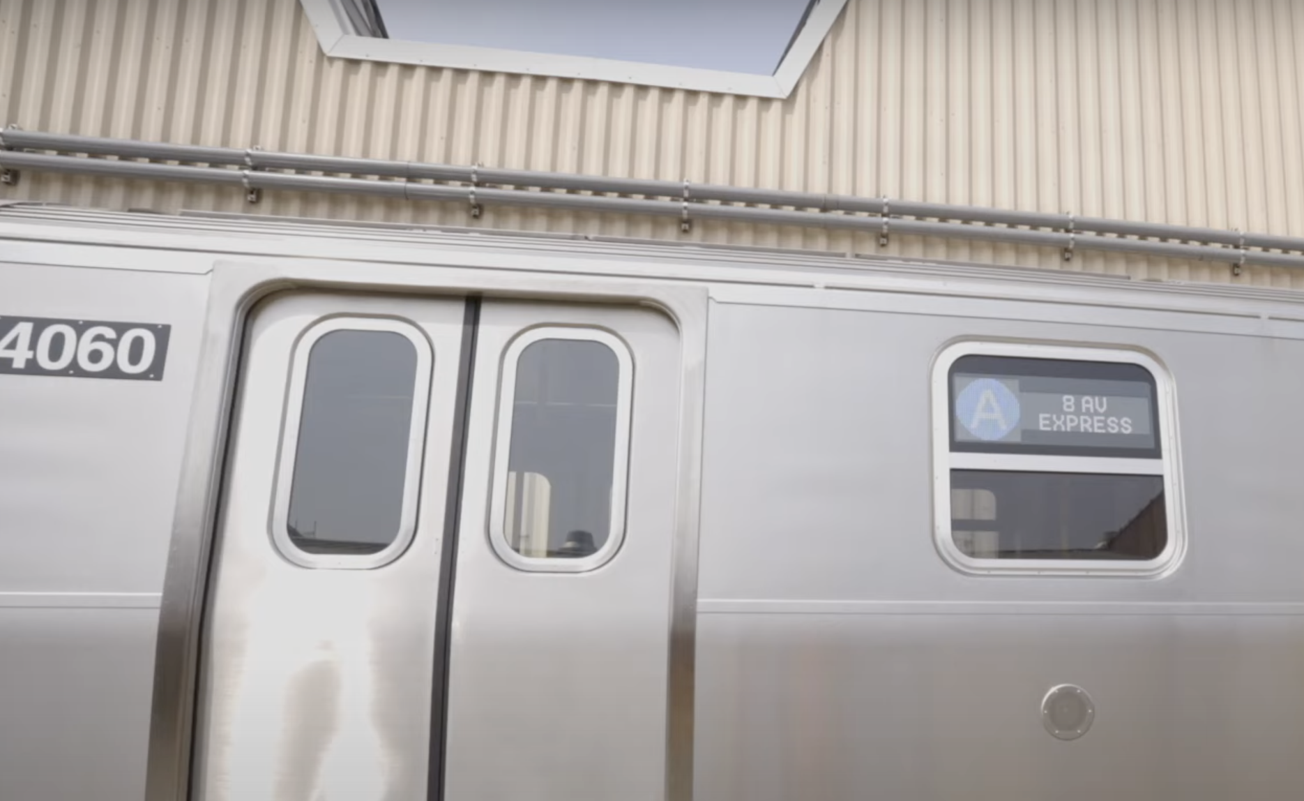
Antenna Design‘s 2017 static mockup of the R211 cars—which are planned to replace the digital display-pioneering R46 cars within the next few years—addressed the display space issue with two lines, one each for the destination and service pattern. But the production cars (at least the few which have arrived in NYC recently for testing) deviate from this design, returning to the more familiar two rectangles, though with altered proportions as a result of the new cars’ shorter windows. From the limited number of glimpses that have been made at the R211s’ signage in action, it appears that, although the displays have two lines because of size constraints, information will be displayed in the same fashion as on older, one-line displays. These size constraints make the type of displays I propose difficult on the R211s—but I think making the route bullet smaller in exchange for more text space on remaining cars would be a worthy trade.
When electronic displays were introduced on the R44 and R46 cars, it was part of a mid-life overhaul the cars received after 20 years of service. That is about the same age as the 2000s-era New Technology Trains are right now. It’s not known whether they will receive a similar mid-life overhaul—though, again, the pace of technological change probably warrants it. It’s worth noting that the MTA has experimented recently with upgrading the displays on a handful the 7 line’s R188 cars, but made no changes the fundamental design. The limitations in the design of earlier displays make sense considering the technology available in the mid-1990s. But as a new generation of subway cars arrive, and the previous generation reach the middle of their service lives, it’s past time to take advantage of more recent technology to make subway navigation easier and improve riders’ experience on public transit.

Leave a comment